Single, "do"

Title

Buttons are available in either fill or outline styles. A button in the fill style has a solid background, since it’s meant to be intentionally more prominent than a button in the outline style.
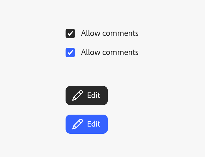
Key example showing the selected state of a sampling of two components, the checkbox and action button. Selected states can be either gray-800 or the accent color in some cases.
Buttons are available in either fill or outline styles.

Single, "don't"

A dragged state has a unique drop shadow to draw attention to the dragged object. Learn more about drop shadows.
Key example showing the selected state of a sampling of two components, the checkbox and action button. Selected states can be either gray-800 or the accent color in some cases.
Example of a tree view item in the dragged state.

Single, "neutral"

Title

Buttons are available in either fill or outline styles. A button in the fill style has a solid background, since it’s meant to be intentionally more prominent than a button in the outline style.

Key example showing the selected state of a sampling of two components, the checkbox and action button. Selected states can be either gray-800 or the accent color in some cases.
Buttons are available in either fill or outline styles.

Without captions

Title

Buttons are available in either fill or outline styles. A button in the fill style has a solid background, since it’s meant to be intentionally more prominent than a button in the outline style.

Key example showing the selected state of a sampling of two components, the checkbox and action button. Selected states can be either gray-800 or the accent color in some cases.

Do and don't, side-by-side

Key example showing the selected state of a sampling of two components, the checkbox and action button. Selected states can be either gray-800 or the accent color in some cases.
Buttons are available in either fill or outline styles.

Multiple

Font weight

Spectrum 2 offers guidance for a wider range of font weights to help establish visual hierarchy in layouts, including the specific usages of Black, ExtraBold, and Medium weights.

Key example showing the selected state of a sampling of two components, the checkbox and action button. Selected states can be either gray-800 or the accent color in some cases.
Buttons are available in either fill or outline styles.
Key example showing the selected state of a sampling of two components, the checkbox and action button. Selected states can be either gray-800 or the accent color in some cases.
Avatars are displayed in circles to draw attention to user content.
Key example showing the selected state of a sampling of two components, the checkbox and action button. Selected states can be either gray-800 or the accent color in some cases.
Regular is the default font weight for Spectrum components and body text.