Usage
These are the "dos" and "don'ts" of Spectrum design.
Single, "do"
Content for the usage block should be in the left column, while the image, caption, and "semantic" indicator go in the right column of your block. Image, captions, and the semantic usage icon all live in separate rows in the right column.
Use the :docheck: icon to signify an approved usage pattern.
Title
Buttons are available in either fill or outline styles. A button in the fill style has a solid background, since it’s meant to be intentionally more prominent than a button in the outline style.
Single, "don't"
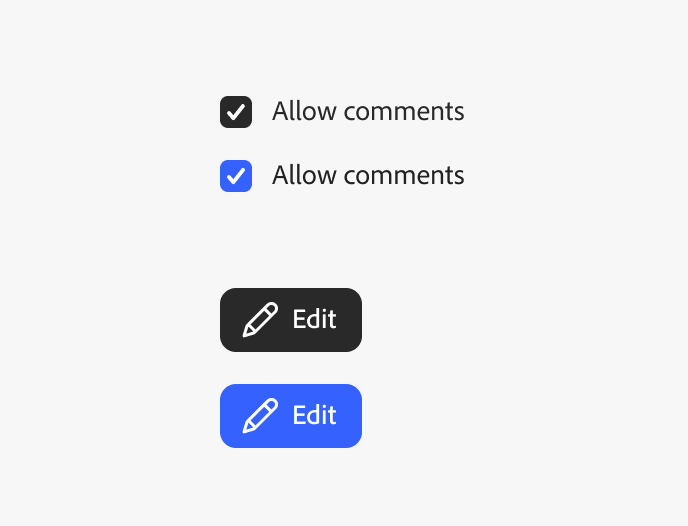
Content for the usage block should be in the left column, while the image, caption, and "semantic" indicator go in the right column of your block. Image, captions, and the semantic usage icon all live in separate rows in the right column.
Use the :dontcross: icon to signify an unapproved usage pattern.
Single, "neutral"
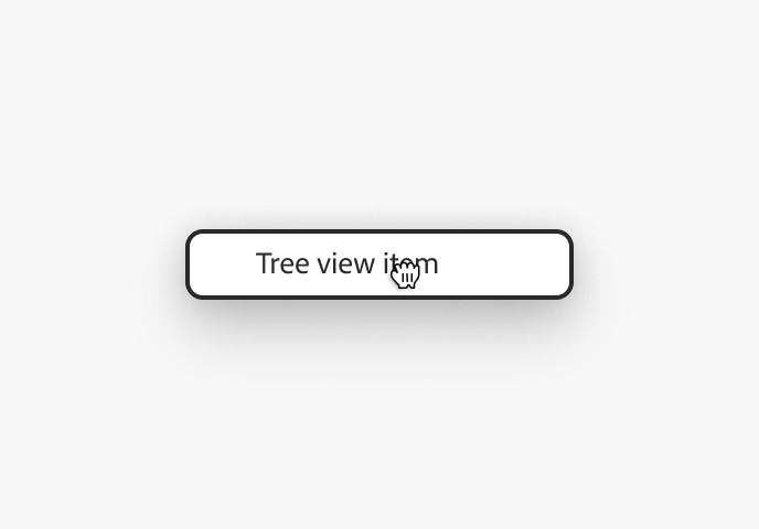
Content for the usage block should be in the left column, while the image, caption, and "semantic" indicator go in the right column of your block. Image, captions, and the semantic usage icon all live in separate rows in the right column.
Use the :neutralminus: icon to signify an approved usage pattern.
Title
Buttons are available in either fill or outline styles. A button in the fill style has a solid background, since it’s meant to be intentionally more prominent than a button in the outline style.
Without captions
If there is no need for an image caption with the usage block, deleting the row will not render it.
Title
Buttons are available in either fill or outline styles. A button in the fill style has a solid background, since it’s meant to be intentionally more prominent than a button in the outline style.
Do and don't, side-by-side
To render the "do and don't" guidelines next to one another, simply author the usage block in a similar fashion. Images are in the first row; image captions are in the second row; the semantic indicator icons are in the third and final row.
Multiple
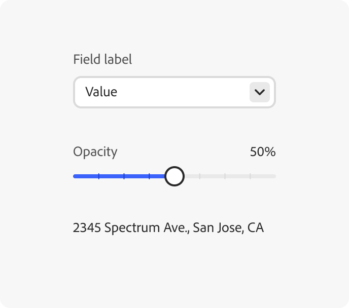
For usage blocks that have multiple images, authors can provide overarching content in the left column, and all other data in separate rows in the right column.
In the right column, follow the pattern "image, image caption, semantic indicator" for each row's content, for every usage guideline.
Font weight
Spectrum 2 offers guidance for a wider range of font weights to help establish visual hierarchy in layouts, including the specific usages of Black, ExtraBold, and Medium weights.