Motion

Overview
Spectrum 2 builds on top of the Spectrum 1 motion guidelines for the design system: that motion is always purposeful, intuitive, and seamless. With this update, we also use motion to draw attention to areas where we want to add personality. No matter what, the usage of motion should be adding meaning to an experience. And, motion over large surface areas needs to support browser and system settings for reduced motion.
Motion is also an important part of brand expression. Just like tone in language, tone in motion can range from formal and direct to lighthearted and subtle.
Motion in Spectrum 2 is categorized into the areas of directional motion, interaction motion, and wayfinding motion. Wayfinding motion is still in development.
Directional motion
The directions in which motion happens communicate intentional meanings. There are three basic categories of directional motion, each used for their own purpose.
Linear
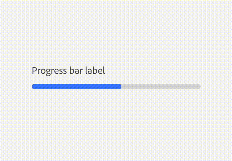
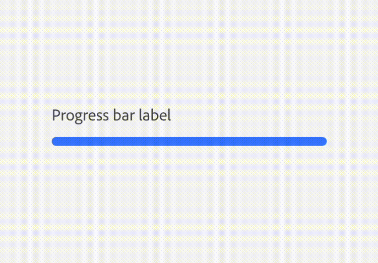
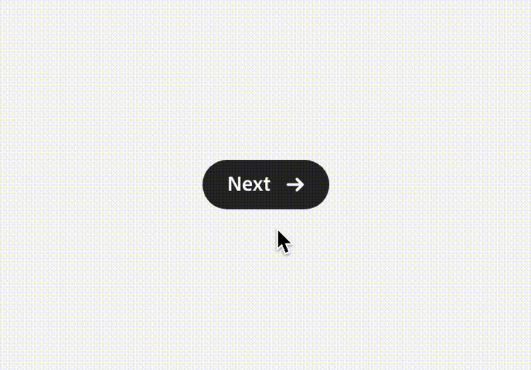
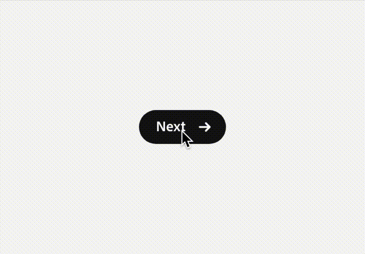
Linear motion indicates forward movement and a sentiment of progress. When emphasizing movement to a different section, page, or item (such as a button or link), the destination is readily clear and minimally disruptive.
If you’re creating a custom animation, consider RTL (right-to-left) languages and also how the meaning of motion might differ depending on cultural context.
Diagonal
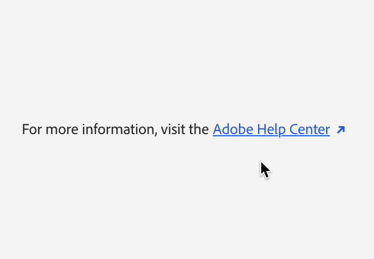
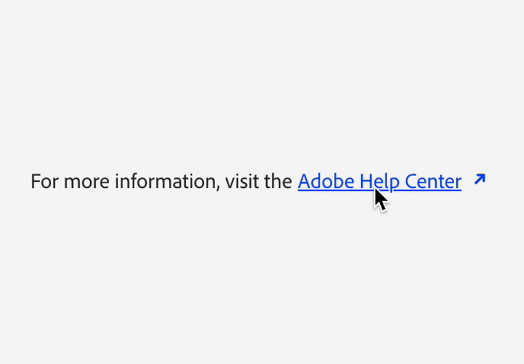
Diagonal motion indicates larger movement, and can be potentially disruptive. This type of motion can be used to emphasize that there’s a switch in context happening, like linking out to a different view or destination.
Clockwise
Clockwise motion indicates a holding pattern that’s repetitive and doesn’t have clear forward momentum or progress. This is most often used for loading indicators.

Interaction motion
Motion shows users feedback that, when interacting with the UI, their actions are registering with a system. It’s not the only way to show feedback, but it helps objects to feel more dynamic and responsive. It also can help communicate meaning, or add emphasis that something is happening that requires attention.
A microinteraction is a single action (like a click, tap, or swipe) which triggers a response (like a transition or animation). In Spectrum 2, microinteractions offer moments of personality that are reflective of product branding.
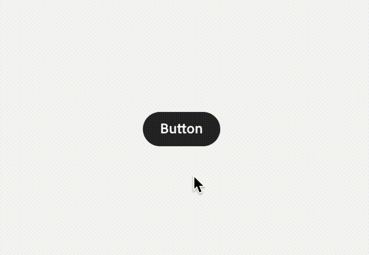
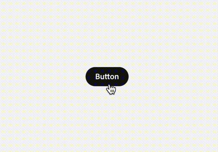
In this example, the button scales down on the down state, emphasizing that something — the action of selecting — happened.