Colors
Spectrum’s color system is used for all colored components, text, and icons, for both semantic and non-semantic usage. We also use colors in our data visualization color palettes.

Principles



Accessible
Spectrum colors are purposefully chosen and combined with one another to create accessible experiences that work for all users across different products, devices, and settings.
Scalable
Spectrum uses structured relationships between colors, grays, themes, and contrast ratios so it can work consistently across Adobe’s many apps, surfaces, and modes.
Purposeful
Color is used to create hierarchy, signal meaning, and guide attention. Spectrum avoids unnecessary color so important actions, states, and messages stand out.
What color does
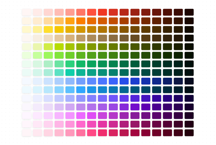
Spectrum’s color system helps you apply color to your UI in a consistent and visually harmonious way. Spectrum’s color system is based on a foundation of visual perception, inclusive design, and accessibility. Spectrum uses the relationships between colors and their properties to create a scalable foundation for color in the design system. Dark and light variants of each color can then be applied to your UI in different ways. Spectrum colors are generated using the Leonardo color tool, by plugging in hues and hue ranges through key colors and combined with target contrast ratios for each color.
Application of brand color
Spectrum’s color system helps you apply color to your UI in a consistent and visually harmonious way. Spectrum’s color system is based on a foundation of visual perception, inclusive design, and accessibility. Spectrum uses the relationships between colors and their properties to create a scalable foundation for color in the design system. Dark and light variants of each color can then be applied to your UI in different ways. Spectrum colors are generated using the Leonardo color tool, by plugging in hues and hue ranges through key colors and combined with target contrast ratios for each color.
Brand colors may differ from Spectrum colors
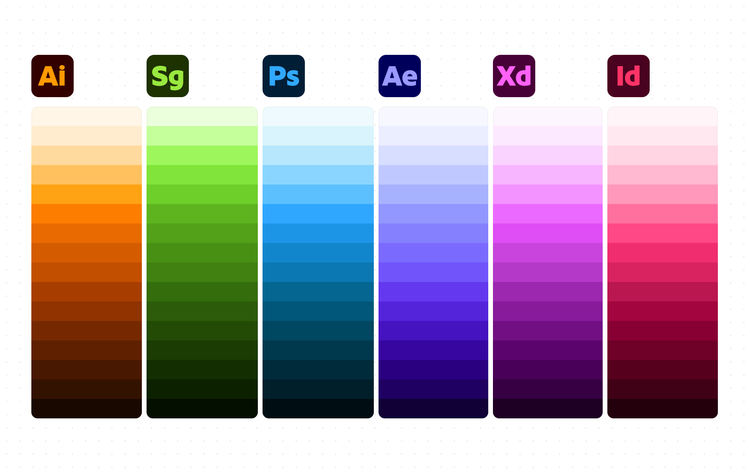
Key colors (shown in hue)
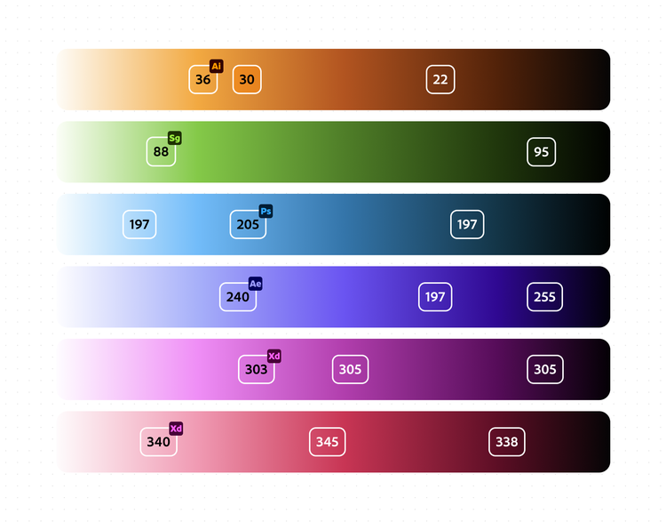
Once the color scale is determined, lightness stops are input for each color in order to get aliased colors.
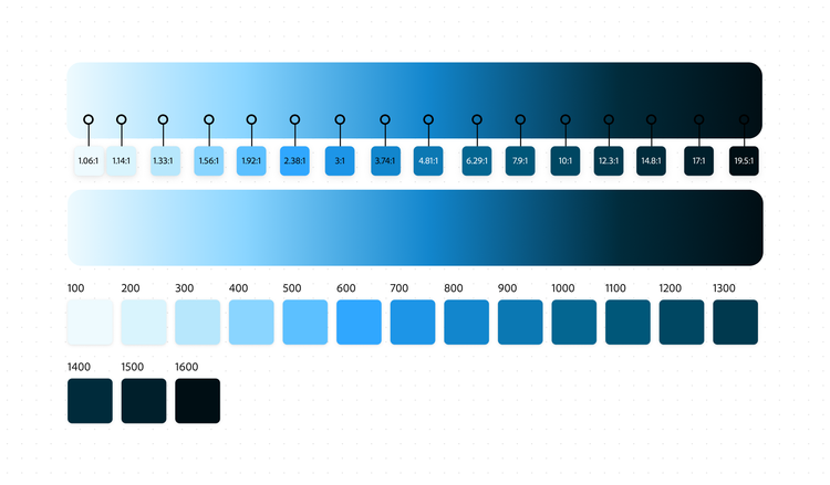
Color backgrounds
Sometimes it’s necessary to use color for the background or fill of an object in an interface. Use color backgrounds sparingly, except for the following cases.
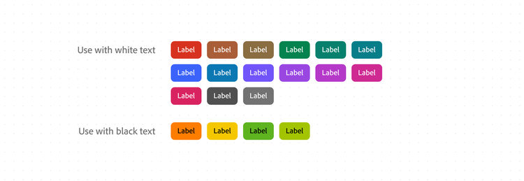
Solid color background with black or white
For these scenarios, color must adhere to WCAG contrast minimums with the color of the text. Most colors have white text placed over the color. To maintain the identifiability of yellow, orange, chartreuse, and celery while still meeting these requirements, these colors must be used with black text. They must be fully opaque and should be referenced from the static color palette.
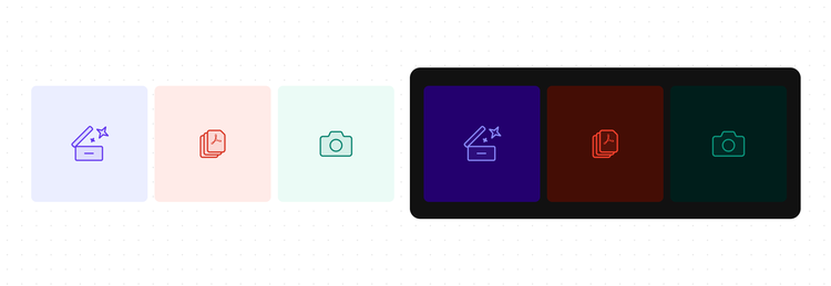
Two-tone color pairing
To create two-tone color pairs, use the 100 index of your color for the background (e.g., magenta-100). The icon or illustration should use the 900 index in light theme (e.g., magenta-900). In dark themes, the 700-1200 indices can be chosen based on the desired lightness or saturation levels of the color. For example, yellow is better represented with yellow-1200, and red is better represented with red-700.
Do not use these colors without a text label representation of the color’s significance in your application. These colors are not color vision deficiency safe, and could be confusing to some users.
Usage guidelines
Don’t create your own colors
Every part of the interface should use a color defined by Spectrum to ensure consistency across products. Spectrum’s colors are carefully chosen and tested to ensure they meet accessibility standards.
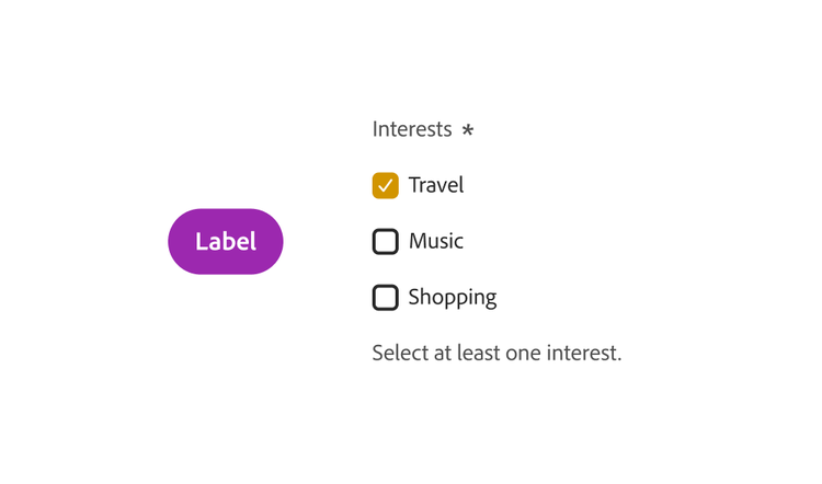
Communicating with color
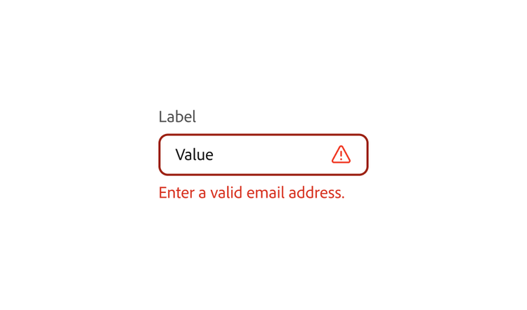
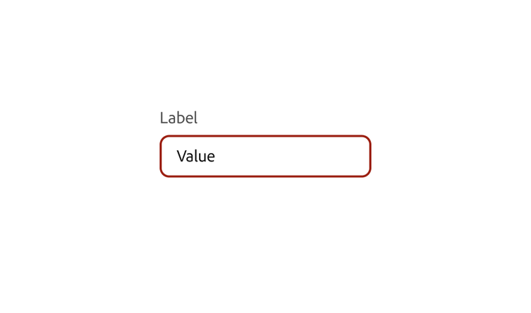
In order to be accessible for as many users as possible, do not use color alone as a method of communication. For every usage of color as a feedback method, there should be an accompanying label and/or icon to communicate meaning.
Create hierarchy with background layer colors
Use background layers for creating application hierarchy. This will ensure that dimensionality and visual/structural hierarchy is appropriately translated between light and dark themes.
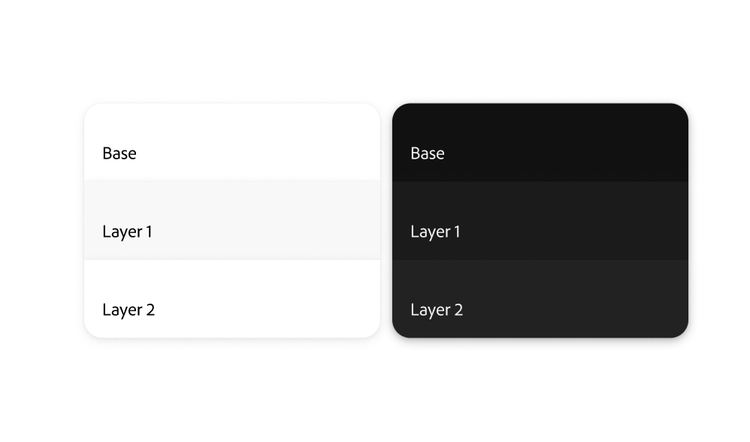
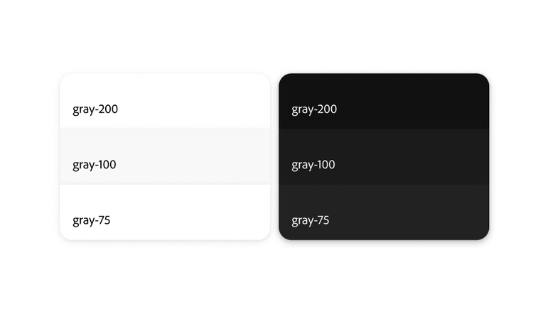
Provide sufficient contrast
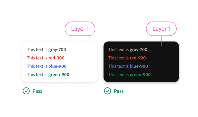
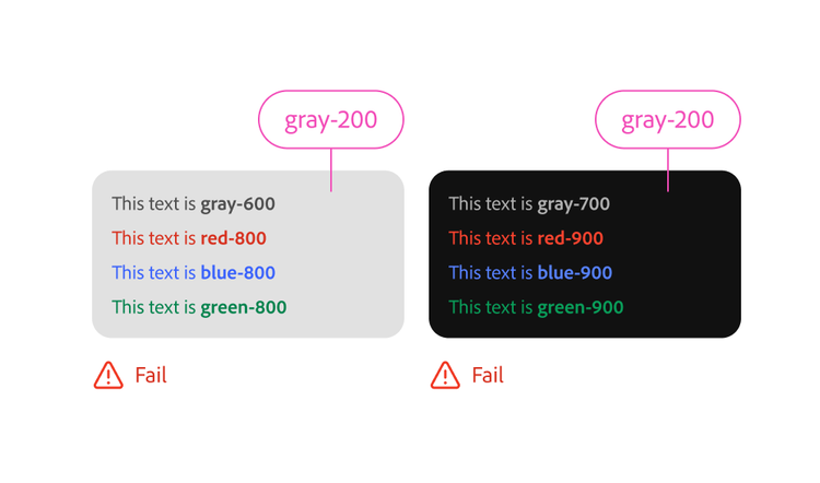
Use the appropriate gray tokens and color tokens for text, icons, and illustrations. These tokens are guaranteed to meet or exceed WCAG contrast minimums when placed on background layer colors for each supported color theme.
Choosing lower indexed color tokens, or using other colors for backgrounds, could result in insufficient contrast. When in doubt, check the contrast for text, icons, and UI components for all color themes supported by your product.
Hue and Saturation contrast
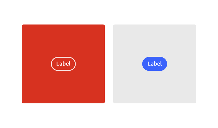
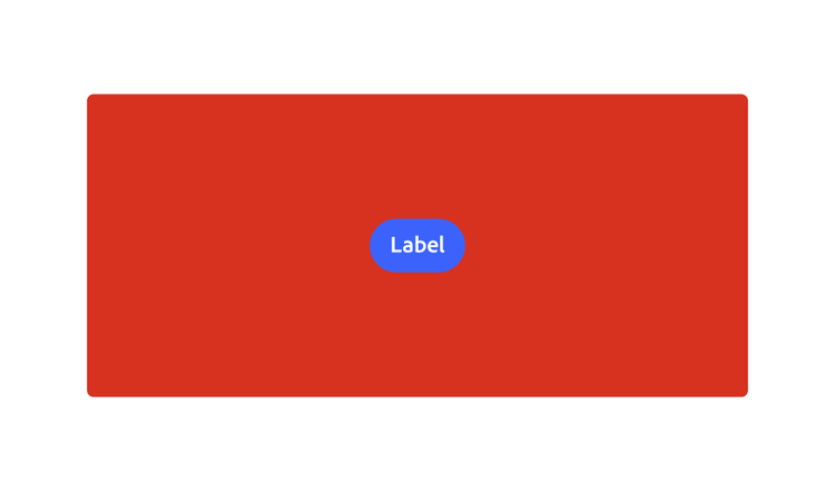
Avoid placing colors directly on top of or adjacent to other colors that have a high degree of hue contrast with near-equal saturation or lightness. These scenarios create a visual illusion of depth or vibration (chromostereopsis) which can result in a poor user experience. If colors have near equal lightness, they will also cause lightness contrast issues since the colors may be indistinguishable to some users.
Use static white or static black components instead of colored components on top of color or image backgrounds.
Programmatic color changes
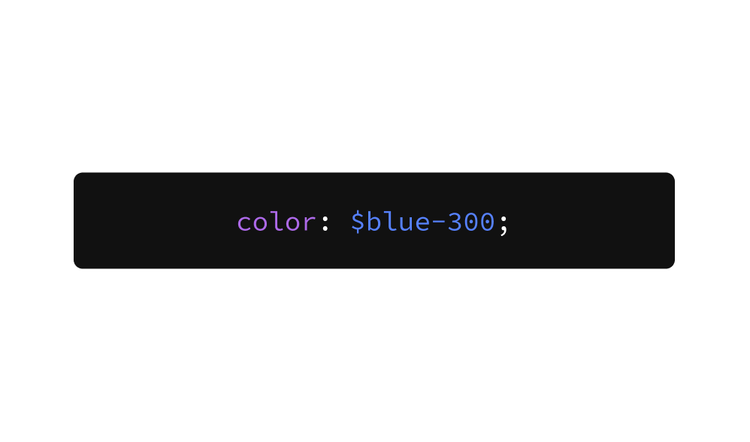
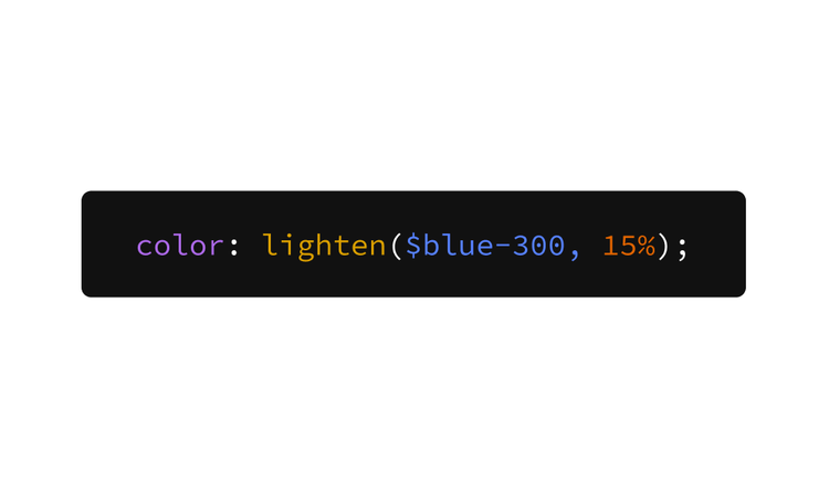
Do not use color functions to modify Spectrum colors. The specific tints and shades of Spectrum’s themes were designed to be perceptually uniform. Modifying colors in the product or framework could result in undesirable colors.