Grays
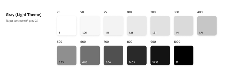
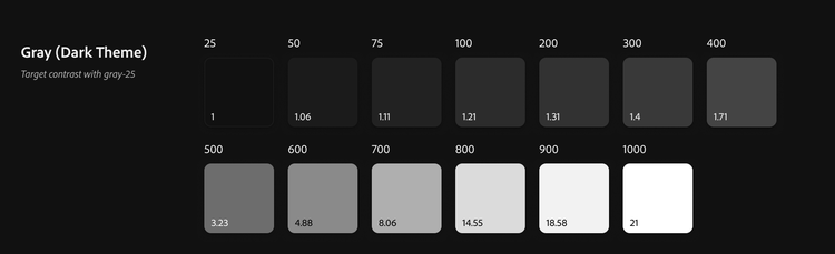
Spectrum 2’s gray system is based on the 11-color system of neutral grays used in Spectrum’s 6.0.0 colors. 11 gray values (per color theme) are used to create background layers, component state progressions, and much more.

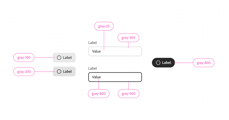
Examples of using grays
- Gray-25, -50, and -75 are reserved for background layers.
- Gray-100, -200, and -300 are used for lower contrast component background progressions or borders.
- Gray-800 and -900 are used for higher contrast component backgrounds such as text and active borders. This ensures that components are always visible, regardless of the background color.
Background Color
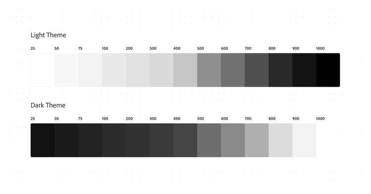
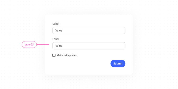
In Spectrum, gray-25 is the default background color, which makes the UI bright and higher contrast.
A single dark theme
Spectrum utilizes a simplified color theming system with a single dark mode. Spectrum’s dark theme is utilized for both the dark color theme (in light device mode) and for dark device mode.

Accessibility and contrast
Adobe aims to be AA compliant for WCAG guidelines. The latest 2.2 guidelines require that text is at least 4.5:1 in contrast for small text. Spectrum never deviates from this.
The World Wide Web Consortium (W3C) also requires active, non-text components to have a minimum of 3:1 in contrast against adjacent colors. Some elements are exempt from this (like disabled items, decorative items, user-set items, or logotypes). This relates to both UI components such as text fields and buttons, and to graphical objects like icons or illustrations.
There are no current WCAG or W3C guidelines about if every fill and stroke in every component of every state needs to be 3:1 in contrast. Another thing to consider is that it’s irresponsible to approach the topic of contrast with a “one-size-fits-all” approach: every user has different needs, and design should account for user preference and customization. While one user may need interfaces to be higher contrast to be able to more clearly read and interact with the content, others may prefer interfaces to be lower in contrast (for example, people who are prone to getting migraines).
Because of this, Spectrum designs all active states of UI components to be at least 3:1 in contrast in some way with the background (such as a text field’s active state border). And, all objects within components, such as icons, drag handles, and text, are also compliant with the 3:1 or 4.5:1 requirement. Other graphical objects also always use at least 3:1 contrast and are accompanied by textual descriptions. Products using Spectrum should be built in such a way that the interface contrast, coloring, sizing, motion, and more can all be adjustable by the user to fit their own specific needs.
View the Inclusive design page for more information about accessibility and inclusivity in the design system.