Object styles
Rounding
In general, Spectrum 2’s system for rounding is more pronounced and flexible than in Spectrum 1.
Larger rounding values give components more expression and personality, and having more rounding options makes it possible to create visual balance across a wide range of contexts.
Rounding builds on the three styles already available in Spectrum — default, small, and full — with the addition of larger 10 px and 16 px corners, which are only used for containers.
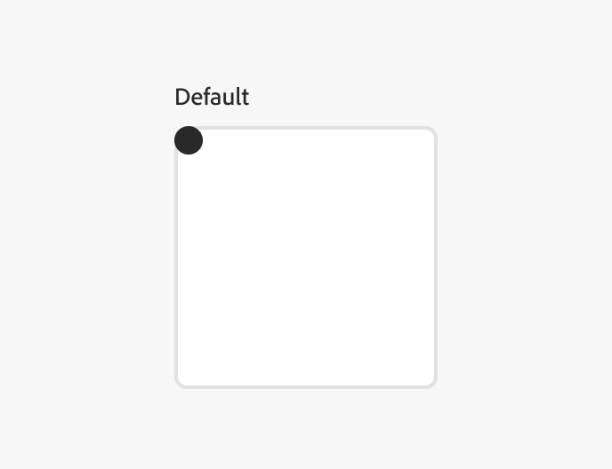
Default
8 px
Most components, extra-small and small cards
Small
4 px
Small controls such as checkbox, in-field button
Full
Full rounding is generally used for emphasis, draws attention, and is used sparingly.
Button, avatar
Rounding for component sizes
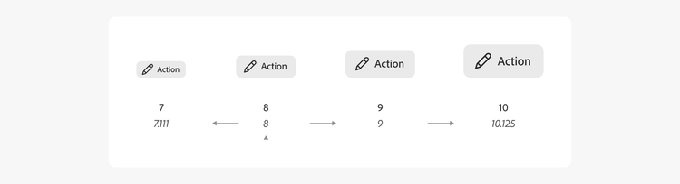
In Spectrum 2, rounding for different sized components varies based on a Major Second logarithmic scale. This allows for components to retain a consistent and identifiable shape at all sizes. Desktop and mobile scales share the same base rounding. Note that the values displayed are base values for desktop scale components, and specific corner radius values may vary between components.