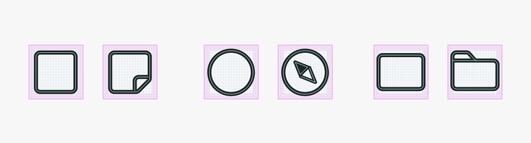
Icon fundamentals
Icons designed to balance personality with function
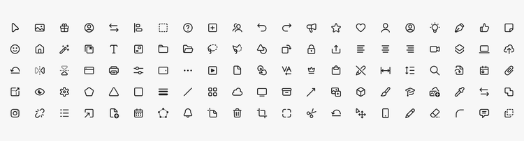
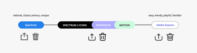
Spectrum 2 icons are crisp, modern, and clean. They have more personality in the form of rounder corners and motion, and use more playful but modern metaphors when there's the need to have more brand expression (for example, in feature onboarding, marketing, and Learn content). The updated icon style picks up the clean and irreducible style of Spectrum and supports the efforts to bring a unified experience to all Adobe products.
What's been updated?
Most noticeably, there's been a switch to an outline style from the previous style of icons as being filled. There's also an updated priority for using meaningful metaphors consistently, focusing on content, and helping users navigate across interfaces. This combines into a cohesive theme: icons signal familiarity. In a product portfolio as complex as Adobe's, this familiarity is expressed through a consistent and cohesive usage of UI elements, colors, patterns, and icon metaphors.
The purpose of the updated icon style isn't just about functionality or the Adobe brand: it's about how many intricate details add up to make a big difference in the user experience. Using icon metaphors consistently makes Adobe's products usable.
History
How the Spectrum 2 icon set was developed
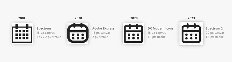
Several teams collaborated on the overall Spectrum 2 design language updates. One goal for iconography was to build out the current style into a unified icon language, to more closely align with our multi-platform design approach and to look and feel cohesive with the iOS and Android iconography systems. Previous testing and the launch of the outline icon style for Acrobat Modern Viewer and Adobe Express provided insights that informed style refinements.
Why is this icon set intentionally different?
This updated icon style aims to connect with a wider audience and a younger user base by pairing a more modern look with a simplified but functional approach. Being mostly monochrome allows for colored accents in badges.
Additional considerations
The Spectrum 2 icon style aligns with contemporary UI and icon trends and is optimized for where the icons are viewed: displays across desktop and mobile. With a bigger focus on high-res screens, we've prioritized spacing and contrast for a more expressive range — leaving behind the problem of pixel-perfect snapping.
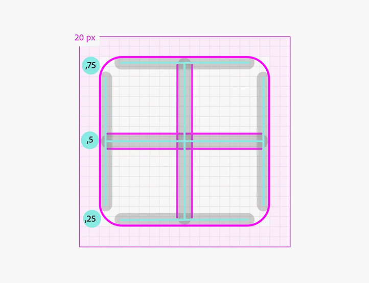
We're also aligning the stroke weight into 4 subdivisions inside the pixel unit to create balanced stroke rendering with a 1.5 px stroke weight. This weight has been proven to work well with mobile retina screens, and it allows for a stronger appearance of the line renderings of icon shapes.
Appearance
Icons are outlined. They're mostly monochrome to allow for colored accents in badges for status updates like alerts, information, and notifications. Some icons also use fill and a stroke to illustrate a concept more clearly (for example, the favorite star rating, or third-party logos).
Occasionally, there are duotone icons to indicate a perceived change of direction, exclusion, transition, or speed (like in flip horizontal/vertical).
Style
Characteristics
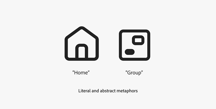
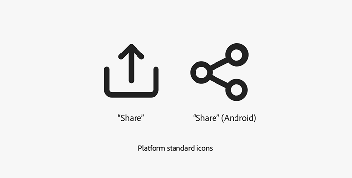
Adobe products often have complex controls, so our icon metaphors are clear, functional, and additive to experiences. They describe tools and topics as simply and accurately as possible. Icons that attempt to relay too much information often become busy and don't read well at small sizes.
The shapes of the icons themselves are based on predefined key shapes to ensure a balanced look and feel across interfaces.