Component spacing
How it works
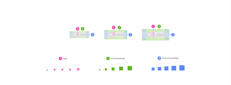
Internal component spacing governs the space within components. It follows its own geometric scales, each designed to reconcile the type scale and component sizes as needed. This is why some values are less round than you might expect. They are calculated to produce balanced proportional relationships for their specific context at every size.
Applying component spacing
Spectrum organizes components into common structural types called structural templates. Each template type has a corresponding set of semantic tokens that handle its internal spacing relationships.
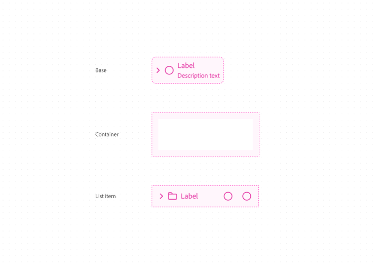
When designing a component, start by identifying which structural type it most closely matches. That identification points you to the right token category. A component that behaves like a list uses list-level tokens. One that behaves like a container uses container-level tokens. One built around a single interactive element uses base-level tokens.
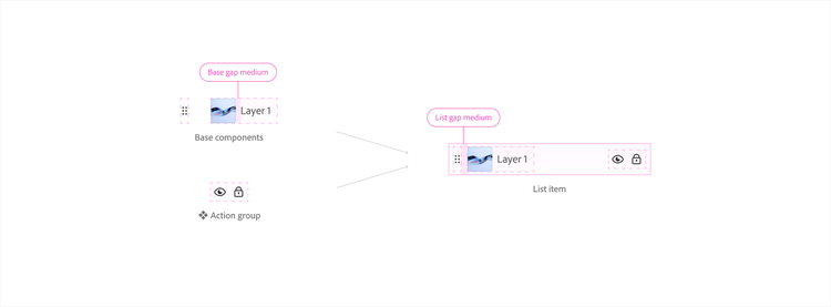
Components can also combine multiple structures. A list item, for example, is made up of base and group elements. Each structural type within the composition uses its own tokens.
Structural templates
Spectrum's spacing values are accessed through semantic tokens, which encode the purpose and context of each spacing decision directly into the system. Repeated patterns for how to use these tokens are implemented through structural templates. These are blueprints or recipes for how to design or build a component in a modular, flexible, and scalable way.
Working with tokens makes this seamless. A hardcoded 8px is just a number. The token base-gap-large gives you both a number and its context, relationships, size variants, and future system updates. Designers who skip tokens get the spacing that exists today, but they lose future enhancements to the system.
Component density
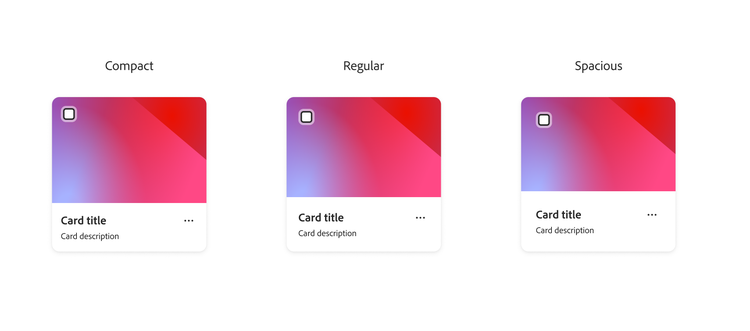
Component density controls the internal spacing of a component, independent of its size tier. To make a component more compact, decrease each spacing token by one step. To make it more spacious, increase by one step. For example, if the regular variant uses spacing-200, compact uses spacing-100 and spacious uses spacing-300.
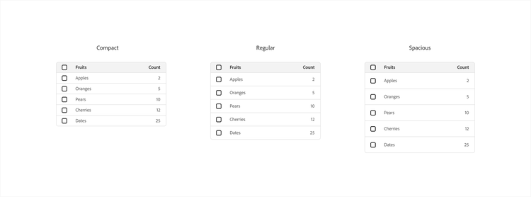
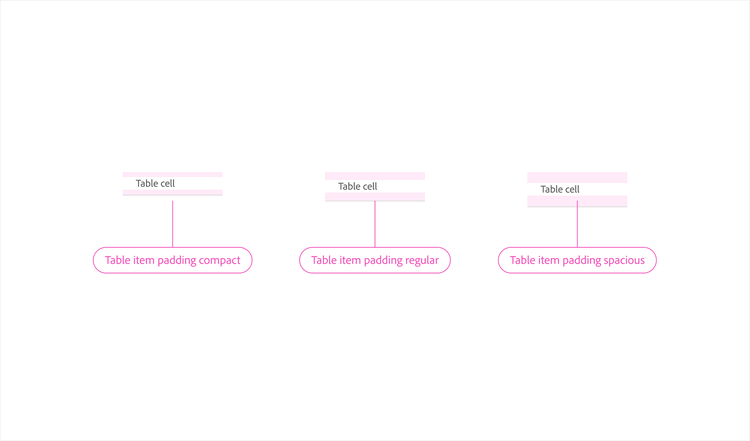
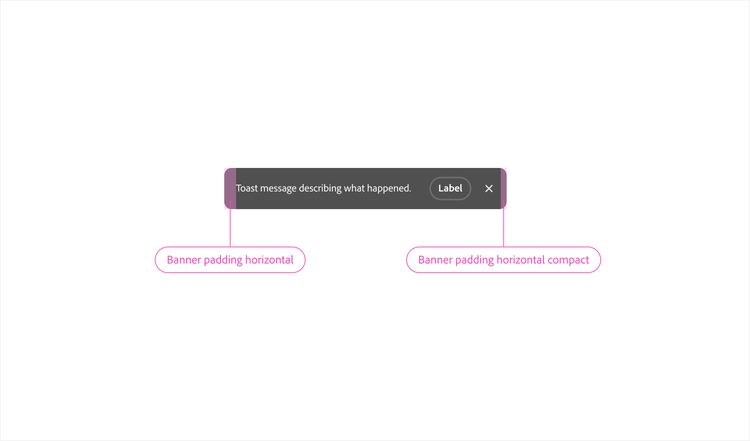
Not all components support density as a configurable option. Only collections and containers do.
Collections are components made of repeated child elements, such as lists, groups, and tables. Containers hold compositions of other components, such as cards and toolbars. Basic components such as buttons and text fields don't support density variants
Collections
For most collections, density affects only the gap between items. An action group, for example, adjusts the gap between its buttons; a list adjusts the gap between its items.
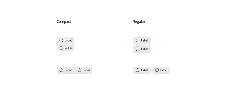
Containers
Density affects all padding, both vertical and horizontal. Containers such as cards may appear in full grids or unidirectional lists, so both axes need to respond to density changes.
Tokens
Spectrum's internal component spacing is defined by a comprehensive set of semantic tokens. Each of these tokens corresponds to a specific structural context. These tokens are built into every Spectrum component, and available to designers in the S2 / Variables Figma library. A full token reference will be available on this site in the future.