Layout spacing
How it works
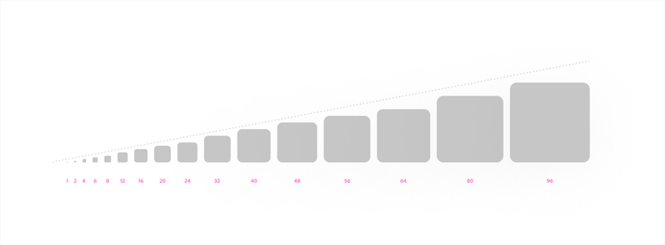
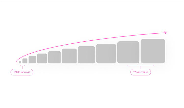
Layout spacing governs object relationships, such as the spacing between components, patterns, and regions of a UI. It’s implemented through global tokens, which follow a geometric progression with values that round to familiar numbers: 2, 4, 8, 16. If you're used to an 8 px grid, these will feel recognizable. The scale provides consistent perceptual difference between adjacent values across its full range.
Applying layout spacing
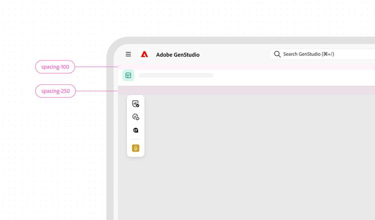
Global tokens govern object relationships in a layout. They create and distinguish the relationships between the components that make up a product UI. Smaller values create tighter relationships. Larger values create more visual independence. The choice should reflect the actual relationship between the objects being spaced.
Why not a fixed grid?
A common approach to spacing is to pick a base unit and build all spacing values from its multiples, such as 8, 16, 24, 32. These values are familiar and easy to remember, which is part of their appeal. This approach is called a linear progression.
Linear progressions like this work well in many situations, but have two limitations. First, spacing needs to grow with the elements around it. A 4 px gap between an icon and label looks right in a small component, but as the component scales up, the nearest grid values (4 px or 8 px) no longer fit the relationship correctly. Second, linear scales lose differentiation at larger values. The difference between 4 px and 8 px is obvious. The difference between 72 px and 80 px is almost imperceptible.
Tokens
Use global tokens for layout spacing.