Border width
Spectrum provides a range of border width options that create clear separation between interface elements, groups of content, and adjacent surfaces. Consistent use of borders reinforces visual hierarchy and helps organize content across layouts.

Principles


Borders when necessary only
Borders are an essential way to create separation, but they can also add visual noise to an interface by filling and disrupting negative space. As a result, they should be used sparingly, only when necessary. For example, a divider might sometimes be needed to separate two distinct action button groups. Or, an object might have a border to demarcate distinct areas, such as separating a panel or card from the rest of the content on a page. Whenever possible, achieve separation through other techniques, like negative space and section titles, instead of using borders.
Consistent border widths
Border width is a functional design choice, not a decorative one. Use a single border width throughout the interface, and only introduce variations to the thickness to communicate meaningful change, such as focus or selection. Avoid varying border widths solely to create visual interest or hierarchy.
Border width system
Borders are primarily used to define component boundaries and organize content within layouts. Different border width styles communicate different levels of emphasis and separation.
Spectrum supports two border widths that are used within in-product UI contexts.
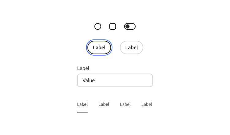
Medium
Medium borders (2 px) are the default size for most contexts. Components with border options use the default medium size, as well as focus rings which appear on keyboard focus.
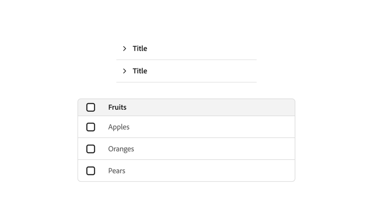
Small
Small borders (1 px) are used in specific components and patterns where there’s greater density (for example, in accordions and tables).
Applying border widths
Border treatments vary depending on their context. The following examples show how to apply borders across common interface patterns to create clear separation while maintaining a consistent appearance.
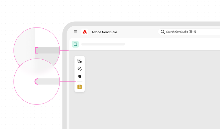
Context-dependent end caps
The rounding of divider end caps changes depending on how the divider is used. When a divider extends to both edges of a container, it uses square ends so it meets each edge cleanly. When a divider has visible gaps at both ends, it uses fully rounded end caps.

Grouping related actions
Use a divider to separate groups of related actions in a header. This helps distinguish global actions from actions that apply only to the current view.
Tokens
Platform availability
These tokens are currently available on web. Guidance for additional platforms will be added in a future release.
border-width-100border-width-200border-width-400