Rounding
Spectrum provides a flexible rounding system with a range of corner radius options that create visually balanced interfaces across different component sizes and layouts. By applying rounded forms consistently, Spectrum creates a cohesive visual style that feels approachable while adapting to a wide range of use cases.

Principles

No sharp corners
Spectrum generally uses rounded corners throughout the interface. Exceptions to this rule are rare and reserved for specialized cases when precision is especially important and helps communicate meaning or improve the accuracy of a visual representation. For example, the fill of a slider or progress bar may use a sharp edge to indicate a specific value or position more precisely.
Visually balanced corners
When rounded surfaces are nested inside one another, their corner radii should adjust in proportion to the space between them. This helps maintain visually consistent gaps and creates the appearance of concentric curves.
Learn more about creating balanced nested corners below.
Rounding system
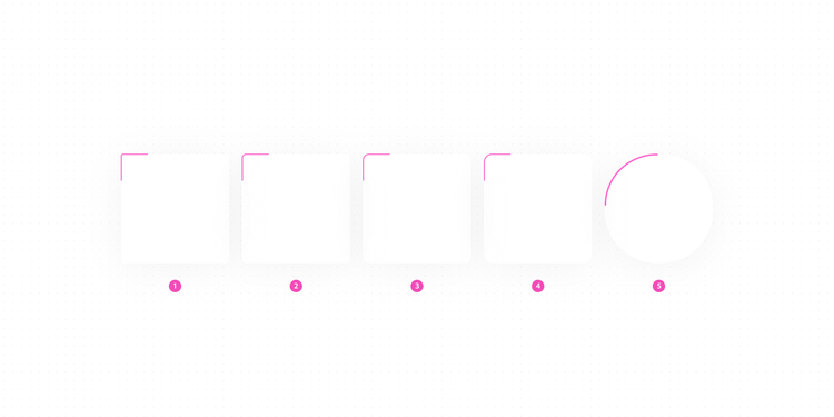
- Small
Small controls such as checkbox, in-field button - Medium (default)
Most components, extra-small and small cards - Large
Medium and large cards, panels, action boxes, select boxes, toolbars - Extra-large
Dialogs - Full
Button, avatar, floating action button, search
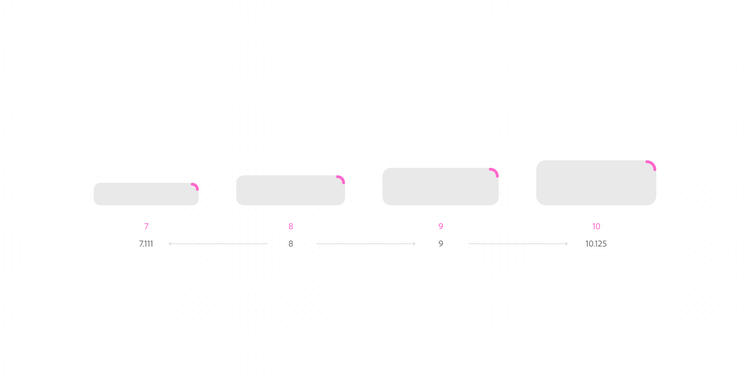
Rounding for component sizes
Corner radius values scale using a Major Second logarithmic scale, the same scale used throughout Spectrum's type system. This allows corner rounding to scale proportionally with component sizes and labels, helping components maintain a consistent visual shape across the interface. The values shown are base values, and the applied corner radius may vary by component.
Balancing nested corners
Spectrum uses different approaches to create visually balanced nested corners, depending on the relationship between the surrounding surfaces. Some scenarios follow a mathematical relationship, while others prioritize optical balance to achieve the intended visual result.
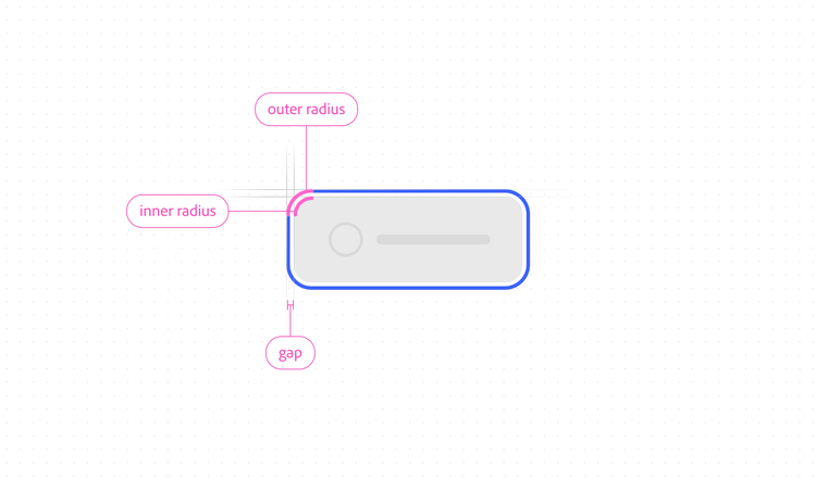
Focus rings
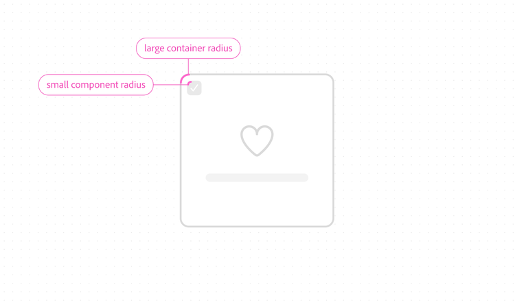
Focus rings use an outer stroke separated from the component by a consistent gap. To maintain visually balanced spacing around every corner radius, Spectrum calculates the focus ring radius using the following formula:
<outer radius> - <gap> = <inner radius>
Nested components
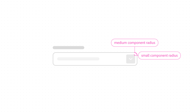
Spectrum components are designed so that smaller objects use smaller corner radii and larger objects use larger corner radii. When components are nested, this creates optically balanced corners and spacing while maintaining consistent relationships throughout the design system.
Applying rounding
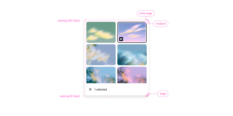
When designing custom containers and surfaces, nested corners that always match the formula precisely can often create complexity and fragmentation. Instead, aim for overall visual harmony instead of numerical precision by nesting smaller corners within larger ones and creating gaps using Spectrum’s Spacing system.
Example
This example shows how nested corner radii can vary depending on spacing. The thumbnails use a larger gap, so the corner radii are adjusted for optical balance rather than following the formula exactly. The action bar uses a smaller gap, allowing the formula to produce a visually balanced result.
Platform considerations
Spectrum iOS
Corner smoothing
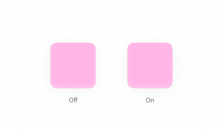
Use Apple’s continuous corner style for rounded shapes, such as rounded rectangles and capsules. Continuous corners create a smooth transition between curved and straight edges and align with the corner treatment used throughout iOS system interfaces.
Learn more in Apple’s Developer Documentation: RoundedCornerStyle
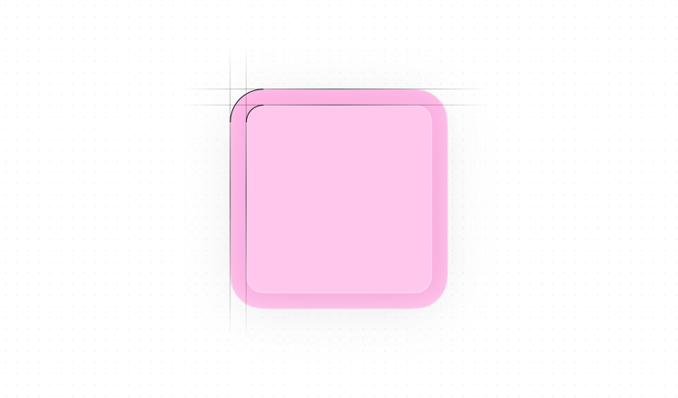
Concentric corners
Use Apple’s concentric rectangle APIs when working with nested shapes. Concentric corners automatically adapt to their container’s shape and spacing, helping maintain consistent curvature and visual alignment across layered interface elements.
Learn more in Apple’s Developer Documentation: ConcentricRectangle.
Tokens
Platform availability
These tokens are currently available on web. Guidance for additional platforms will be added in a future release.
corner-radius-small-defaultcorner-radius-medium-defaultcorner-radius-large-defaultcorner-radius-extra-large-default