Brand
Brand assets
There are a number of key assets that are used systematically across interfaces.
Product logos, app icons, and lockups
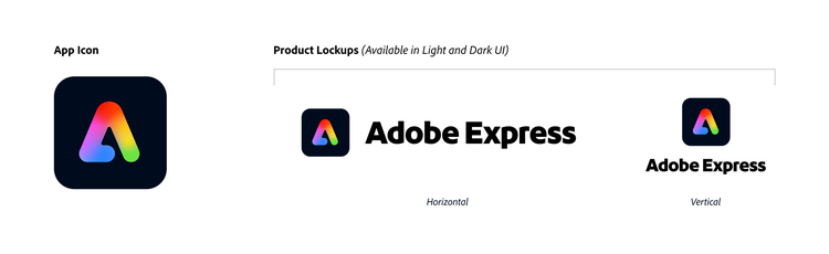
A product logo or tile color does not change, even if the background is dark. One-color product logos are for usage as workflow icons. You can find app icons within the App Icons library.
Loading screens
Loading screens include desktop splash screens, mobile loading screens, and web loaders.
Desktop splash screens celebrate artwork from the Adobe community and are updated at least once a year. All desktop products that have a loading time of longer than 2 seconds, or don’t open instantaneously, are required to have a splash screen. This is so a user can understand that there’s a loading process happening.
Follow OS-specific conventions for mobile loading screens. View more information about using Android loading screens.
File type and folder illustrations
On desktop, product folder icons are branded to help users find any product-related settings. For web and mobile, folders use Spectrum colors to fit better in the experience.
Primary file types always utilize brand colors, since they’re often file formats proprietary to the product (for example, PSD to Photoshop, or AEP to AE). Secondary filetypes are shared across many products, so they take a neutral palette using Spectrum 1 colors.
The Brand team creates desktop versions of these icons in ICNS (for Mac) and ICO (for Windows) files, while web versions are delivered most often as SVGs. Desktop folders and file types can be found on the Brand wiki under individual product delivery pages. View web folders and file types.
Color
Color has historically been an extremely important part of Adobe’s brand. Bringing more color into Spectrum 2 lets product experiences draw a much closer connection to marketing materials and product branding.
Spectrum’s 6.0.0 color system didn’t throughly incorporate the Adobe brand colors, even though in-product UI colors are so close to them in both hue and saturation. With the colors for Spectrum 2, we’ve made some shifts to ensure that brand colors are better represented throughout product experiences.
Creative Cloud
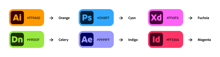
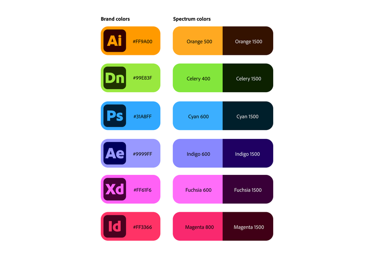
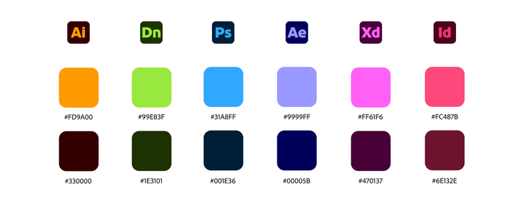
Creative Cloud uses Adobe red and six product-specific colors, each with corresponding light and dark values.
Document Cloud
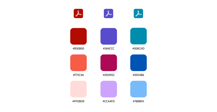
Document Cloud’s colors align to Spectrum. There’s three primary product colors plus Adobe red, as well as six secondary colors.
Experience Cloud
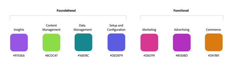
Experience Cloud’s colors align to Spectrum. The foundational apps use cool colors, while the functional apps use warm colors.
Adobe Express
Adobe Express uses three colors. Indigo is used for a fill accent color and for highlighting main metaphors. Spectrum gray is the main stroke color.

Gradients
Gradients are a significant characteristic of Spectrum 2 and a very noticeable part of how the Adobe brand is expressed in UI contexts. They help communicate product differentiation across our brand portfolio, and also allow for individual products to have a wider range of expression. Both of these aspects heavily contribute to the bolder, more colorful visual language of Spectrum 2.
Because gradients are very expressive, they’re always placed intentionally and with a strategic meaning. They should not distract from the main content in an experience. They’re only used in specific areas in order to create a system, feature the product brand, and support visual hierarchy. And, their colors are directly tied to product brand color palettes.
Premium and Generative AI gradients
<iframe style="border: 1px solid rgba(0, 0, 0, 0.1);" width="800" height="450" src="https://embed.figma.com/proto/mCajRBbchBKtSYVzRctsNC/Premium-and-Generative-AI-Gradient-Buttons?kind=proto&node-id=6509-20142&page-id=4733%3A12555&scaling=contain" allowfullscreen></iframe>
Usage guidelines
Request assets from the Brand team
Brand considerations are highly strategic, and coherence is a priority. Don’t make your own illustrations, colors, gradients, logos, or other assets. The Brand team will work with you to create assets that align to your product’s strategy and timing.
Any new Spectrum 2 assets must be requested directly from the Brand team. It’s very important that you do not create your own.
To view existing S2 Illustrations, visit the S2 / Illustrations library in Figma. If you need a new illustration, make a request using Workfront.