Buttons
Overview of purpose
Buttons enable actions or navigation between views. They come in multiple styles to support different levels of emphasis, and are commonly used to trigger actions or to guide progression through a flow.
Cross-platform differences
Android
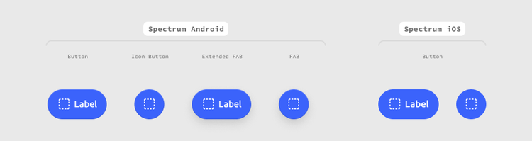
There are four button types: button, icon button, floating action button (FAB), and extended FAB.
- The button component is used for actions that include a text label and an optional icon. It can be placed anywhere within a layout
- The icon button component is used for actions that only require an icon. It can be placed anywhere within a layout.
- The floating action button (FAB) component is reserved for the most important action in a view. This is typically a simple action like selecting a file or activating the camera. It is most commonly placed at the bottom right corner of the screen and is elevated above all other content, persisting on scrolling views.
- The extended FAB adds a text label next to the icon, which can give clarity for actions with less obvious icons. Like the FAB, the extended FAB is typically a simple action and is most commonly placed at the bottom right corner of the screen.
In addition to casting a shadow, the button component includes a gradient stroke. Together, they give the button a sense of dimensionality, as if it is being lit from above and sitting naturally on top of the content beneath it.
iOS
- Both the button and icon button types are handled with a single component. iOS does not have an equivalent to the Android floating action button (FAB).
- iOS buttons do not include dimensionality, but are planned to add it in a future release.
Anatomy

Buttons are made up of two to three parts: a container, text, and up to one icon.
Width
Buttons with text labels can have their widths set to hug their label contents or to fill their parent container. Do not apply custom widths to icon buttons, FABs, or extended FABs. When using fill, avoid extremely wide button widths, especially when screens scale to larger devices.
Shape

Icon buttons can have a circle (1:1 aspect ratio) or capsule (1:1.125 aspect ratio) shape. Capsule shapes help drive attention to a feature, and should be used thoughtfully to add visual emphasis to an icon button, especially when placed within a set.
Android component options
Small Medium LargeQuiet Secondary Primary Accent PremiumEnabled

Size

Choose between three sizes: small, medium, and large. When selecting a size for a button, consider its layout context. Small buttons work best in denser UI layouts with multiple actions, while large buttons are best suited for more spacious layouts with fewer actions. Regardless of a button’s visual size, a minimum accessible tap target of 48 dp × 48 dp should be maintained.
When using buttons or icon buttons, default to the medium size. When using FABs or extended FABs, default to using the large size.
Style
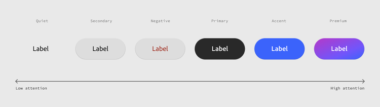
Choose between six style variants of button. From low attention to high attention, they are: quiet, secondary, negative, primary, accent, and premium. Each variant represents different levels of emphasis and function, helping designers establish clear visual hierarchy and guide users toward appropriate actions.
On Android, secondary, quiet, and negative styles are not available for the FAB or extended FAB components.
Premium buttons
The Premium button leverages a gradient as a way to draw user attention, create strong visual hierarchy, and bring delight into the system. Gradient buttons communicate strong emphasis and should be used for Premium use cases only.
Accent buttons
The accent button communicates strong emphasis and is reserved for actions that are essential to an experience. Use accent buttons sparingly in a single view, as these give extra prominence to important actions and are meant to establish a clear hierarchy.
Primary buttons
The primary button is for medium emphasis. Use it when the action requires less prominence, or if there are multiple primary actions of the same importance in the same view.
Secondary buttons
The secondary button is for low emphasis. It’s often paired with high emphasis button types to surface less prominent actions. This style variant is not available for FABs or extended FABs.
Quiet buttons
The quiet button is used for the lowest emphasis actions. It has no visible background until it is interacted with, and works best when a clear layout makes it easy to parse. This style variant is not available for FABs or extended FABs.
Negative buttons
The negative button is used for actions that can be destructive or have negative consequences if taken. Use it sparingly. This style variant is not available for icon buttons, FABs, or extended FABs.
Show icon
Use an icon only when necessary and when it has a strong association with the label text.
Text
Buttons should always have a label. They can have an optional icon, but it should not be used for decoration. unless they are only using an icon that is universally understood and accessible. They can have an optional icon, but it should not be used for decoration.
Icon
An optional leading icon can be used in buttons when additional clarity is required. The icon should be highly relevant to the action and never used just for decoration. In RTL layouts, the leading icon is on the right side of the text.
iOS component options
Size
Choose between three sizes: small, medium, and large. When selecting a size for a button, consider its layout context. Small buttons work best in denser UI layouts with multiple actions, while large buttons are best suited for more spacious layouts with fewer actions.
Accessibility guidance: Regardless of a button’s visual size, a minimum accessible tap target of 44 pt × 44 pt should be maintained.
Style
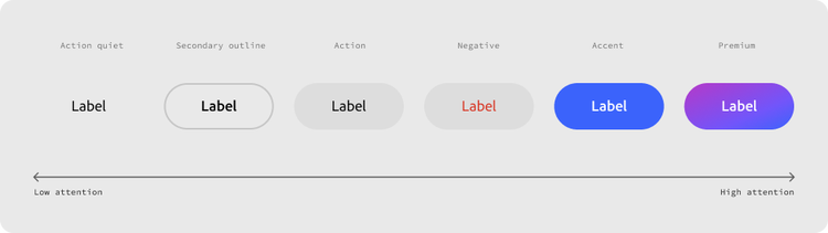
Choose between six style variants of the button. From low attention to high attention, they are: action quiet, secondary outline, action, negative, accent, and premium. Each variant represents different levels of emphasis and function, helping designers establish clear visual hierarchy and guide users toward appropriate actions.
Premium buttons
The Premium button leverages a gradient as a way to draw user attention, create strong visual hierarchy, and bring delight into the system. Gradient buttons communicate strong emphasis and should be used for Premium use cases only.
Accent buttons
The accent button communicates strong emphasis and is reserved for actions that are essential to an experience.
Design guidance: Use accent buttons sparingly in a single view, as these give extra prominence to important actions and are meant to establish a clear hierarchy.
Action buttons
The action button is for medium emphasis. Use it when the action requires less prominence, or if there are multiple primary actions of the same importance in the same view.
Secondary outline buttons
The secondary outline button is for low emphasis. It’s often paired with high emphasis button types to surface less prominent actions. This style variant is not available for FABs or extended FABs.
Action quiet buttons
The action quiet button is used for the lowest emphasis actions. It has no visible background until it is interacted with, and works best when a clear layout makes it easy to parse. This style variant is not available for FABs or extended FABs.
Negative buttons
The negative button is used for actions that can be destructive or have negative consequences if taken. Use it sparingly. This style variant is not available for icon buttons, FABs, or extended FABs.
State

Choose between three state variants of the button: default, hover/pressed, and disabled.
Show text
The text can be hidden to create an icon-only action button. If the text is hidden, an icon is required.
Text
Action buttons should always have a label, unless they are only using an icon that is universally understood and accessible. They can have an optional icon, but it should not be used for decoration.
Show icon
Use an icon only when necessary and when it has a strong association with the label text.
Icon
An optional leading icon can be used in buttons when additional clarity is required. The icon should be highly relevant to the action and never used just for decoration. In RTL layouts, the leading icon is on the right side of the text.
States
Every button contains two states in Figma: enabled and disabled.
- Enabled: resting state, no interaction happening.
- Disabled: button is present but not interactive. Disabled buttons stay in the layout. Don't remove them entirely just because they're inactive, as this will cause layout shift and remove context about what would be available. The exception is if the action does not apply in a given context (not just “temporarily unavailable”), in which case removing it is acceptable.
Behaviors
Text overflow
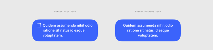
Labels that exceed the button’s available width wrap to as many additional lines as needed. If the button has an icon, the lines of text will be left aligned. Otherwise, the lines of text are centered in the button.
Presets
In addition to providing flexible button types, Spectrum also includes some preset buttons with all of the necessary configurations applied across design and code.
Icon buttons
The following are available in all sizes, in quiet and secondary styles:
- Add (iOS only)
- AI assistant (iOS only)
- Cancel
- Close
- Done
- Help
- Info
- More
Usage guidelines
Content and labeling
Do use clear, action-oriented labels that tell users exactly what will happen when tapped.
Labels should start with a verb and describe the specific outcome, not just restate the trigger.
- Use verb-first, specific labels like “Save changes” or “Delete account” instead of vague ones like “OK” or “Submit.”
- Keep labels short enough to avoid wrapping at standard button widths, ideally one to three words.
- Don't use punctuation in labels unless it’s functionally necessary, like “Continue…” to indicate a follow-up step.
- Match the label’s tone to the action’s weight. A destructive action shouldn’t be softened with casual phrasing, and a low-stakes action shouldn’t sound overly formal.
- Don’t repeat the screen’s title or heading in the button label. If the heading already says “Delete photo,” the button can just say “Delete.”
Button placement
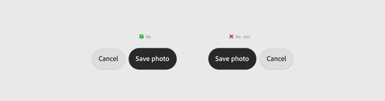
Do keep button order and placement consistent with platform conventions.
- Place the primary or confirming action on the trailing side (right side on LTR layouts), with cancel or dismiss to the leading side.
Grouping buttons
Do maintain clear hierarchy when grouping buttons
Whether stacked vertically or horizontally, button groupings should create clear action hierarchy.
- Don’t group more than two button styles.

- On Android, premium, accent, and primary buttons can be paired with seconday or quiet buttons. On iOS, premium, accent, and action buttons can be paired with secondary outline and quiet buttons.
Premium, accent, primary (Android), and Action (iOS) buttons can be paired with secondary or quiet buttons.
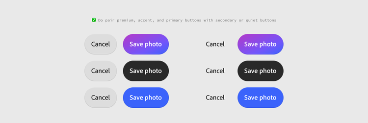
- Don’t pair Premium, and accent buttons with each other.

- Secondary buttons can be paired with quiet buttons.

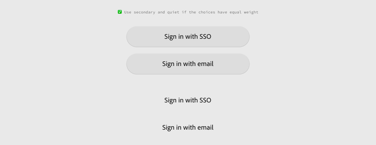
- In cases where button pairings need to have equal hierarchy (such as multiple sign in options), use secondary or quiet button styles only.
Do use attention hierarchy to guide button selections within a layout
Button sizes and styles communicate levels of importance. Avoid using too many high attention buttons within a single layout
Destructive actions
Do reserve the negative style for irreversible actions

The negative style should only be used for irreversible actions like deleting an account or permanently removing data.
Don't pair a destructive button with a primary button
Do not pair destructive actions with Premium, Accent, or Primary buttons within the same group without a clear visual distinction between them. If both styles are competing for attention, users can lose track of which one is actually the safe choice.
Icon usage within buttons
Use an icon only when necessary and when it has a strong association with the label text. Never use an icon solely for decorative purposes.
Haptics & motion
Buttons support optional haptic feedback. Use haptics sparingly and thoughtfully, as they can lose meaning when applied too frequently.
On Android, buttons have a ripple effect on press. On iOS, Buttons scale down on press and scale back up on release. If a user’s device has reduced animations turned on, the end state of the animation is presented, but the animation itself is disabled.
Internationalization
RTL
For RTL (right-to-left) languages, the layout of the action button is mirrored. The icon is placed on the right side of the text and the close and action buttons are placed on the left side of the icon.
FABs
For RTL languages, the FAB should be placed at the bottom left corner of the screen.
Accessibility
Most accessibility behaviors are built in to the component to meet user preferences; including font scaling settings, bold text, reduced animations, TalkBack / VoiceOver compatibility, color contrast, and support for non-touch navigation modes.
Additionally, teams will need to:
- Accessibility labels
- Provide an accessibility label for icon-only button types that describes the action that the button performs.
- Note: Accessibility labels are not needed for buttons that also contain text.
- Tap target size
- Maintain a minimum tap target area of 48 dp × 48 dp on Android or 44pt × 44pt on iOS when laying out buttons, even if their visual size is smaller.
- Consistent identification
- Buttons that do the same thing should be identified consistently across the application.