Writing for errors

What is an error?
An error occurs when users expect one thing to happen, but either something else — or nothing — happens. Errors can cause frustration, confusion, a loss of data, or more labor for users. These moments make it harder for people to get things done.
At Adobe, the audiences for error messages span a wide variety of people. The language we use can vary depending on the audience and the context. But ultimately, these kinds of messages need to be in service of the end user, regardless of their skill sets or technical familiarity.
These messages often bring frustrating news, and can be highly visible and memorable, so they need to be relevant, useful, and clear. We show users error messages to let them know what happened, what the cause of the error was, and what (if anything) they can do to resolve it.
Error message design foundations
For error scenarios, content and design are inseparable. It’s crucial to know what you need to say (the message), and how you’re going to say it (the design).
Avoid showing a message whenever possible
The best error message is no error happening at all. The message — and the error itself — are disruptive to a user’s experience and can stand in the way of them accomplishing their task. Make sure that the system can anticipate and address errors on the back end before showing an error message on the front end.
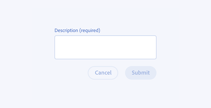
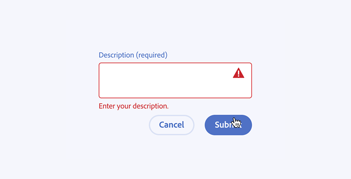
Find ways to avoid the error altogether, like by using in-line validation, visual cues, and disabled states to guide users. Ensure your design is as inclusive as possible by anticipating and accommodating multiple spellings of words in search queries and results.
Have the system automatically resolve errors
Error messaging should be a last resort. Try whenever possible to design experiences in a way that the UI doesn’t rely on showing error messages or prompting direct user action to resolve an error.
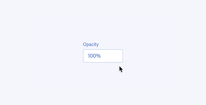
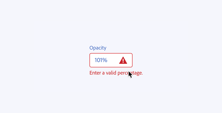
For example, if a user were to input “101” when a field can only accept numbers up to 100 (such as showing percentages), automatically revert the entered value to 100.
Choose the message first, then the component
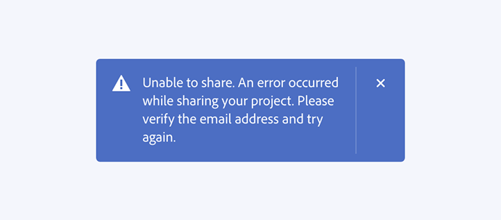
Error messages appear in the wrong UI components all too often. A complex message is usually too long and too complicated for a toast, and a short and straightforward message is far too much for an alert dialog. Errors that are lower in signal or consequence shouldn’t warrant a dialog that blocks the entire experience, and errors that are high priority shouldn’t appear in a toast with a timeout of only a few seconds.
Write out what the message should say, free of any UI constraints, to understand how you should say it. Then, determine the right component for the message. Learn which component to use, when.
Anatomy of an error message
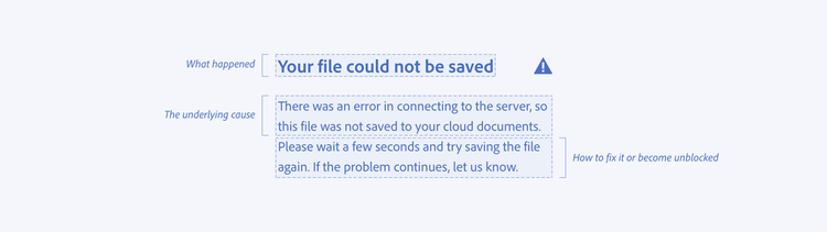
Regardless of the design component or message length, the most comprehensive error messages include three distinct communication parts:
- What happened
- The underlying cause (if possible)
- How to fix it
Not every error message you'll write will follow this framework, but many will. Depending on your audience or the situation, it may not be necessary or relevant to communicate the underlying cause.
What happened
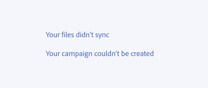
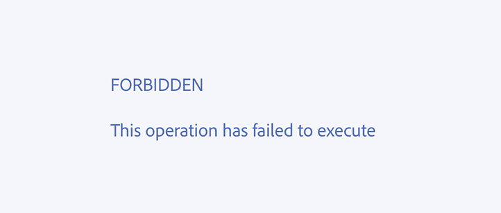
This should be the first part of the message, like in a headline (if the UI element allows). Be sure to communicate the general outcome of the error. Use plain language and focus on what it means to the user.
The underlying cause
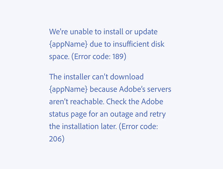
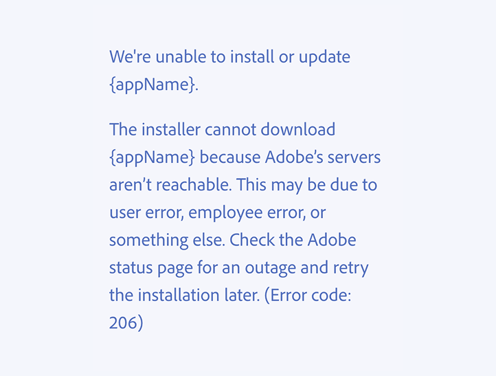
It’s helpful to have an explanation of why something happened, if there’s space to include it. Explaining the cause is optional depending on the context; sometimes this can increase a user’s understanding, but sometimes it gets in the way of useful, usable information.
How to fix it
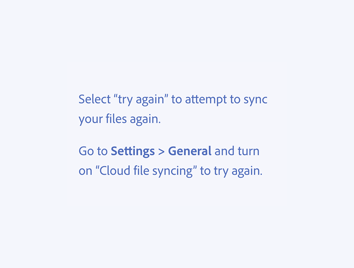
This part tells the user what they can do about it. If there’s nothing for them to do, then explain what the product is doing. This should be as simple and actionable as possible. Offer a path forward within the error state itself, such as a “Try again” or “Go back” button, or a step-by-step resolution in the error message text.
Linking to a help article can be useful, but only if that article is specific and descriptive to the error’s use case. Try to avoid generic, catch-all resolutions like “Contact your IT administrator for details.”

Be empathetic to users, not the system
Error messaging, like all in-product content, prioritizes the humans that use interfaces over system technicalities.
Center the language around user goals, not system constraints
Sometimes it seems like the best way to resolve an error is to explain the constraints of the system to the user. But, most users don’t care about the constraints of the system — they care about accomplishing their goals.
Center the language around what the user is trying to accomplish, why that didn’t happen, and how they might resolve the error.
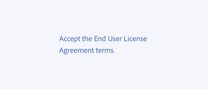

Use plain language, and avoid jargon
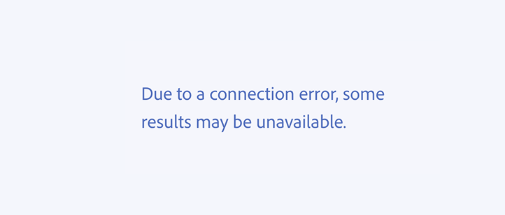
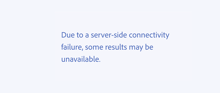
Users may not understand server architecture or client-side queries. Know your audience, and write your error messages in plain, usable language so that your user will understand what went wrong and how it’s being resolved.
Technical terms are different than jargon. If you’re confident that your audience would be readily familiar with technical terms, and if such terms are relevant to the message, you can include them.
Don’t blame the user, even if the error is their fault
Some errors are outside of a user’s control, but they can happen because of a direct user action. While you want to tell a user what happened, don’t sound accusatory or that you’re blaming them — we want them to feel supported and taken care of in any experience.
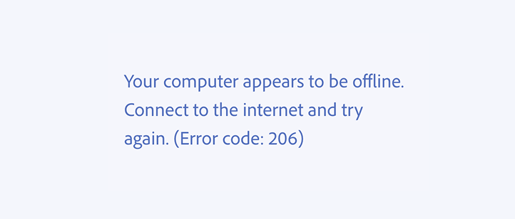
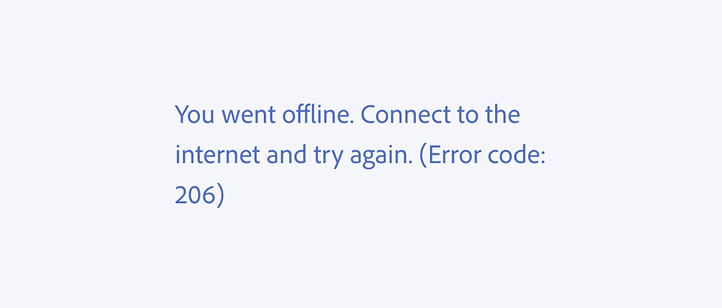
Include error codes only if useful and relevant
Again, think about your audience. Include an error code or other technical information if your users would benefit from having it in order to resolve the error.
Put error codes at the end of the message so that readers aren’t potentially overwhelmed with information they may not understand at the start.
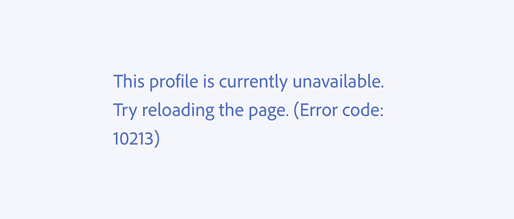
Be as useful as possible
Error messages are opportunities to help users confidently move forward. When writing them, think about the most straightforward path to a solution, then clearly describe it.
Use positive framing to keep the focus on what users can do
While a user will want to know what went wrong, be as clear as possible about what they can do to fix the error, or provide them with an alternative workaround. Sometimes it’s simple (“try again in a few minutes”) and sometimes the only solution can be time-intensive or potentially frustrating (“contact your IT administrator”).
Avoid putting the focus on the problem, what a user can’t do, or what they did incorrectly. Instead, offer context and help people understand what they can do.
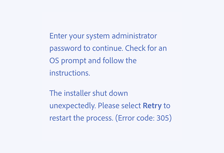
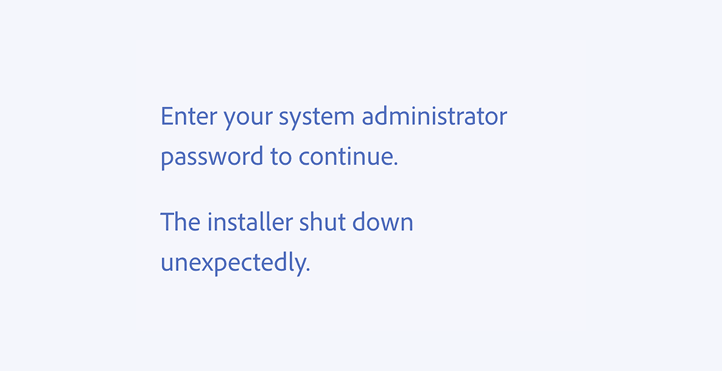
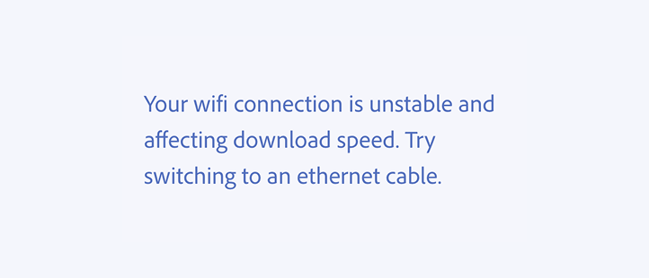
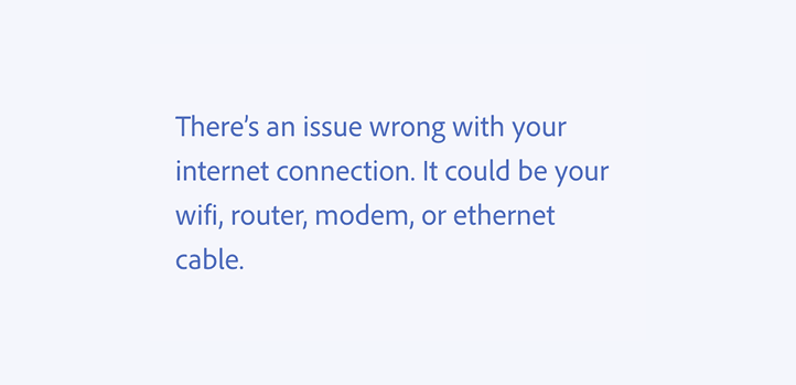
Create error states that are specific to each case whenever possible
It may be tempting to write a catch-all error message to accommodate dozens of similar scenarios, but that will tend to be wordier and less concise. When users need to understand multiple causes of the error — and also figure out which one applies in their scenario — that creates a lot of unnecessary cognitive load in an experience.
Creating multiple, more specific error messages takes additional effort, but it ultimately creates a better user experience. Having these can also provide clearer insights and analytics that can help identify and resolve common pain points — and show you how to prevent errors from happening in your product in the first place.
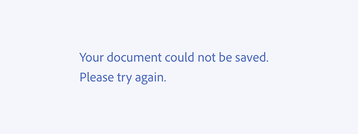
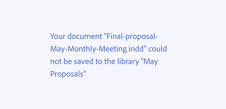
While the error should be specific, use generic language
Generic language allows for better localization, and it also reduces the need to write many different versions of messages for similar use cases. It’s usually unnecessary to include specific filenames, usernames, or folders because a user can get that context from elsewhere in the UI.
Writing the error message
Using voice
As with all other in-product writing, error messaging should follow Spectrum’s in-product voice principles: Rational (clear and understandable), Human (friendly, honest, and responsible), and Focused (concise and simple).
Using tone
Tone is a strategic tool to help a user accomplish goals and more easily relate to a system. Tone changes depending on the audience, context, and severity of an error.
Here are a few tones for common error messages:
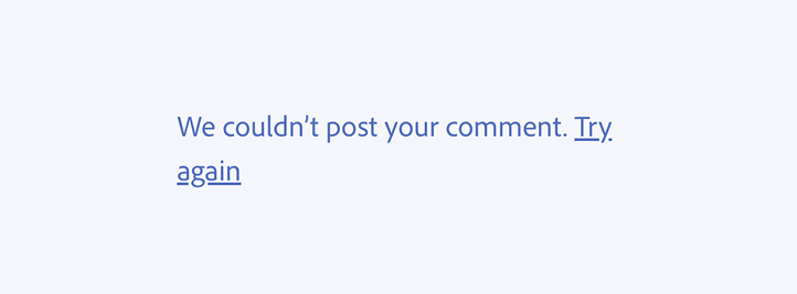
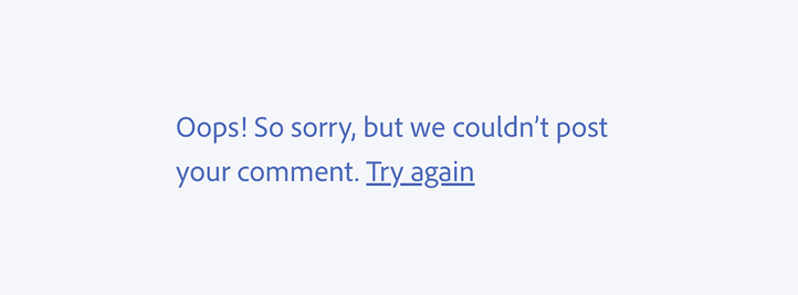
Don’t apologize unless it’s warranted
Apologizing for minor mistakes or when the system is not at fault sounds insincere, and it gets in the way of the important parts of a message.
Save “sorry” for serious errors: when there’s data loss or something requires a user to take a major action to resolve the issue.
Use passive voice sparingly
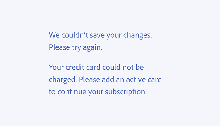
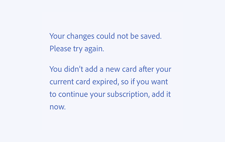
Try to write in active voice, which is quicker and easier to parse. Passive voice is useful to soften a message that might otherwise come across as blunt or terse, especially when the error was caused through user action or inaction.
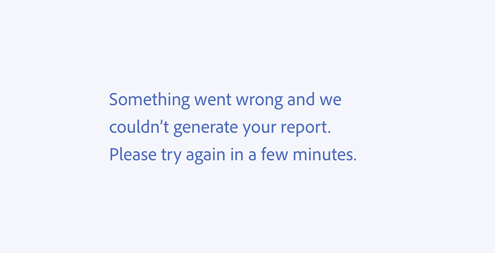
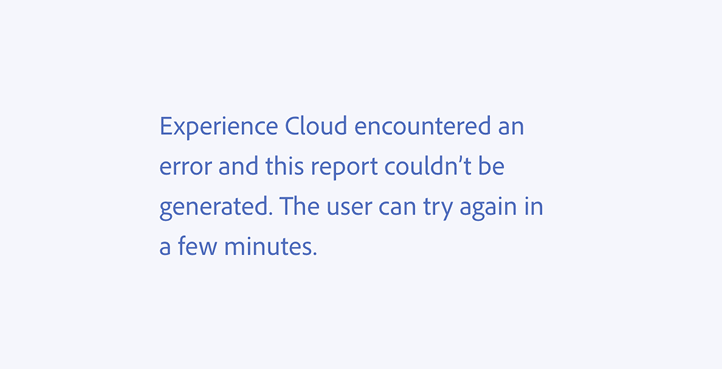
Own mistakes, and help users parse complicated actions with “we” and “you”
We typically avoid referring to ourselves — meaning “we,” the interface — in UI copy because it adds unnecessary cognitive load. But, directly referring to the interface as "we" and to the user as "you" in an error message can be a clear and helpful way to answer the questions "where did this go wrong?" and "who needs to take action to fix it?"
Choosing the right error message component
Choose your component based on your error message — not the other way around. Always have the error message ready before determining how to show it.
When you have your error message ready, then consider how it will fit within the interaction design. Think about what user or system action triggers the error, how contextually or spatially relevant it is to where a user is in the UI, and what a user may be doing in the moment before the error would appear.
Use this framework when deciding which component to use:
How consequential is the error?
It’s a simple error that can easily be resolved.
It’s a high-stakes error, potentially destructive, and is a big deal to the user.
How complicated is the error?
There’s not much we need to explain to the user beyond how it affects their experience right now.
The circumstances or points of failure are long or specific, and the user needs to know about it.
Can the user do anything to resolve the error?
The user can’t do anything, or just needs to “try again.”
The user needs to actively resolve the error, like change a setting or restart an app.
Try keeping to one error message per component, to help users more easily parse the information. For multiple errors that can appear at once, like toasts, these will stack based on timing and severity to let users acknowledge each error individually.
Spectrum has several different types of components for showing error messages. Here’s how to choose which would be the best for your use case.
Alert dialog
- Consequence: High
- Complication: High
- Action: High
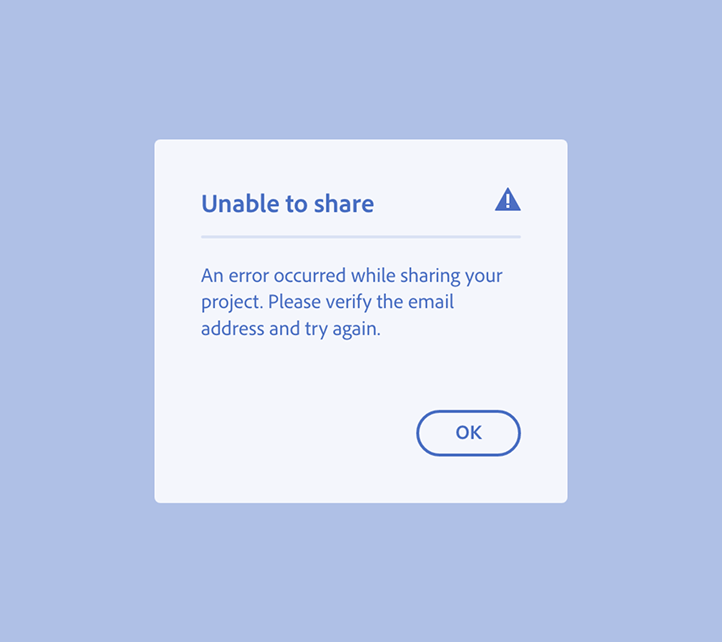
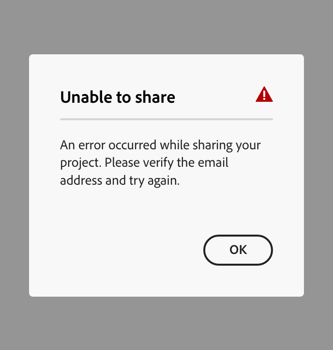
Alert dialogs appear over the interface to show important information that a user needs to acknowledge or make a decision about before moving forward. This is a common error message component for letting someone know about a change or action they took or need to take, but it’s often more disruptive than it needs to be. Use alert dialogs consciously; even if the message is important, they are still highly interruptive to an experience.
Alert dialogs are associated with task-level (rather than system-level) errors. Use these for consequential, complicated, timely, actionable errors that block a user from moving forward. Some examples of scenarios where an alert dialog may be appropriate are:
- A message telling the user that a file can’t be shared because of an invalid email address
- A user can’t sign on because their account has been compromised
- A CSV with a list of email addresses for a bulk upload couldn’t be processed because it was formatted incorrectly
Alert banner
- Consequence: Low
- Complication: Low
- Action: High
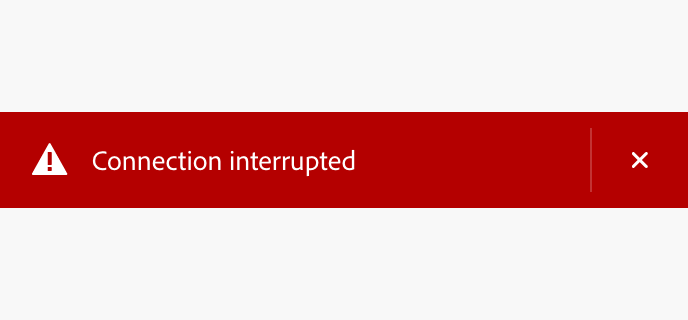
Alert banners show system-level, pressing, and high-signal messages. They’re meant to be noticed and prompt users to take an action. The red (negative) and grey (neutral) semantic variants are both associated with error messages.
Use an alert banner for a message that isn’t directly related to an action that a user would have just taken, but is still high-signal and needs attention. It's also ideal for communicating connectivity errors.
Help text
- Consequence: Low
- Complication: Low
- Action: High
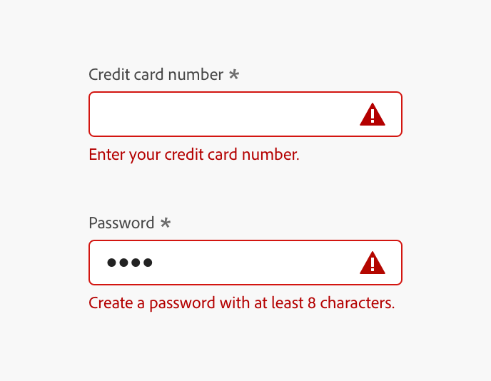
Help text provides an in-line error message that’s associated with an input, giving more context and guidance to help a user successfully complete an interaction.
These kinds of error messages communicate what to input or select, or sometimes how to do it. The message can include information such as hints for what kind of information needs to be input or selected to move forward in a flow, or share specific formatting examples or requirements. Multiple instances of help text showing in-line validation errors can be aggregated into an in-line alert.
View the guidelines for writing error messages using help text.
In-line alert
- Consequence: Any
- Complication: High
- Action: High
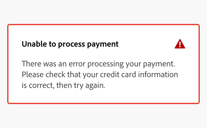
In-line alerts display a non-modal message associated with objects in a view. These are often used in form validation, providing a place to aggregate feedback related to multiple fields into a single message for higher visibility. The red (negative) and orange (notice) semantic variants are for use with error messages.
Use in-line alerts to combine multiple input errors into a single error message, or for cases when a dialog would be too interruptive to an experience but an error message still needs to be shown in order for a user to proceed with a task.
Toast
- Consequence: Low
- Complication: Low
- Action: Low
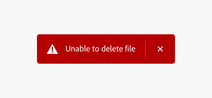
Toasts display brief, temporary notifications. They’re noticeable but don’t disrupt the user experience, and they don’t require an action to be taken in response to the message. The red (negative) semantic variant is associated with an error message.
Use toasts to communicate error messages that are contextual or triggered by a user action (e.g., moving an item, taking an action on something in a canvas). Whenever possible, include an in-line action on a toast with an error message so that a user can readily address it.