States
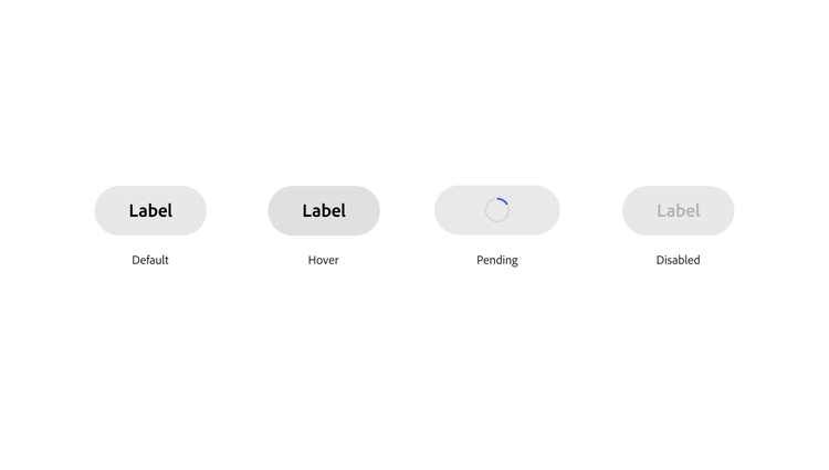
A change in color is the primary way that a state is communicated. Colors follow a standard progression for user-initiated states: default, hover, down, and keyboard focus. There are minor updates to the styles of disabled, selected, and dragged states, and these are all component options.

Down state
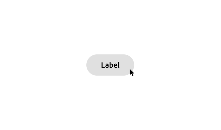
In Spectrum 2, some components use a change in size instead of color to communicate a down state. This gives the illusion of objects being pressed-in, and makes interactions more dynamic and responsive.
Disabled state
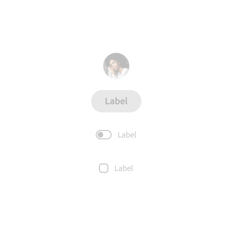
Disabled states generally stay the same from Spectrum 1, but there have been some minor updates to specific components. For example, a text field retains the outline style when disabled, to more closely match its default state.
Selected state
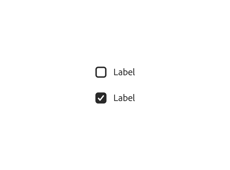
Selected states use a primary style by default, generally through a gray-800 fill. Some have an accent color option that can be used to draw emphasis. This is primarily helpful in contexts with a specific and narrowly-scoped goal (for example, in a dialog), or when there’s a single, clear call to action within a page (for example, a “Create” button).
When there’s many groups of controls that require the same amount of attention (such as in a panel) the not emphasized option works best. For more details about this concept, view Attention hierarchy.
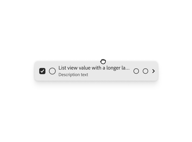
Dragged state
A dragged state has a unique drop shadow to draw attention to the dragged object. Learn more about drop shadows.