Drop shadow
Spectrum provides a range of drop shadow styles that communicate elevation, create visual separation, and emphasize important interface elements. Consistent use of shadows reinforces visual hierarchy while creating a cohesive sense of depth across the interface.

Principles

Create elevation
Use drop shadows to indicate when content appears above other content. Shadows help establish spatial relationships between interface elements and reinforce the visual hierarchy of the interface.
Support emphasis
Drop shadows can also be used to emphasize important interface elements. When applied sparingly, they help guide attention while maintaining a clear and consistent visual hierarchy.
Drop shadow system
Drop shadows are most commonly used when content appears above other content, such as popovers and floating panels. They can also emphasize important interface elements, helping maintain a clear visual hierarchy and consistent sense of depth. Each shadow style is intended for a specific visual purpose.
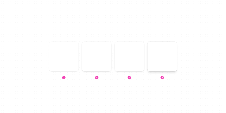
- Emphasized, default
In certain situations, drop shadows can also be used to provide emphasis to containers within a page. When used appropriately, content that requires more attention will visually stand out, as if it’s slightly elevated or above other content. - Emphasized, hover
If a whole container is interactive, such as in a select box, the drop shadow becomes emphasized-hover on hover. - Elevated
Containers that appear on top of content, such as menus and tooltips, have drop shadows to show elevation. - Dragged
Containers don't use drop shadows by default. When a container is dragged, a drop shadow is applied to indicate that it has been lifted above the interface. This behavior applies to both default and emphasized containers.
Drop shadow details
Composition
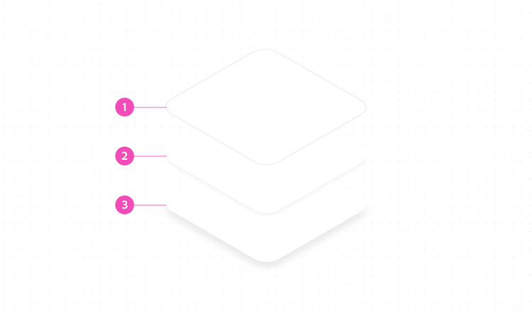
Spectrum drop shadows are composed of three layers that work together to create a natural sense of depth while preserving the shape of the component.
- Key shadow
Defines the edge of the component against the background. - Transition shadow
Softens the transition between the key and ambient shadows to create a smoother appearance. - Ambient shadow
Creates the overall sense of depth and determines the total size of the shadow.
Dark theme
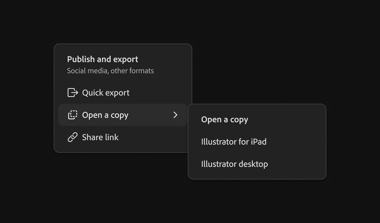
Drop shadows continue to communicate elevation in dark theme, but their appearance is adjusted to maintain sufficient contrast against darker surfaces. Dark theme shadows use three times the opacity of their light theme equivalents.
Components that appear above other content, such as popovers, also use a border in dark theme to provide additional separation from the background.
Overlay
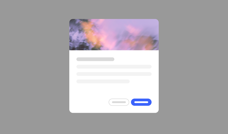
An overlay communicates elevation by visually separating foreground content from the rest of the interface. When an overlay is used, such as behind a dialog, an additional drop shadow isn't needed because the overlay already establishes the elevated relationship.
Tokens
Platform availability
These tokens are currently available on web. Guidance for additional platforms will be added in a future release.
Shadow styles
Each shadow style is represented by a single composite token that defines the key, transition, and ambient shadow layers used to create the final drop shadow.
The table below lists the values for each shadow layer:
- X: Horizontal offset. 0 px for all layers.
- Y: Vertical offset. The ambient shadow uses the largest offset.
- Blur: Blur radius. Each layer uses a different value to create a smooth transition between the shadow layers.
- Spread: Spread value. 0 px for all layers.
Y = 0
Blur = 1
Spread = 0
Y = 1
Blur = 4
Spread = 0
Y = 2
Blur = 8
Spread = 0
Y = 0
Blur = 2
Spread = 0
Y = 2
Blur = 6
Spread = 0
Y = 4
Blur = 12
Spread = 0
Y = 0
Blur = 2
Spread = 0
Y = 2
Blur = 6
Spread = 0
Y = 4
Blur = 12
Spread = 0
Y = 0
Blur = 6
Spread = 0
Y = 6
Blur = 8
Spread = 0
Y = 12
Blur = 16
Spread = 0
Shadow colors
Spectrum drop shadows use black (#000000) as their base color. The perceived appearance of each shadow is created by varying its opacity and layering.
In dark theme, the opacity value is 3× the opacity value of light theme.
drop-shadow-emphasized-key-color24% (dark)
drop-shadow-emphasized-hover-key-color36% (dark)
drop-shadow-elevated-key-color36% (dark)
drop-shadow-dragged-key-color48% (dark)
drop-shadow-ambient-color24% (dark)
drop-shadow-transition-color12% (dark)