Using icons
Types of icons
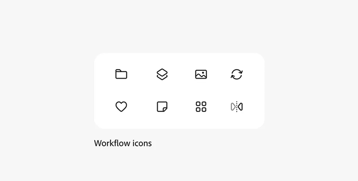
Workflow icons
Workflow icons are graphical metaphors or symbols that users interact with to navigate and manipulate objects. They maintain a consistent size and style within each platform to ensure visual harmony and usability. While consistency is key, it is now fairly common to combine different icon scales to support hierarchy and context.
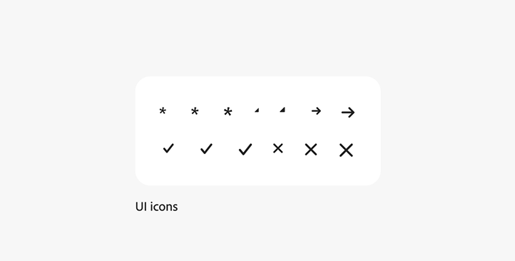
UI icons
UI icons are atomic pieces — like arrows, crosses, or chevrons — that are part of a component. They aren't metaphorical per se, but they're an indication of how users interact with a component (for example, what happens when you click on a disclosure chevron or drag handle in a panel). Unlike workflow icons, UI icons come in assorted sizes.
Badges (status and premium)
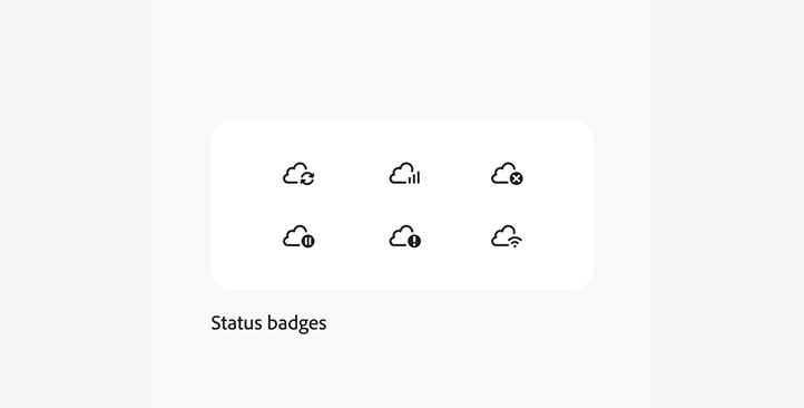
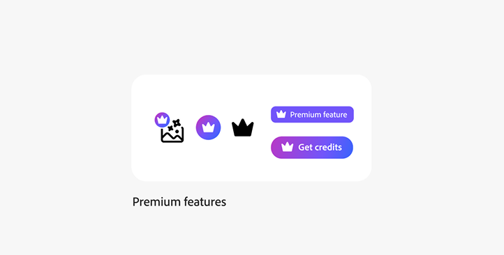
Status badges are indicators that communicate a variety of statuses or states, such as presence, validity, completeness, and more. Premium badges indicate that a feature is only available to paying customers.
Cursors and HUD
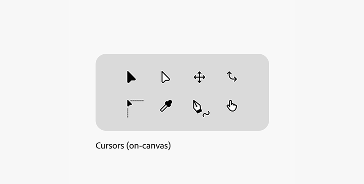
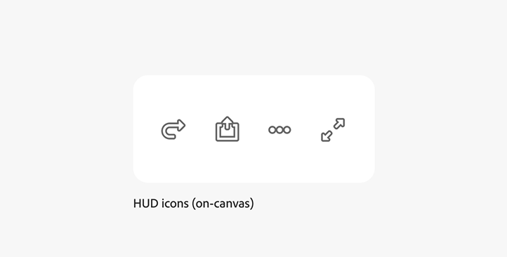
The cursor style has also been updated to match the look and feel of the Spectrum 2 icons.
Sizes
Workflow icon sizes
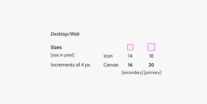
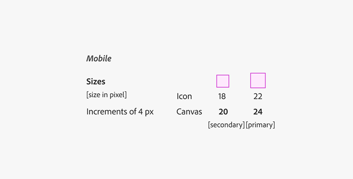
Spectrum 2 workflow icons come in two sizes per platform, but with one stroke weight: 1.5 px.
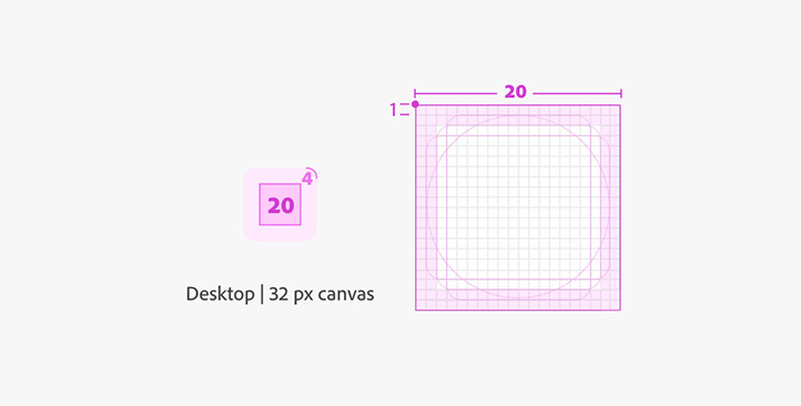
The primary size for Desktop/Web is a canvas of 20 px with the icon being ~18 px. There's a secondary size for UI areas — like a layers panel, lists, or cards — which require smaller versions and come in a 16 px canvas with the icon being ~14 px.
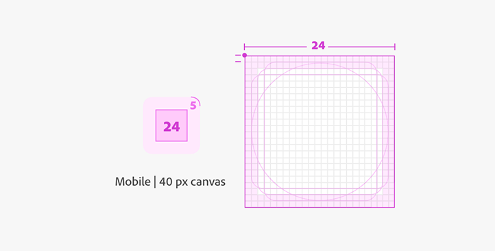
The equivalent for Mobile is the primary size of the canvas at 24 px with the icon being ~22 px. The secondary size canvas is 20 px with the icon being ~18px.
T-shirt sizes
In Spectrum components, workflow icons scale up or down slightly when they're used. For example: a 20 px icon in a medium-sized component will be slightly larger in a large-sized component, and smaller in a small-sized component. UI icons come in their respective size range, since Spectrum components treat these differently.
Naming convention
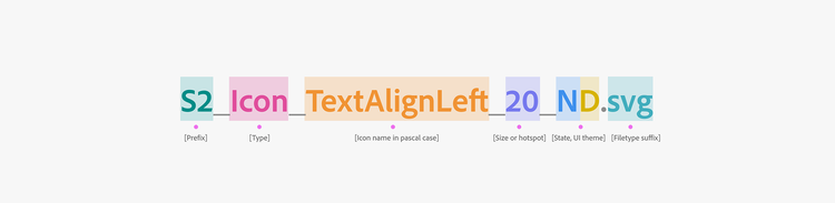
"S2" is the prefix for Spectrum 2 icons.
Here's a breakdown of each part of the icon naming convention:
- Prefix identifies it as part of a larger group of assets.
- Type is the type of the asset: Icon, Ani-Icon, Ani-Illu, Illu, Cur, or Mock-Icon.
- Icon name is in Pascal case: there are no empty spaces or individual characters allowed. When names use multiple words, it utilizes a hierarchy to determine the word sequence.
- Icon canvas size is stated in pixel at @1x.
- Icon State indicator: normal state is "_N", selected state is "_S", and Dark UI theme adds a "D".
- Filetype suffix indicates the asset format, like SVG or PDF.
Attributes
Stroke border (weight)
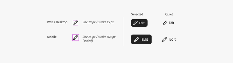
Keeping one stroke weight consistent within a size range helps to balance out and contrast the visual weight. For Web and Desktop platforms, icons are designed at a 20 px canvas as default with a 1.5 px stroke, resulting in a 1.64 px stroke when sized up to 24 px for mobile. This helps keep a unified look, and it builds icons efficiently since it's not necessary to redraw them for each platform.
Corner radius and shape rounding
All icons with angles get a 1.5 px rounding treatment to achieve a rounder appearance. Inner corners are slightly rounded, and all stroke ends have rounded end caps. By default, the corner radius can be decreased in case a metaphor requires pointy edges.

Icon and badges placement
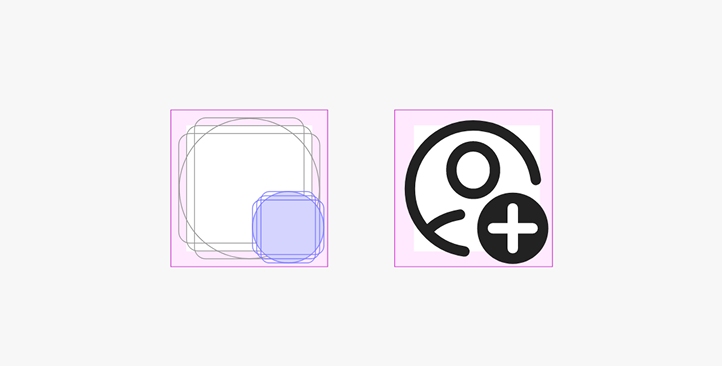
Icon designs include a safe area to ensure there's flexibility for finding the best positioning and balance in a layout. The main shape should be centered, and modifier placement is primarily at the bottom right corner of the canvas. Notification dots appear at the top right corner (these are mostly added programmatically).
Text and icon alignment
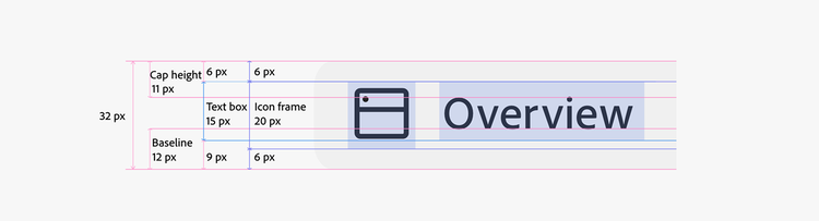
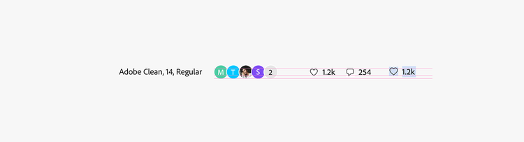
The vertical spacing between icons and text is adjusted to create balance.
For example: in a medium-sized component, shifting the text box 1 px up and the icon box 1 px down inside a button better balances out the appearance and refines the relationship with text in Adobe Clean Medium.
New SVG structure
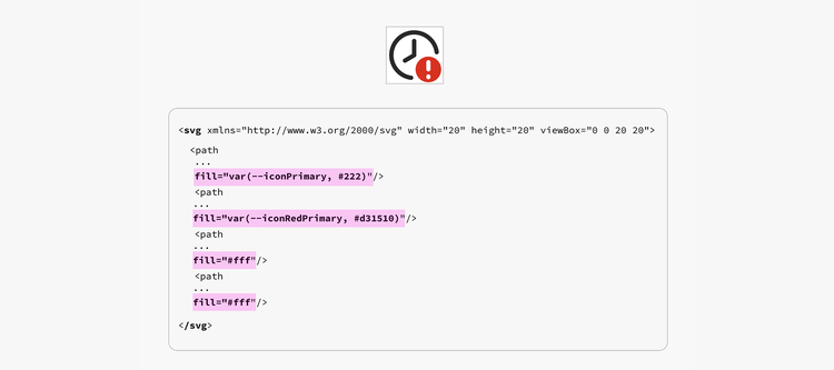
The new SVG native format for icons allows for automatic tinting to match different states (hover, selected, etc.) and can programmatically switch depending on UI brightness or color theme. It's not about tinting the whole SVG in one color, but tinting single elements inside the SVG. To do this, the new SVGs use named CSS variables to set color values for every element. There will be Spectrum tokens for this, so automatic tinting will work out-of-the-box in any product using Spectrum CSS.
For other apps, it will be easier to add the needed color information to their own CSS. Transparencies will be used to achieve tints of the primary icon color, making it easy to use at least the gray tone when it's not possible to work with CSS variables.
Advantages to the new SVG structure
- One SVG asset serves all states in all UI color themes
- Stable and easy creation and export workflows in Illustrator
- Streamlined SVG code for smaller file size
- Minimal effort to update any Spectrum color changes
- Allows for app-specific custom colors (a variable illustration accent color could be matched to the app color)
- Will become easier to add special colors for an app (for example, the brand red color used in Acrobat)
Usage guidelines
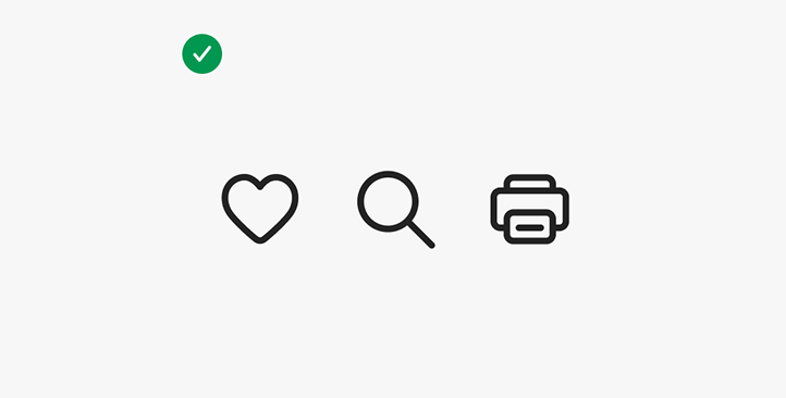
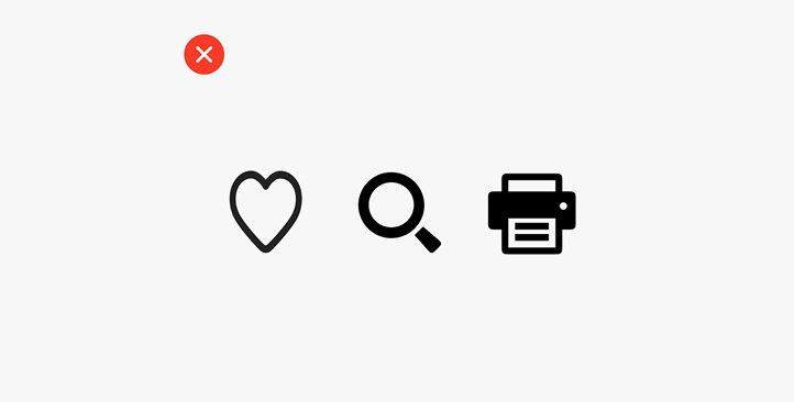
Don't resize icons
All icons are crafted with a specific stroke weight, size, and canvas to match a larger icon set. Resizing or scaling them can change the appearance, creating inconsistency within a product.
Don't create your own icons
The Icons team works carefully to ensure that icon metaphors and style are consistent across Adobe products. When different product teams each decide to choose their own metaphors or build their own icons, this becomes a complex issue in Adobe's large product portfolio — and it shows our customers that we don't speak with a single brand voice.
Semantic colors
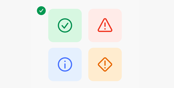
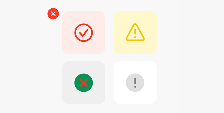
Semantic colors have specific meanings in the design system. Choose icons with metaphors that visually align with their corresponding semantic color.
Ensure that any semantic color usage in icons is consistent with Spectrum's usage. If you're using icons to convey "Success," "Alert," "Information," or "Caution" meanings (such as in an in-line alert), use the appropriate colors.
Meeting contrast requirements
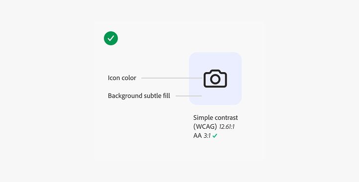
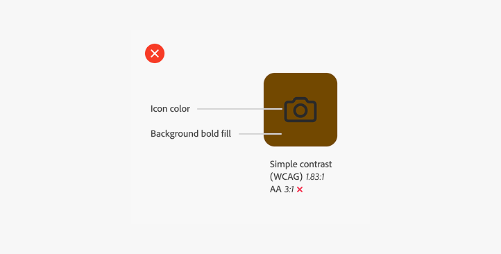
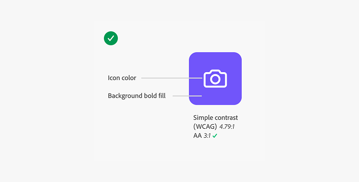
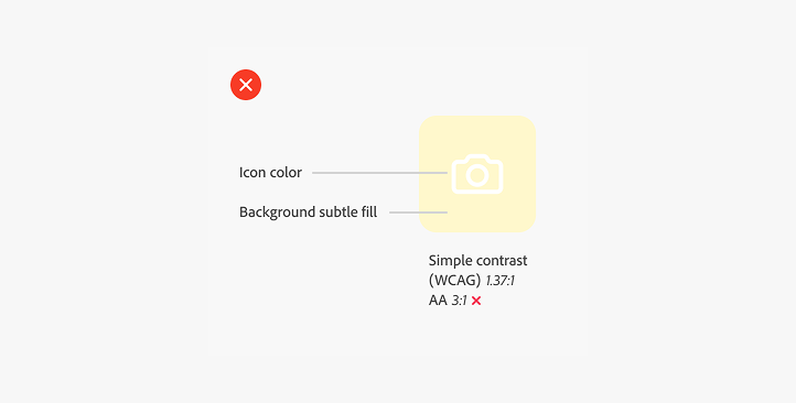
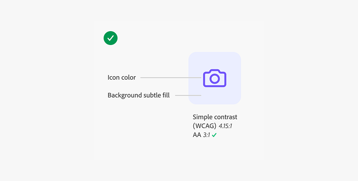
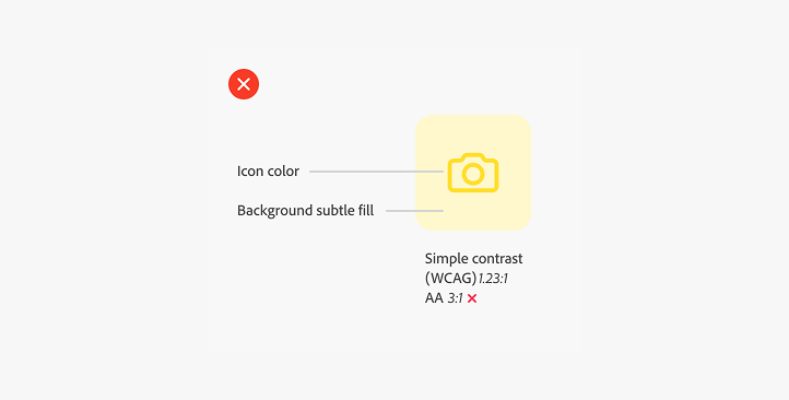
Using the available Spectrum 2 colors with Spectrum 2 icons will ensure that your design is both visually appealing and meets the WCAG minimum contrast ratio of 3:1 for non-text contrast.
If you diverge from Spectrum colors, you'll need to make sure that your design has enough contrast between the icon and the background. Use subtle fills in light and dark themes to maintain legibility without overpowering the UI. Make sure that the icons remain legible and distinguishable across varied backgrounds and themes.
Consider three color combinations:
- A dark icon on a color background
- A light icon on a color background
- Tinted icons on a color background