Containers
Containers separate concepts with distinct purposes.
Overview
In Spectrum 2, containers have more defined rules to help guide in the creation of custom containers for product-specific contexts. Containers are used across Spectrum 2 interfaces in multiple ways, but the commonality they share is that they group related concepts together into distinct areas. Some usages of containers have more detailed guidelines.
For example, a card uses a container and inherits its properties, but it can only represent a distinct object (such as an individual asset or product). A block of marketing material containing multiple concepts (like subscription information plus actions to take) is grouped together in a container, but is not considered a card. Whether broad or specific, a user should be able to readily tell the purpose of a container.
Separation of containers is marked through a clear visual change, such as contrast in a background color or through spacing. All containers share a common set of rules for styles, padding, and emphasis.
Example
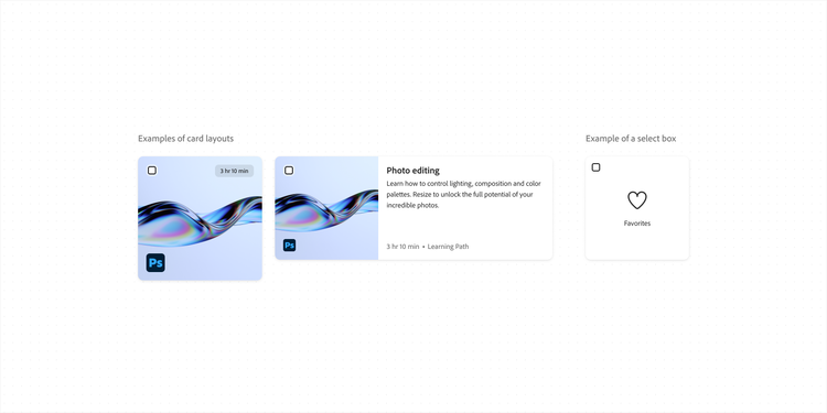
Cards and select boxes share container styles. In this example, both use the emphasized style. Cards also have additional options that select boxes do not, like t-shirt size and layout.
Styles
All containers share a set of defined styles.
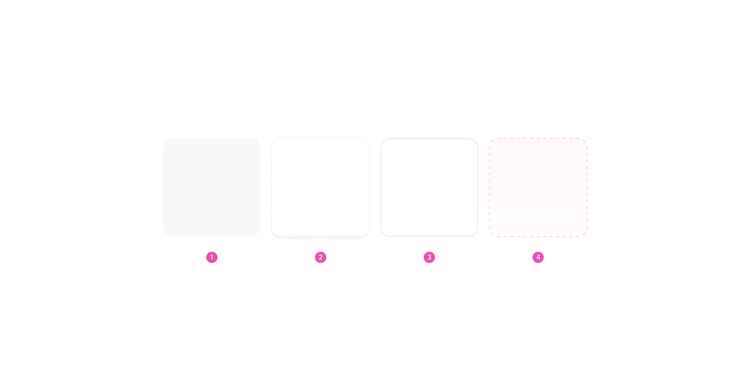
- Background color
By default, containers are visually distinguished through a change in background color. Learn more about this in background layers. - Emphasized
In some situations, drop shadows are used to provide emphasis to a container or group of containers, like in a set of related cards. Emphasized containers should be used sparingly. View more about container emphasis. - Border
Borders can also be used around objects as an alternate style to a background color, and should be used without a fill. Vertical, full-width dividers can also be used to create separation for larger sections of content, like in a panel. View more about border width. - Spacing
This is the container style with the least emphasis. Instead of using a visible border, spacing is used to create separation between concepts. View more about spacing.
Padding
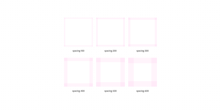
Internal padding is dependent on component size, density, and platform scale, all of which vary for specific components and patterns.
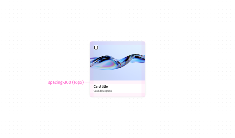
The following chart is a point of reference for how padding values are used in Spectrum 2 containers. The spacing values themselves remain unchanged from Spectrum 1. View more about spacing.
spacing-100spacing-200spacing-300spacing-400spacing-500spacing-600Example
This medium card uses spacing-300 for internal padding.
Emphasis
An emphasized container has a drop shadow to draw attention. When deciding whether a container should be emphasized, consider the rest of the page. Emphasized containers should be used to highlight the main content.
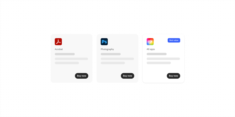
Consider how different container styles can be used to draw attention to the most important content. As a general rule, a group of containers should all have the same intent. While there are exceptions, generally only one group at a time should be emphasized on a page. For example, a group of related cards can use a drop shadow, but not every element on a page should have a drop shadow.
Example
In this group of containers — each representing a product — different container styles can be used to draw attention to a specific item. In this case, the emphasized container is paired with a badge, and contrasts against the more subdued containers with filled (gray) backgrounds.
States of interactive, emphasized containers
If the whole container is interactive, hover is shown through a slightly more prominent drop shadow. When dragged, a much more prominent shadow is shown in order to bring focus to the dragged item and show elevation above the rest of the UI.
Note that specific components might have different options and states.
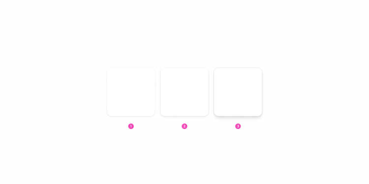
- Emphasized, default
- Emphasized, hover
- Dragged
App frame
A consistent app frame helps create a sense of brand unity and helps users feel comfortable and familiar with our products. Predictable navigation is also especially helpful for users who work across multiple applications, and it makes it easier to learn how to use new products.
The Spectrum 2 app frame framework provides a consistent visual style and navigation. It offers foundational structures and guidelines that product teams can adapt to their own contexts. View more details about the S2 app frame.
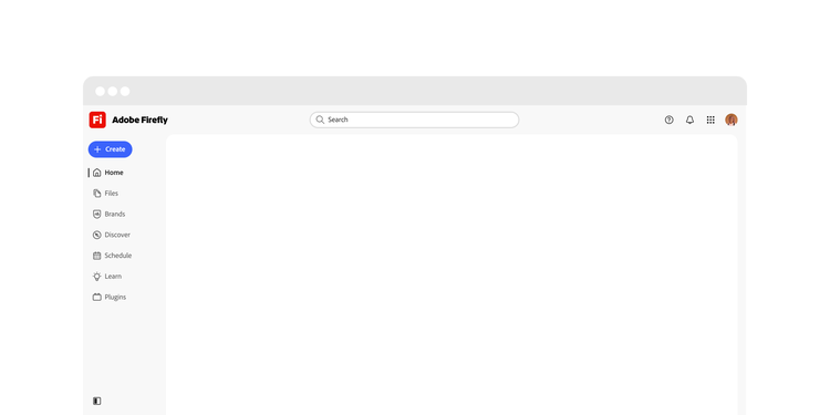
The main content area is defined by a unique container style that's used only in the app frame. It has a subtle drop shadow to provide separation from the navigation. View more about using container styles to divide content within content areas.