Creating bluelines
Note: The guidelines included here are not comprehensive of the requirements and needs for bluelines since specific accessible names, landmark regions, heading annotations, and keyboard annotations are dependent on context and content within your design. Use these guidelines as a starting point, and build on top of them.
Accessible names
The accessible name is the text that software uses to identify a component, and communicates it to the user. Assistive technologies like screen readers and voice control require an accessible name to read aloud content to screen reader users, or to accept speech input from voice control users to interact with digital content.
Accessible names vary depending on the content. Accessible names must be defined for controls that don’t have visible text labels.
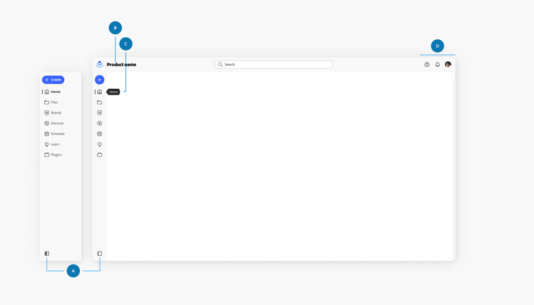
Here are some guidelines to keep in mind as you define accessible names in the app frame:
A. Side navigation state control
The default accessible name are Show menu labels and Hide menu labels. In general, the names should be as specific as possible and are up to individual product teams to define, based on the content inside. View more details about side navigation state control.
B. Product lock-up
When an interactive control has a visible text label, there is no requirement to specify an accessible name. The visible text label will be accessible and the graphic will be ignored by a screen reader.
C. Side navigation labels
When the side navigation is partially minimized (icon-only), the labels on the tooltips and when the side navigation is expanded should match the accessible names. Because a text label is available in both expanded and minimized states, app frame side navigation buttons do not require additional annotation.
D. Adobe-wide actions
If using the universal navigation pattern, follow guidance defined in the design and implementation for continuity across products.
Landmark regions
Landmark regions create a programmatic identification of the visual areas or sections of web applications, which represent the spatial layout of the user interface. The purpose of annotating landmark regions is to ensure developers code the page structure correctly, include the correct content in the defined grouping, and apply an accessible name to the landmark regions that require them.
Any non-text element in a digital interface with a text label must have a text alternative. Here’s an example of how you might name landmark regions in an app frame:
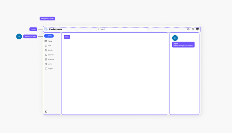
Note that you may also want to include additional landmark regions for content within each area.
A. The navigation areas require accessible names, because there is more than one area on the page. Depending on your content, the accessible names might be different for your product.
B. Regions always require accessible names, and should be named based on the content of the region. If using content areas split into additional areas, make sure to name those regions as well.
Note: In some cases, landmarks might be better defined as a complementary landmark instead of a region landmark. For example, the AI assistant in Digital Experience products is separate from the main content (not contained within another landmark), but is still supportive of the main content. In that case, the AI assistant would be a complementary landmark instead of a region landmark.
Heading annotations
Heading annotations describe the heading structure of a digital interface and are helpful for all users. Screen reader users in particular rely on them to navigate an interface. They organize information, help create an information hierarchy, and build a mental map of the content available.
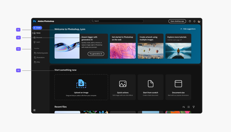
There must be one <h1> heading, and any text that serves the purpose of a heading must be marked accordingly from <h1> to <h6>.
Because headings rely greatly on structure and content, they will likely vary depending on the page. As a general rule, the <h1> should live in the main landmark region.
Here’s an example of how you might structure heading annotations for this screen:
Keyboard focus order
The keyboard focus order describes how someone who uses a keyboard to operate the interface (instead of a pointing device like a mouse), would interact with an interface.
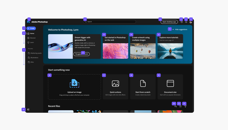
Keyboard focus order will depend on what controls are available on the page. Here’s an example of how you might define the order in the app frame:
Usage guidelines
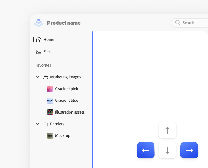
Support keyboard focus for resizing the side navigation
Example of correct usage, support for keyboard focus for size navigation. The side navigation width is focusable and resizable by using the left and right arrow keys.
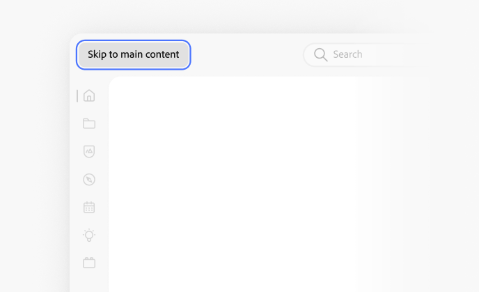
Include a “Skip to main content” button
Example of correct usage, inclusion of a Skip to main content button within the app frame header.
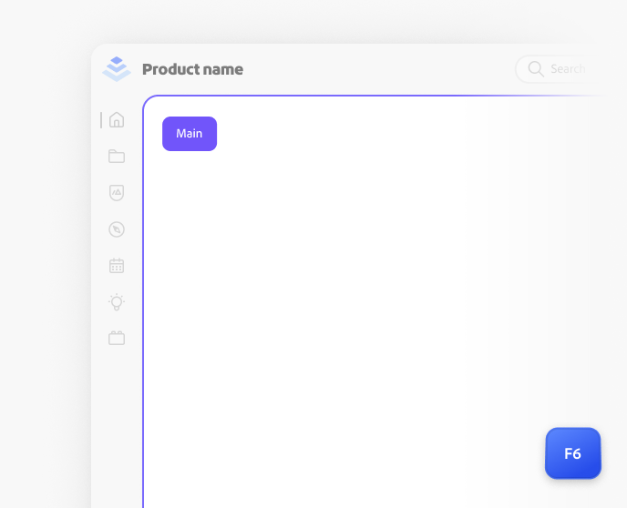
Support F6 key navigation
When properly supported, the F6 key allows keyboard users to navigate through different regions of an application efficiently. Without this support, keyboard-only users have no means to jump to specific areas of the application, resulting in an excessive number of keystrokes to reach their desired goal.
Here are some key quality factors to consider:
- A keyboard focus indicator should be present to show keyboard-only users their current location within the interface.
- Ideally, the focus of the F6 key should move in accordance with the landmark regions defined in the HTML of the application.
- Major sections of the app should be accessible through the F6 key, including main navigation, toolbars, contextual toolbars, and the canvas.
- Each of these regions must have an accessible name assigned to them, allowing screen reader users to understand which area of the user interface they are currently navigating.
Mobile overlay guidance: Keyboard focus
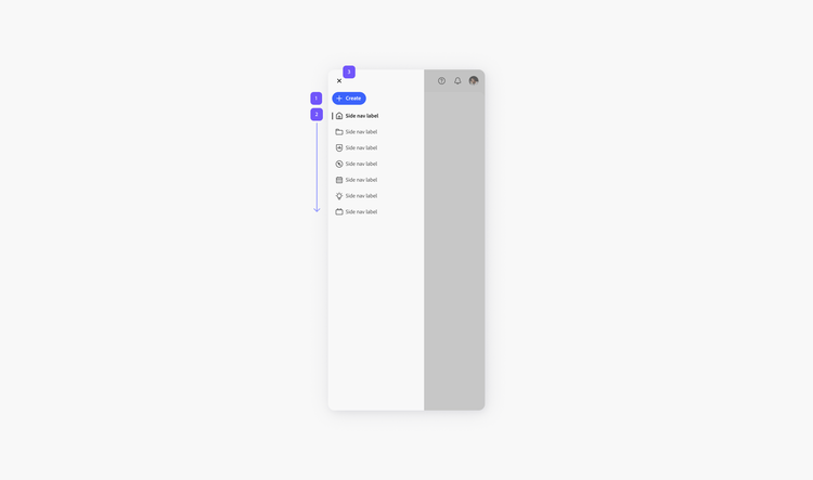
For mobile breakpoints, a tray is used to open and close the app frame side navigation. In this example, the keyboard focus order starts at the “Create” button and ends at the close button. Clicking on esc should also close the tray.