App frame
The app frame is the core navigation direction for Spectrum 2. It’s designed as a flexible framework that’s readily adaptable to specific product needs while still creating a shared, predictable experience across products.

Framework principles
Spectrum 2 treats the app frame as a framework to help product teams make the best decisions for their use cases. This is a resource that combines high-level framing, direction about construction, and specific examples for inspiration. It offers a balance of information that’s strategic and tactical, with the following principles at the forefront:



Flexible and adaptable
The app frame needs to be opinionated without being restrictive. It directly accounts for the needs of future Spectrum 2 products, and is also flexible enough to be readily adaptable across varying product segment needs.
Cohesive and predictable
A cohesive, consistent app frame reinforces Adobe’s brand and helps users feel comfortable and familiar with our products. Predictable navigation across products is also imperative for Adobe to support users working across multiple applications — and helps people more readily learn how to use new products.
Embodies Spectrum 2
The app frame is the main stage to showcase the Spectrum 2 style, and it reflects the core foundations and principles of the design system. It works readily with all other design system resources, is committed to complying with WCAG standards, and holds the highest standards for globalization support.
What’s here, and what’s to come
Spectrum offers a high-level direction as well as a definition of which parts can be flexible and which parts need to be highly predictable. Product teams are then empowered to apply this direction in ways that make the most sense for their use cases and users.
We’re designing the app frame in stages that align to the two main experiences that are shared across all Adobe products: browsing and editing. What’s currently defined here is mainly focused on the browsing context: workflows that draw attention to the content as the primary focus (examples of pages in browsing contexts include a Home or Files experience). This does overlap with the editing context, where the workflow draws attention to the canvas as the primary focus, but we’re still defining the editing context in more detail overall.
This framework defines broad information architecture: the general categories of objects, and where they go in the app frame. It does not define the location or ordering of specific objects within those categories.
App frame construction
Browsing context: Zones
Zones are the general areas into which certain types of actions should go. They’re not specific to components.
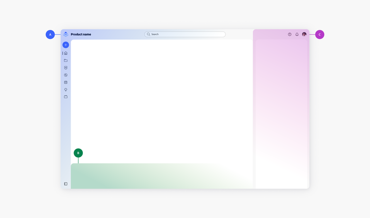
A. Navigation zone
This area holds the primary navigational items on a page. Navigation should be highly predictable across products. In the Spectrum 2 app frame, navigation can be shown in different ways: through the header and side navigation components, as well as through other navigational components (e.g., side navigation and tabs) within the content area for secondary navigation.
B. Global action zone
This is a general area that contains global actions, such as view actions (e.g., layout and zoom options) and supplemental features (e.g., AI Assistants). Actions here can be shown in different ways, such as using part of the content area to show actions in the header, or in a dedicated side rail. There is no single visual representation of how actions should look in this area.
C. Contextual action zone
This area is reserved for transient actions that are contextual to content on the page (e.g., an action bar).
Browsing context: Anatomy
Parts of the anatomy have defined rules and behaviors. The terms used here to describe the anatomy of the app framework are for internal alignment only, and are not representative of how these parts of the app frame should be described to end users.
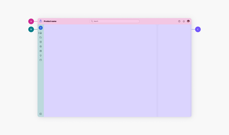
A. App frame header (Navigation, required)
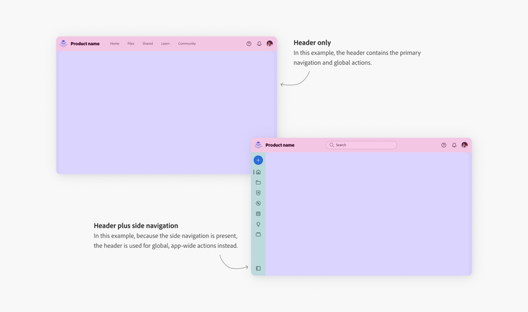
Holds the product brand and global actions, including the universal nav. This area can include top-level navigation, and is suitable for categorizing product segments (e.g., marketing contexts) and for larger fly-outs. If there is an app frame side navigation instead, use this area for global, app-wide actions (e.g., search). View header guidelines and examples in App frame header (browsing context).
B. App frame side navigation (Navigation, optional)
Holds the main categories of product functionality, such as workflow-related navigational items (e.g., home, files, learn, dashboards). This navigation has specific behaviors for showing and minimizing labels. Do not use this for categorizing marketing pages. View side navigation guidelines and examples in App frame side navigation (browsing context).
C. Content area (Required)
Modular space that supports multiple layout configurations. The content that goes inside this area is free and not defined by the app frame.
Gradients, when used in this space, are applied with clear intent and strategic purpose. They should contribute to the visual hierarchy, not distract from it. And, their colors are directly tied to product brand color palettes.
In the S2 app frame, gradients are only used as backgrounds in content areas — they are not used in the header (A) and navigational areas (B). This allows for greater flexibility between pages where gradients may be calling attention to different kinds of content.
View side navigation guidelines and examples in App frame content area (browsing context).
Anatomy examples
Side navigation state control
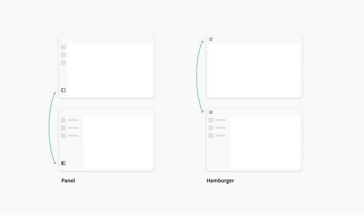
There are two variants of the side navigation state control: hamburger and panel. They should never be used at the same time.
Interacting with the side navigation state control (an icon-only button) will expand and collapse the width of the panel. This allows for the labels of the side navigational items to be shown or hidden. When used to expand the panel, the accessible name (optionally shown as a tooltip) changes to “Show menu labels.” When used to collapse the panel, the accessible name changes to “Hide menu labels.”
Hamburger
Interacting with this icon in the header will either fully expand and collapse, or partially collapse, the panel.
Panel
When hovering on the panel icon, the icon will show an animated preview of what action would be done upon interaction (either expanding or collapsing). This animation offers more context about what to expect. The placement of the panel icon is at the bottom of the app frame side navigation panel.
Learn more about the side navigation state control’s user customization and preserve user preferences. App frame variants: Top App Bar (TAB) will go over the use cases of hamburger and panel icons.
App frame variants: Top App Bar (TAB)
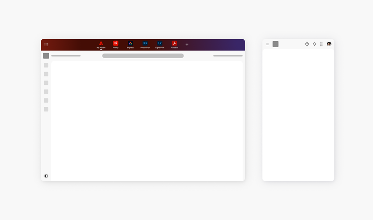
The Top App Bar (TAB) is the the most-up-to-date form of the 9-grid app switcher in Adobe Home. While the underlying functionality remains unchanged, the TAB introduces a more prominent visual placement, appearing at the top of the header when active.
How to use the TAB
To activate or deactivate the TAB, select the 9-grid icon. Once clicked on, the TAB will appear above the header. On a screen reader, if there is an alert banner present, then the visual placement from top to bottom would be alert banner, TAB, then header.
Product-Specific Variations
The placement and appearance of the TAB icon may differ across Adobe products. Not all products will utilize the TAB. The currently supported products are Adobe Home, Firefly, Express, Photoshop, Lightroom, and Acrobat.
TAB products (Digital Media)
For products that use the TAB, the side navigation state control (panel icon) will be at the bottom of the side navigation. For mobile experiences, the side navigation state control (hamburger icon) and product switcher will be in the header.
Anatomy examples
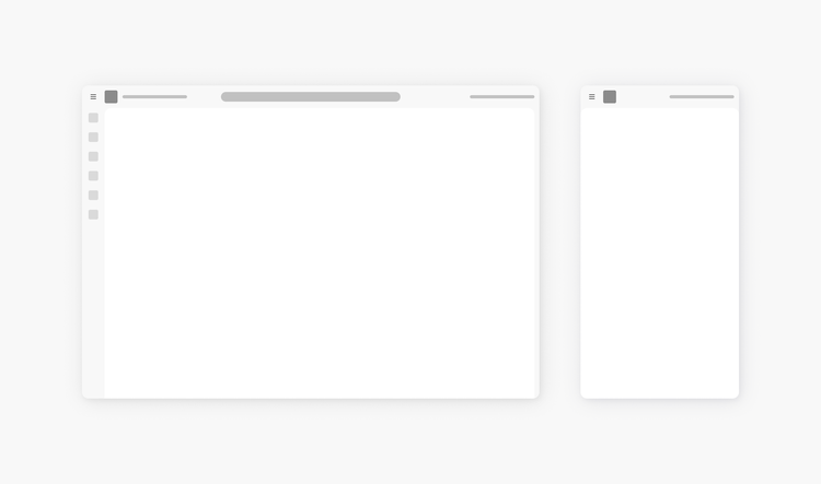
Non-TAB products (Digital Experience and Unified Shell)
For products that don’t use the TAB, the side navigation state control will always be the hamburger icon.
Terminology and content standards
It’s ultimately up to product teams to decide how to translate the terms used in the framework anatomy — and other internal jargon — into UI language that makes the most sense for their end users.
Internal product development jargon often unintentionally surfaces in UI, and this can create confusing experiences for the people using our products. In order to avoid that — as well as align across differences in team and individual jargon — the terms used here to describe the anatomy of the app frame are focused on communicating high-level construction (how something is built) and intention (how something is used).
Some common Adobe terms for describing the UI
The following are some common terms used at Adobe for describing the core UI elements that make up the app frame, along with some notable usage considerations. Consider this as a starting point for you to take and develop into working language that may need to be more contextual for your product. Work with your Content Strategy partners to adapt it to your needs.
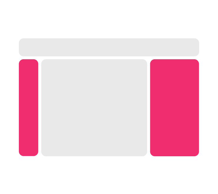
Panel, Rail
Panels and rails share so many similarities in their appearance and behaviors, as well as the same root concept: an area of content, with visible boundaries, affixed to one side, that has a specific focus or intention. These are a type of container, and can be flexible in what they contain.
A panel is the preferred way to describe this general concept. This is because the word borrows from the well-known analog metaphor of a “control panel”: a flat board, usually square or rectangular, where controls are fixed.
Content area
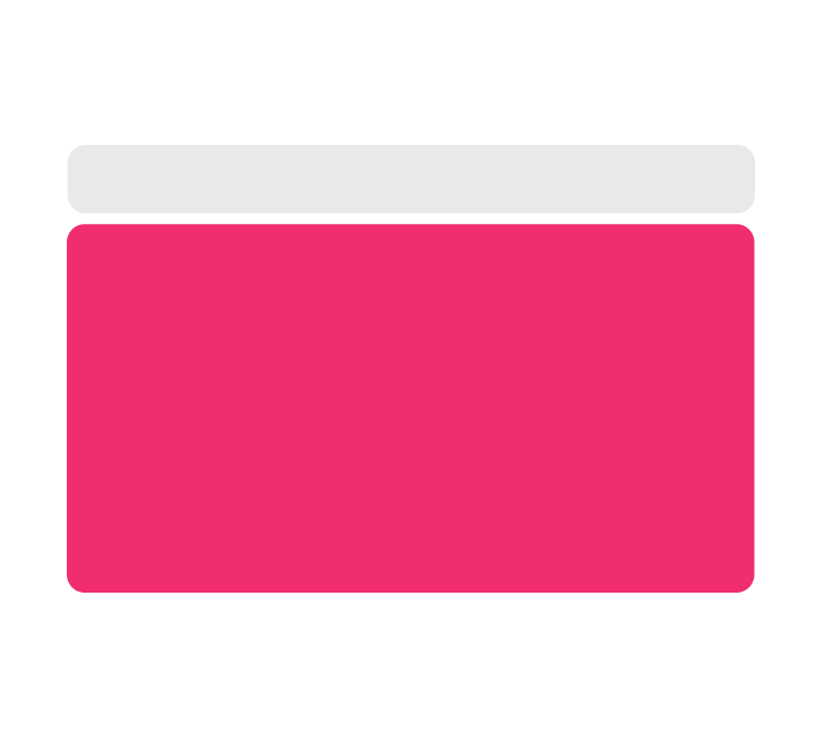
Spectrum refers to a designated part of a composition of components as a content area if it can support many layout options, and is flexible in what it can contain.
The word “content” is general in theory but specific in application. In general, it’s a catch-all word for something that is contained in a designated space, and communicates meaning or intention. Specific to the context of the app frame, it describes that what goes into this area is at the discretion of a given situation or user experience.
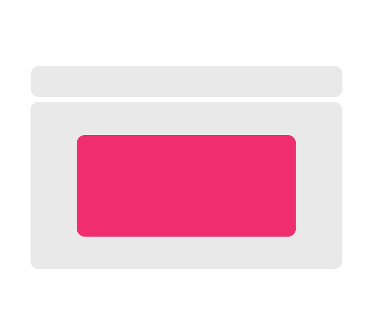
Well
A well is a type of container that is used to show non-user-editable content. It generally communicates lower-attention, supplementary information.
This is a commonly used internal term, but is not recommended for describing the interface to an end user. This is because it relies upon a visual metaphor to mimic an analog concept: something that “sinks” into a UI plane, like a water well sinks into the surface of the ground.
Identifying user-facing terms vs. internal-only terms
Internal jargon is important and we want to be aligned across teams, but we also need to be careful about using internal terms, externally. By “user-facing term,” we mean that user to be the “end user”: the person who encounters the UI of an Adobe experience.
In general, if you’re creating resources for internal usage (such as design guidelines or specs), you can safely use internal jargon. If you’re creating actual product UI, you will need to ensure that you’re using the appropriate terms that will help your user best understand and navigate the interface. Use the following steps to decide on terms:



Note your context
What's the context — the workflow or scenario — for where a term will appear? That will help you determine who you’re speaking to, with what language.
Different deliverables will each have their own audience. For example:
- A label on a button in a UI mock, in Figma: end user
- Technical specs that show how to build UI: Adobe engineer
- Design guidelines that show assemblages of components: Adobe designer
Assess your audience
Are you creating something for internal builders (designers, engineers, anyone creating products) at Adobe? Or are you creating something for an external user?
Be specific about who you’re speaking to. If you're speaking to an internal audience looking at design direction for how to build UI, that’s a different audience from the users who will ultimately work with the UI.
Identify where the term will appear
Will the term appear as a UI string (such as the title of a panel)? Would it appear as a label in an image that shows the anatomy of different parts of the component?
It’s generally OK to say things like "left rail" or “side panel” descriptively in day-to-day work conversation, but be careful about using that description in an end user/customer facing capacity. Review Creating accessible app frame terminology for more guidance.
Focus on the content, not the container
The main focus for most users is on the content — the information being shown, and the actions to select from — rather than where or the means by which the action is contained.
This app framework intentionally uses the anatomy term “content area” to describe the main information or main focus in a given view, because it’s a flexible area that’s contextual to the main view of a given place in a user’s workflow.
Avoid terms of relative direction or appearance
To create more inclusive products, describe parts of the UI in terms of function (what something does, or what something is) rather than appearance or position (such as relative direction: left, right, top, bottom).
Talk about the actions available or the names of the features inside of a part of the interface, rather than how the interface itself looks. View the Spectrum Inclusive UX writing guide for more guidelines and examples.
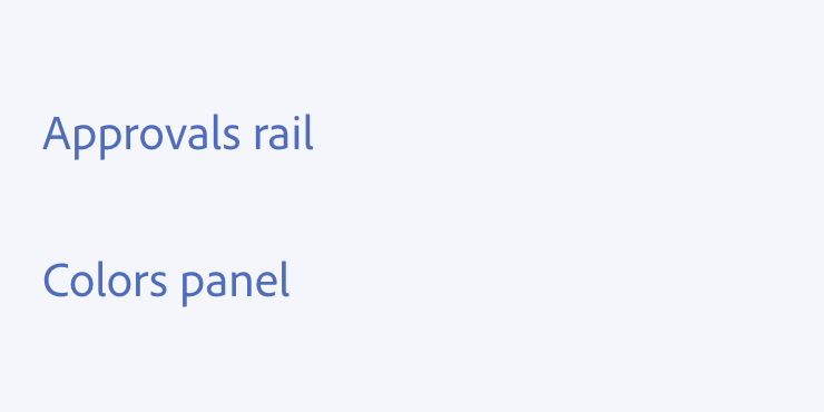
Using “panel” and “rail” as user-facing terms
The word panel is acceptable as a user-facing term only when there is no other way to describe the interface.
The word rail is acceptable to use as internal jargon, but it should never be used as a user-facing term. This is because the word is about how something looks: a long, straight divider, like a slide rule or a railroad track.
View the Spectrum in-product word list for more details and usage notes about these and other terms to refer to parts of the interface.


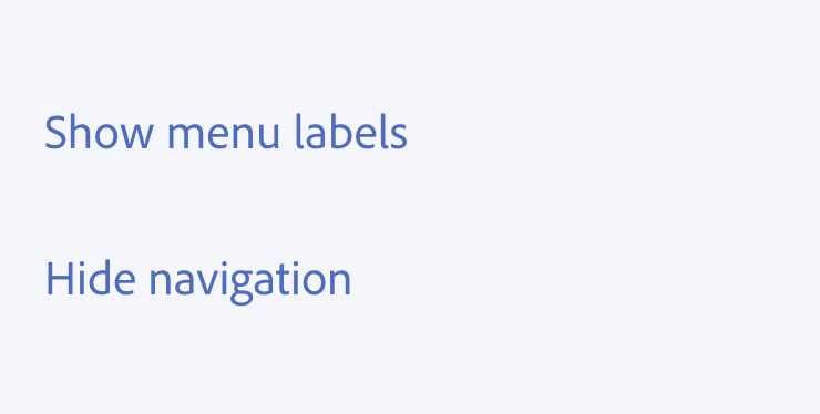
“Show” and “Hide”
“Show” and “hide” are the preferred terms to use to describe the open/close actions on the side navigation. This is for several reasons:
- Globalization readiness. The words “show” and “hide” both have low character counts in U.S. English, and are the most common already-existing terms to express this concept across Adobe products.
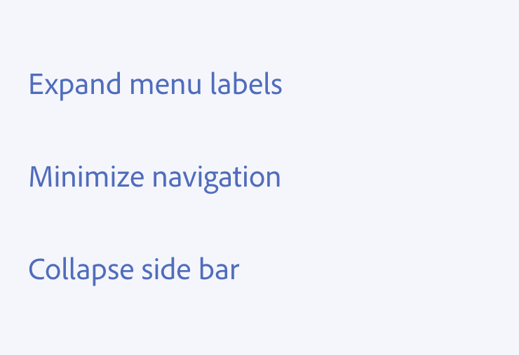
- Plain language. “Hide” is more straightforward and common language than “Minimize,” and is also at the appropriate reading level for UI text.
- Conceptual accuracy. “Show” and “Hide” better align to their associated actions; items aren’t disappearing completely from view, but are being tucked away or are changing appearance.
When in doubt, use sentence case
As you’re designing the UI content of your app frame using this framework, follow the Spectrum content standards for all UI text and labels.
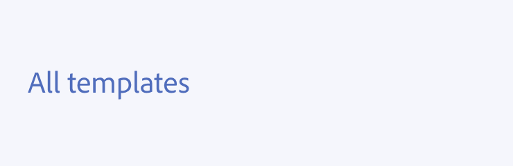
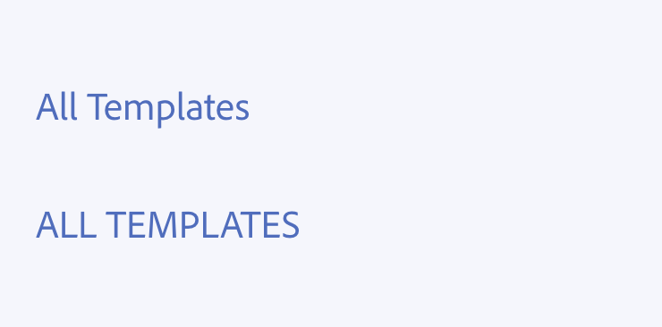
Most of the writing you’ll be doing for the app frame will be short labels. These, as well as all other UI content, are formatted in sentence case: only the first letter of the first word is capitalized. View the Spectrum Grammar and mechanics page.