Browsing context: Header
Because the header contains critical, need-to-know information about where the user is within the greater Adobe ecosystem, it needs to be standardized across all Adobe products.
The header is required across all app frame layouts, and contains the highest-level content within the information architecture of a site. It includes information about the greater Adobe ecosystem (e.g., apps, notifications, help, and user profile) and where the user is within it (e.g., product brand, search, and navigation items).

Anatomy
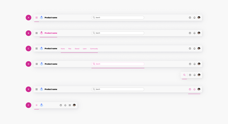
There are several parts of the header that are consistent across all Adobe products:
A. Top App Bar (TAB) switcher
TAB is the up-to-date form of the 9-grid app switcher in Adobe Home. While the underlying functionality remains unchanged, the TAB introduces a more prominent visual placement, appearing at the top of the header when active. View more information on TAB usage.
B. Product lock-up
The lock-up tile is provided by the Brand team. It should be used as-is based on the specs in the Figma library. These items should be shown as-is, in all root-level browsing headers. In a small breakpoint, the product name can be hidden to allow room for additional actions. View more information about Brand assets.
C. Navigation
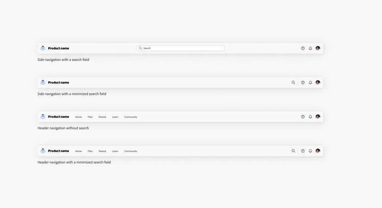
When there isn’t a side navigation present, the header should contain the primary, top-level navigation that represents the main categories of the product.
D. Search
The search field is optional, but when used, should be center aligned. Use a minimized search button when there isn’t space for a search field.
E. Universal nav (navigation)
The universal nav provides clear and consistent access to important Adobe-wide actions, regardless of cloud, product, or surface.
F. Side navigation state control
The side navigation state control (hamburger icon) appears in the header for mobile breakpoints and the Unified Shell. View details about the side navigation state control usage.
Component options
App frame header
hasSideNavigationStateControl
Shows a hamburger button on the far left of the header. This controls whether the minimized style of the side navigation (partial/full).
hasNavigationItems
Shows navigation items in the header.
hasSearch
Shows a search option in the header.
searchStyle
Defines the style of the search option that's shown.
hasSkipToMainContentButton
The “skip to main content” button helps improve keyboard navigation by creating a shortcut to the main content of the page. This button is an accessibility feature to allow skipping to the first navigable HTML item.
App frame header navigation item
showIcon
Shows an icon to represent the header navigation item.
icon
The text that is displayed as the label of the header navigation item.
label
The text that is displayed as the label of the header navigation item.
isSelected
Presents the header side navigation as selected or not selected.
isDisabled
Changes the header navigation item to the disabled state.
hasPopover
Shows a chevron next to the label that indicates an additional menu.
App frame side navigation state control
label
The text that is displayed as the label of the tooltip.
States
App frame header
App frame header navigation item
App frame side navigation state control
Usage guidelines
Limit the number of call-to-action (CTA) buttons
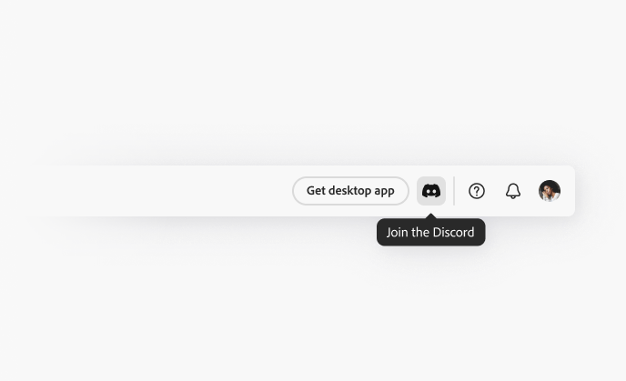
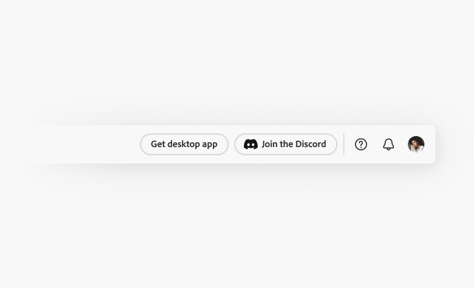
As a general rule, only use one call-to-action (CTA) button, aside from any buttons used to log in or log out, as defined in the universal nav. When too many CTAs are shown at once, the messages compete for attention and dilute the ability for a focused attention hierarchy.
If there are multiple actions, consider combining them into a single menu or use other button types. The button should represent the most important CTA across the product; for example, “Share” and “Get desktop app” are common CTAs.
Examples
Accessibility
Keyboard interactions
If a “skip to main content” button is enabled, it appears only on keyboard focus as the first item in the focus order. View details and examples of keyboard interactions documentation.
Cursor guidelines
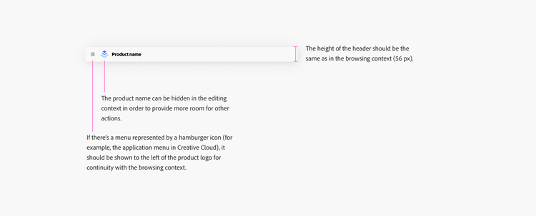
Notes on the editing context
Diagram with notes about the app frame header in the editing context. If there’s a menu represented by a hamburger icon, such as the application menu in Creative Cloud, it should be shown to the left of the product logo for continuity with the browsing context. The product name can be hidden in the editing context in order to provide more room for other actions. The height of the header should be the same as in the browsing context (56 px).