Browsing context: Side nav
The side navigation is always used in partnership with the header, and never instead of it. When used, the side navigation holds the main categories of product functionality, such as workflow-related navigational items (e.g., Home, Files, Learn, Dashboards). Don’t use this for categorizing marketing pages.

Anatomy
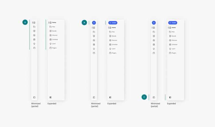
Side navigation consists of a few parts:
A. App frame side navigation items
These navigation elements represent core workflow-related categories within the product. Their visual and behavioral style is exclusive to the Spectrum 2 (S2) app frame and should not be reused elsewhere in the product experience.
Although the app frame side navigation may look similar to the standard S2 side navigation at first glance, its interaction model introduces notable differences. One key distinction is its collapsible behavior, which allows items to expand or contract, revealing or hiding labels as needed. This feature helps users maintain focus and minimizes visual clutter. Additionally, the app frame navigation supports only two styling options: icon-only, and a mixed style where icons appear at the first level but are omitted at the second and third levels.
B. App frame create button
This button is optional, but when shown, should appear at the very top of the side navigation. It’s important that this placement is consistent: putting key actions in different places across products makes features unpredictable and difficult to learn.
Additionally, this button should not be used outside of the app frame context. It has unique animations between expanding and collapsing that are optimized for the app frame side navigation panel.
C. App frame side navigation state control
The panel icon side navigation state control is located at the bottom of the side navigation. This is used when products are using the Top App Bar (TAB). Learn more about the usage of the TAB in the app frame.
Component options
App frame side navigation panel
minimized
Allows the side navigation to be minimized by the user.
minimizedStyle
The partial style displays icon-only side navigation items when minimized. The full style hides the side navigation when minimized.
hasCreateButton
Shows a create button at the top of the panel.
isResizable
Enables drag on the side navigation.
dragToMinimize
If the side navigation panel can be minimized (Can be minimized: true), dragging to the min width (expanded) will collapse the side navigation into the minimized state.
minWidth (expanded)
The minimum width that the side navigation panel can be adjusted to.
defaultWidth (expanded)
The default width that the side navigation panel appears in.
App frame side navigation item
label
The text that is displayed as the label of the app frame side navigation item, to supplement the icon.
hideLabel
Hides the label, making the app frame side navigation item icon-only.
labelTruncation
The number of lines that is shown before the label is truncated.
isSelected
After the user clicks on an app frame side navigation item, the left visual bar will turn gray-800, text will bold, and color will change to content-neutral.
isDisabled
Changes the side navigation item to the disabled state.
App frame side navigation state control
label
The text that is displayed as the label of the tooltip.
States
App frame side navigation panel
App frame side navigation item
App frame side navigation state control
Behaviors
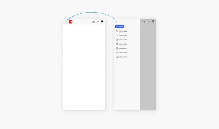
Mobile overlay guidance
Use the overlay variant of the app frame: side navigation (browsing) component for smaller breakpoints. The overlay is triggered via the hamburger menu in the header (rather than a touchpoint at the bottom).
Although 768 px is the recommended breakpoint to begin displaying the overlay designs, each product team should determine which breakpoint best suits their needs.
View the keyboard focus order of mobile overlays.
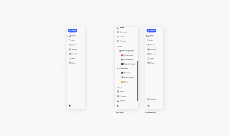
End section divider
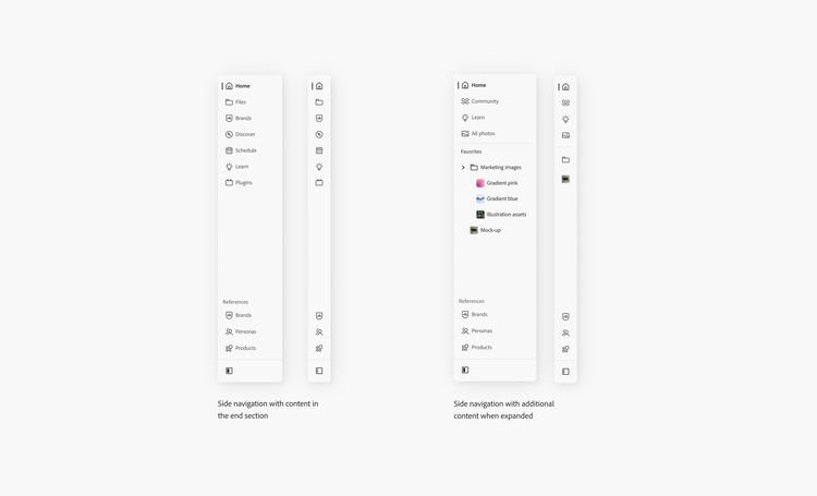
The divider at the bottom of the side navigation is an intentional visual element that separates overflow side navigation items and end section items from the state control icon.
The end section is optional and used to contain navigation items in a separate category that is secondary to the main navigation items. Categories, when defined, should readily communicate a clear purpose and be meaningful to users. Items placed here sit on a separate area. When resized to a smaller height, the items should append onto the start section and scroll together.
Minimum width
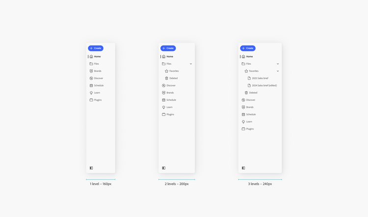
The minimum width is customizable, depending on the number of levels:
- 1 level: 160 px
- 2 level: 200 px
- 3 levels: 240 px
Usage guidelines
Support side navigation resizing for user-generated content
If the side navigation contains user-generated content (like shortcuts to folders and files), enabling resizing can be a good way to improve usability by respecting user content, without needing to predict the length of labels that users might input.
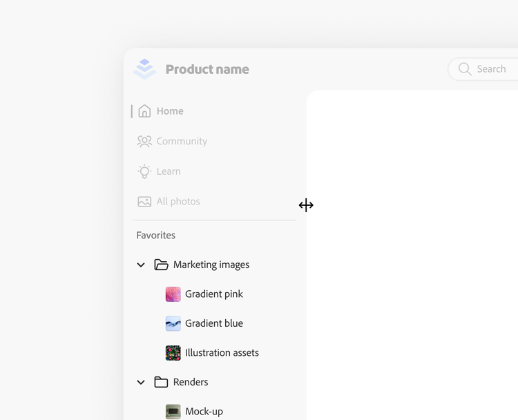
If drag to resize is enabled, support alternate methods for resizing
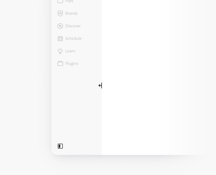
Spectrum is committed to complying with WCAG standards, and dragging interactions require alternate methods. The side navigation width can be dragged to resize the side navigation state control (hamburger icon in the header or panel icon at the bottom of the app frame side navigation panel). This control serves as an equivalent function for dragging interactions and enables the drag area to have a smaller touch target, only when necessary (for example, when a scroll bar is present).
Resize behavior should also support keyboard interactions and preserve the user’s preferred width.
Be concise
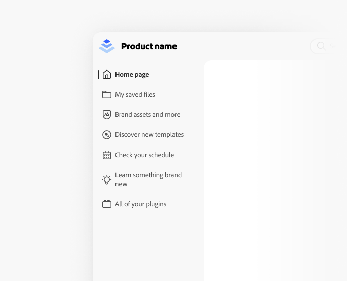
Along with being descriptive, the labels of navigation items should be succinct. Keep navigation strings to 1 or 2 and no more than 3 concise words (in U.S. English, which is the source locale). Reduce any unnecessary words in order to ensure simplicity.
Navigation items should never be so long that they require truncation, except in instances where navigation is user-generated (e.g., folder and file names).
Be cautious with line breaks
If possible, the default width should auto-adjust to the longest string in the navigation in order to accommodate all translations. As a last resort for long strings, specific line breaks can be built into the implementation. These line breaks depend on the content, and requires manual handling by Globalization engineers.
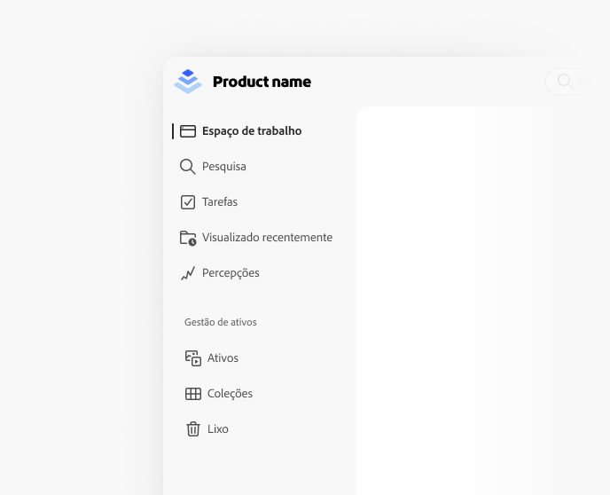
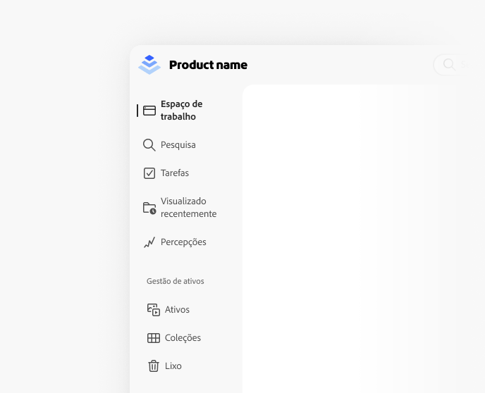
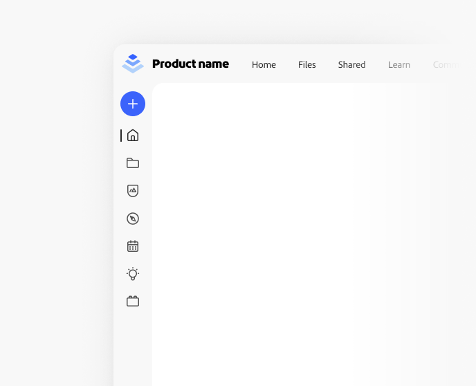
Put navigation in either the side navigation or the header, not both
When navigation items are shown in both the side navigation and header at the same time, the hierarchy and relationships between them become unclear. If the side navigation is used, don’t put any navigation items in the header.
Support user customization and preserve user preferences
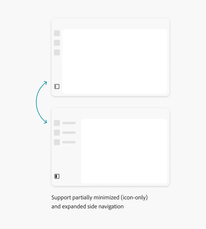
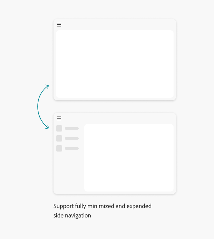
Supporting multiple states (default, and partial or fully minimized style) provides users with the option to choose their preferred layout based on their own preferences. In user studies, individual preference is the biggest factor when it comes to whether or not people want to view labels by default.
If supporting multiple states, consider showing the side navigation in the expanded state by default, and preserve user preferences across pages and sessions. If minimizing the side navigation is not supported, show the side navigation in the expanded state. Showing labels by default increases recognition and familiarity.
Learn more about using the hamburger and panel side navigation state controls.
Always use icons in first level of the app frame side navigation
There are some app frame-specific constraints for the side navigation. Icons are required at the parent level. Nested items can have no icon, but the parent level must have an icon.
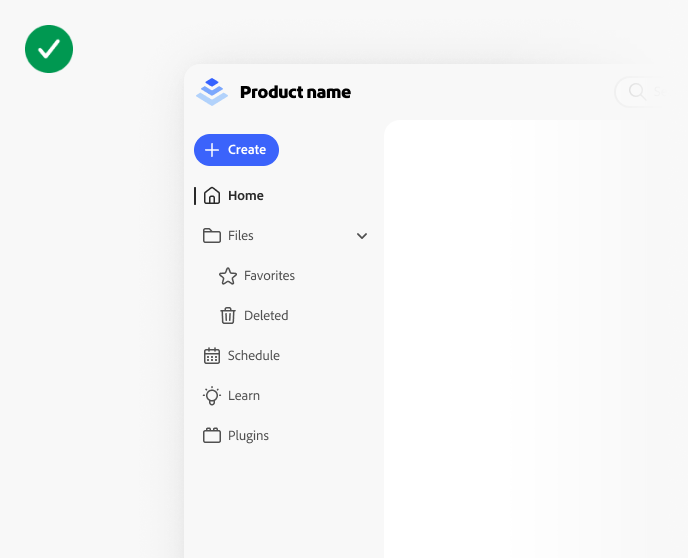
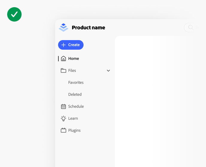
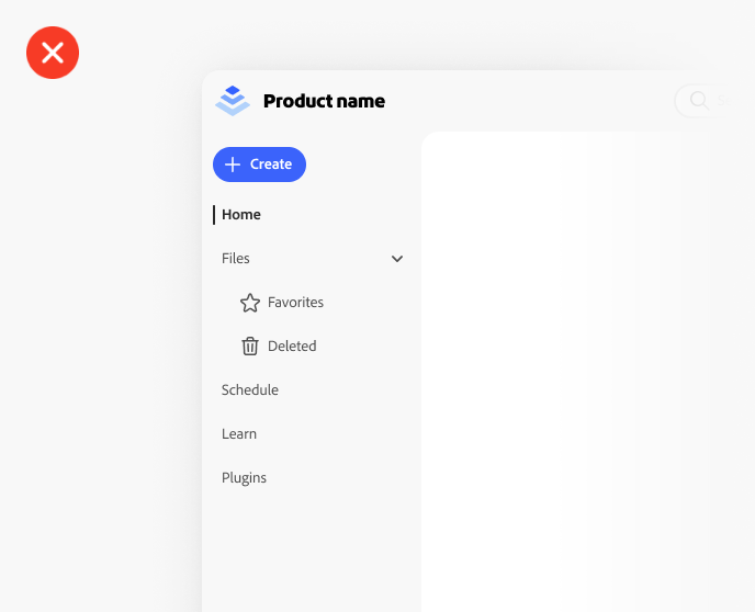
Side navigation examples
Accessibility
Keyboard interactions (App frame side navigation panel)
Keyboard interactions (App frame side navigation)
Cursor guidelines
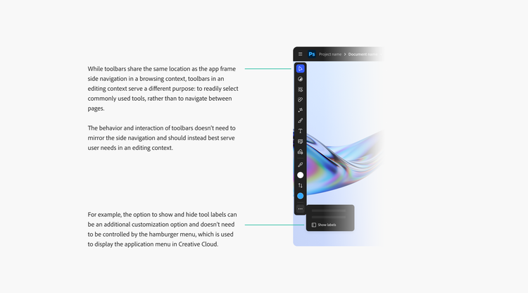
Notes on the editing context
Diagram describing notes about the side navigation for the app frame, in the editing context. While toolbars share the same location as the app frame side navigation in a browsing context, toolbars in an editing context serve a different purpose: to readily select commonly used tools, rather than to navigate between pages. The behavior and interaction of toolbars doesn’t need to mirror the side navigation and should instead best serve user needs in an editing context. For example, the option to show and hide tool labels can be an additional customization option and doesn’t need to be controlled by the hamburger menu, which is used to display the application menu in Creative Cloud.