Background layers
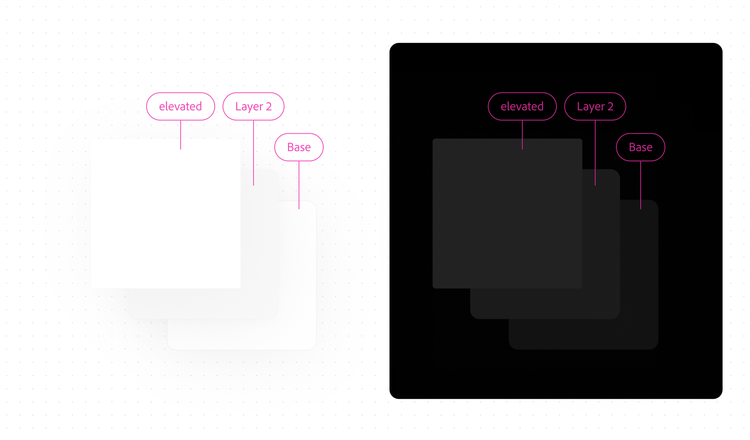
Background layers utilize Spectrum’s gray system, which contains many options for greater flexibility.

Layering system
In Spectrum, background layers are used differently depending on the primary context of the page. For pages where the primary purpose is the canvas and related actions for editing, view Editing contexts. For pages where the primary focus is browsing content, such as a Home or Files experience, view Browsing contexts. If you’re not sure whether a page is in an editing or browsing context, contact the Spectrum design team.
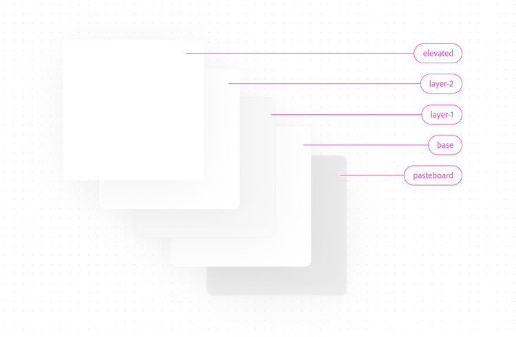
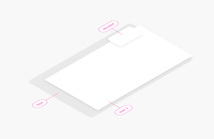
In addition to the three existing background layer options — background layer 1, background layer 2, and background base — Spectrum includes an elevated option. Elevated background layers create depth and emphasize content floating on top of a canvas.
Editing contexts
Overview
In Spectrum, background layers are used differently depending on the primary context of the page. For pages where the primary purpose is the canvas and related actions for editing, view Editing contexts. For pages where the primary focus is browsing content, such as a Home or Files experience, view Browsing contexts. If you’re not sure whether a page is in an editing or browsing context, contact the Spectrum design team.
Editing application
Pages in editing contexts draw attention to the canvas, which is the primary focus.
Elevated (highest attention)
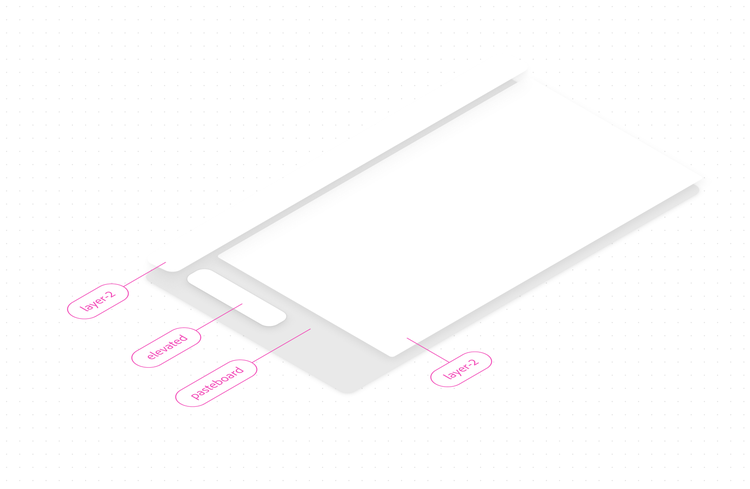
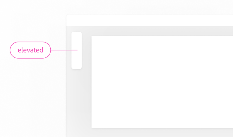
Elevated backgrounds create the illusion of depth through the use of a drop shadow, and display content that appears on top of other content. They draw attention and are used sparingly. In an editing application, this background option works well for parts of the app frame that appear on top of the canvas, such as a floating toolbar, panel, or popover.
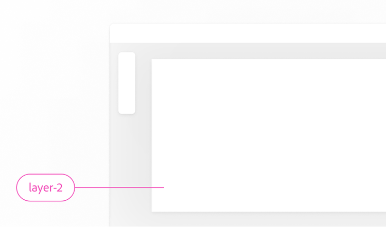
Layer 2
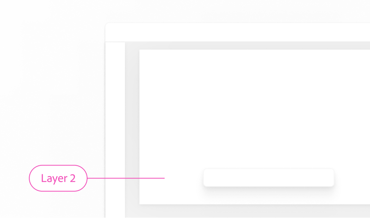
Layer 2 is the color of the canvas. This background layer color can also be used in both professional and lightweight editing applications, in the app frame, to put it on the same dimension as the primary content.
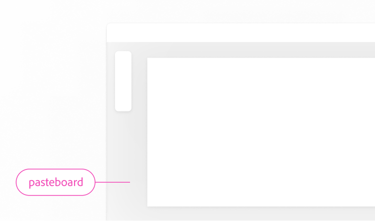
Pasteboard
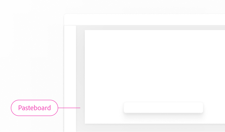
The pasteboard has a dedicated background layer. This is because no components are placed directly on top of it, with the exception of an artboard (which uses a white background color). Other components should be placed on a layer 1, layer 2, or elevated background.
Professional application
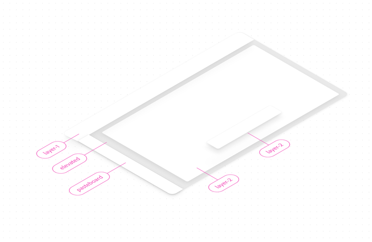
This example shows an editing application using background layer 2 for both the artboard and the app frame. An elevated background is used for a floating toolbar, which appears on top of the canvas.
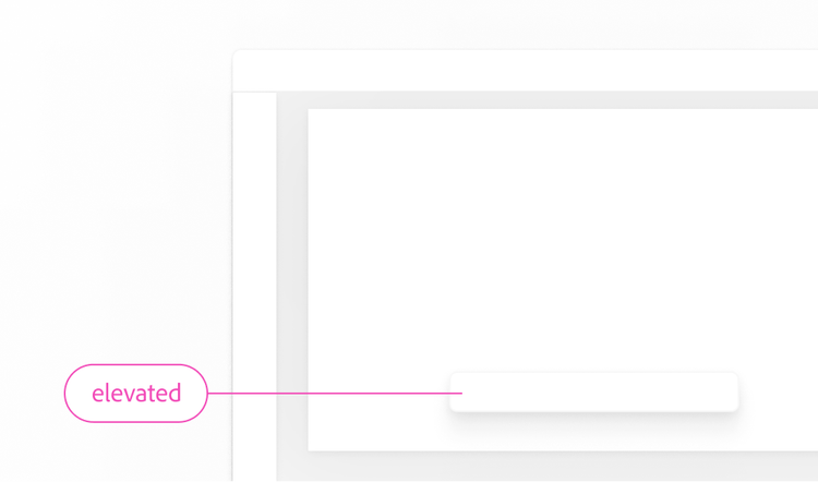
Elevated (highest attention)
Elevated backgrounds create the illusion of depth through the use of a drop shadow, and display content that appears on top of other content. They draw attention and are used sparingly. In an editing application, this background option works well for parts of the app frame that appear on top of the canvas, such as a floating toolbar, panel, or popover.
Layer 2
Layer 2 is the color of the canvas. This background layer color can also be used in both professional and lightweight editing applications, in the app frame, to put it on the same dimension as the primary content.
Layer 1
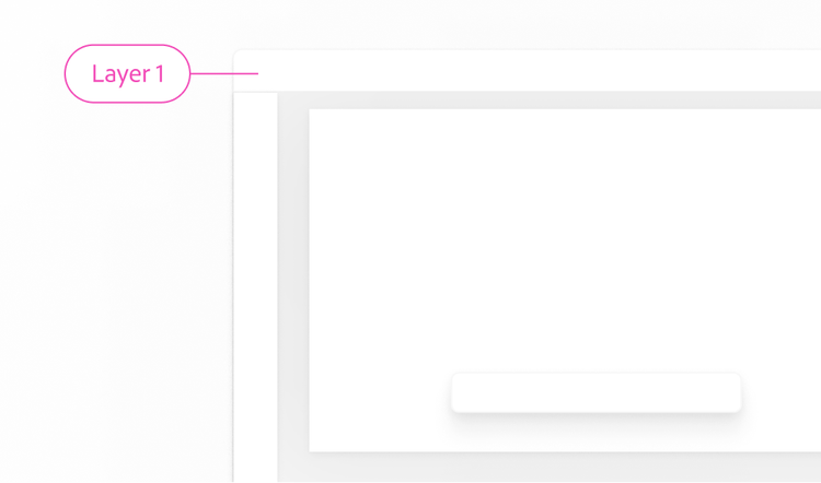
Layer 1 can be used as the app frame color in professional editing applications, which require additional depth differentiation.
Pasteboard
The pasteboard has a dedicated background layer. This is because no components are placed directly on top of it, with the exception of an artboard (which uses a white background color).
Browsing contexts
Pages in browsing contexts draw attention to the content, which is the primary focus. Examples of pages in browsing contexts include a Home or Files experience.
Elevated (highest attention)
Elevated backgrounds create the illusion of depth through the use of a drop shadow, and display content that appears on top of other content. They draw attention and are used sparingly. In browsing contexts, this background layer style is used in components like menus and tooltips.
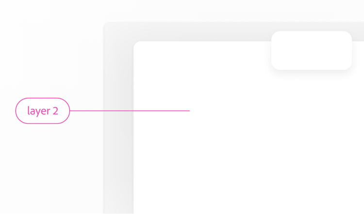
Layer 2
Layer 2 is used to group related content together and to create separation from the primary content on a page, such as in the background of the app frame.
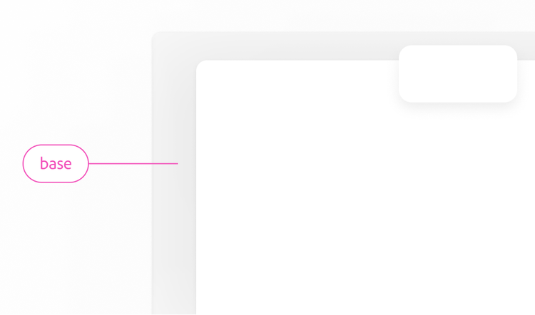
Base
Spectrum 2 uses gray-25 as the base background color to draw attention to the primary content of a page. Using gray-25 allows for higher contrast between the background and content, and it provides a blank canvas for more vibrant colors.
For using a drop shadow to draw emphasis to a container that isn’t elevated, view container emphasis.