Spacing
Spacing communicates structure and relationships. When spacing is done well, an interface becomes immediately understandable.

Principles
Spectrum's spacing system is built on three principles, which are grounded in how the visual system perceives and interprets proximity.



Relational
Every spacing decision carries meaning. Proximity communicates what belongs together, what is separate, and how an interface is organized.
Proportional
Not all elements grow at the same rate. Spectrum uses distinct spacing scales, each tuned to the elements they serve. This keeps values consistent and harmonious across all sizes and contexts.
Perceptual
Spectrum's spacing values are based on visual perception. They are designed to support accurate visual interpretation and maintain consistent relationships between interface elements across different contexts.
What spacing does
Spacing tells people what belongs together, what is separate, and how content is organized.
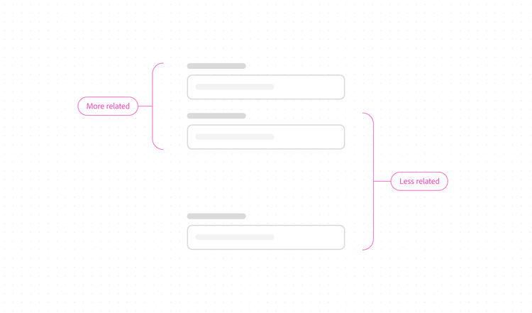
It works because of how the visual system perceives proximity: elements placed close together are seen as related. As the distance between them increases, that relationship weakens. With enough separation, elements read as completely independent.
Relationships
Relationships
Closer elements are more associated. Distant elements are more independent.
Boundaries
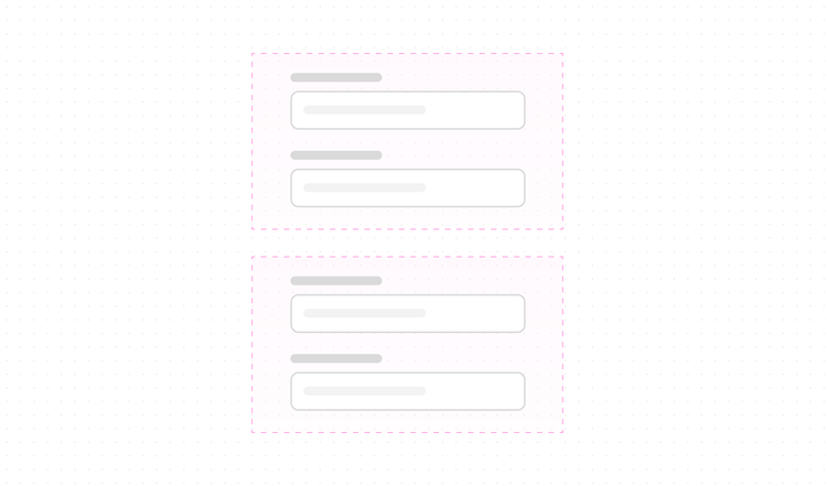
Consistent proximity within a group signals that all members are equally related.
Structure
The overall distribution of space shows how content is organized within a layout.
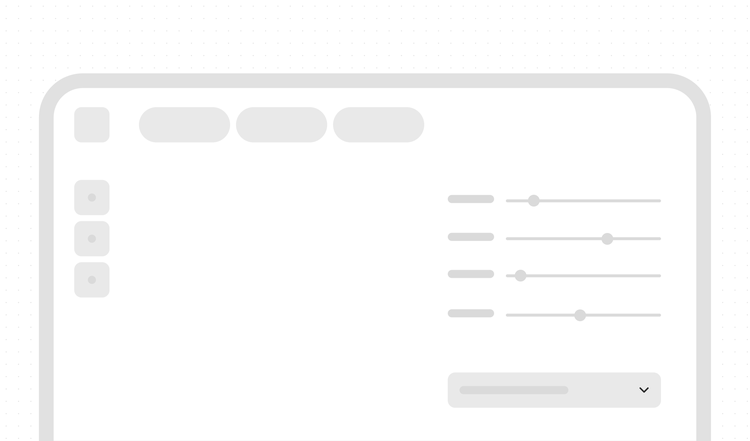
These three things are connected. Change one, and the others shift too. Spacing decisions are not visual alone, but rather they are structural and meaningful.
Spacing also shapes how an interface feels. Negative space (the open areas between and around elements) creates a sense of calm and helps people focus on what matters. It's one of the most effective ways to create visual balance and direct user attention within a layout.


Types of spacing
Every spacing decision falls into one of two tracks.
Layout spacing is for anything above the component level, such as the relationships between components, patterns, and regions of a product UI.
Component spacing is for anything within a component.
Layout spacing and component spacing scale at different rates and serve different purposes. Within a single component, different spacings may be present at the same time, each scaling according to its own role.