Object styles

Object styles are specific visual shapes or effects that are used to communicate intent or to give cues about an interaction.

Three UI object style examples: a solid rounded pill shape, a search bar with dashed outline, and a rounded square button with a checkmark icon, shown against a soft gradient background.

Overview

Spectrum’s object styles include rounding, border width, and drop shadow. Object styles are combined with color in different ways to communicate specific cues about interactions, adding a layer of meaning to the style of components.

For example, different types of inputs all share styles. Search fields, text fields, and combo boxes use object styles to communicate text input. A search field is often more of a global scope, and has full rounding to add emphasis and differentiation from other types of fields. Action buttons, pickers, and in-field buttons share a fill color to indicate selection. Checkboxes, radio buttons, and switches share object styles to indicate binary selection.
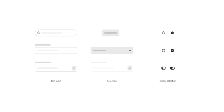

Wireframe comparison of three form control categories — Text input (search field, text field, dropdown), Selection (button, dropdown menu, dropdown menu), and Binary selection (radio buttons, checkboxes, toggle switches) — each shown in unselected and selected states.

Jump to

Four corner brackets arranged in a square formation illustrating corner rounding, with the top-right corner highlighted in a blue-to-teal gradient.

Rounding

Rounding

Three horizontal pill-shaped bars illustrating different border width styles: a thin gradient outline, a thicker soft-edged border, and a wide blurred border.

Border width

Border width

A rounded square outline with a soft drop shadow next to a diagonal rounded line in a pink-to-purple gradient, illustrating drop shadow styling.

Drop shadow

Drop shadow