Browsing context: Content area
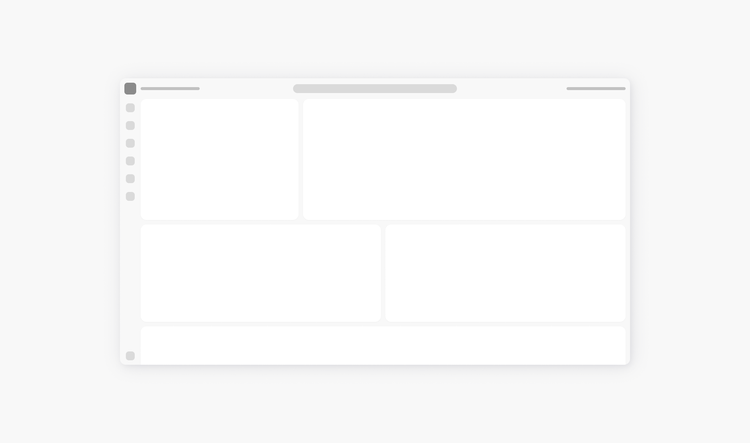
The app frame content area is the primary focus of a page, and should draw the most attention. This area is flexible and supports several different layouts, dependent on the content to be shown. The specific content that goes into each section is not defined by this framework.

Here are some layouts to consider:
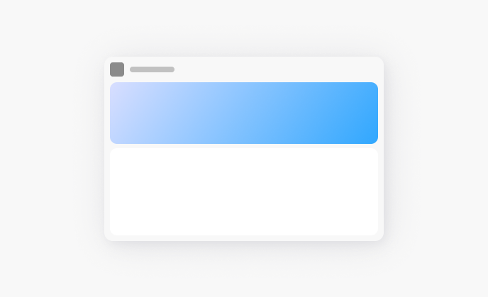
Single section
This layout is suitable when all content is related and unified by the primary purpose of the page. This single section can be subdivided using full-width dividers, or by creating visual groupings of content using proximity and spacing.
View more about spacing in Spectrum 2.
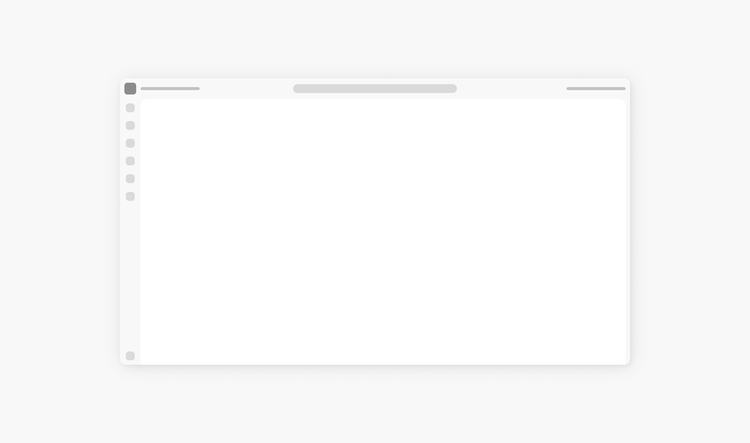
Use dividers to separate related content
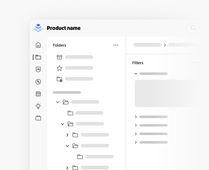
Dividers are useful to separate content when using spacing alone wouldn’t be clear enough to mark the boundaries of distinct areas. Generally, more complex content with a varying alignment of objects will benefit the most from using a divider.
For example, showing the contents from a selected folder, or a commenting panel of a selected file, would benefit from a divider. If showing content that’s unrelated, like an AI assistant that’s available across multiple pages, use the vertical layout. View more about border width in Spectrum 2.
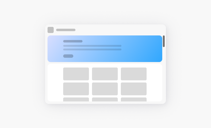
Horizontal sections
The top section can also be useful to visually indicate that the content is separate and has additional affordances, such as the ability to be minimized. For example, “welcome” type content might be shown in the top section, and recent files might be shown below.
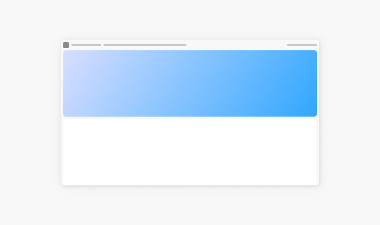
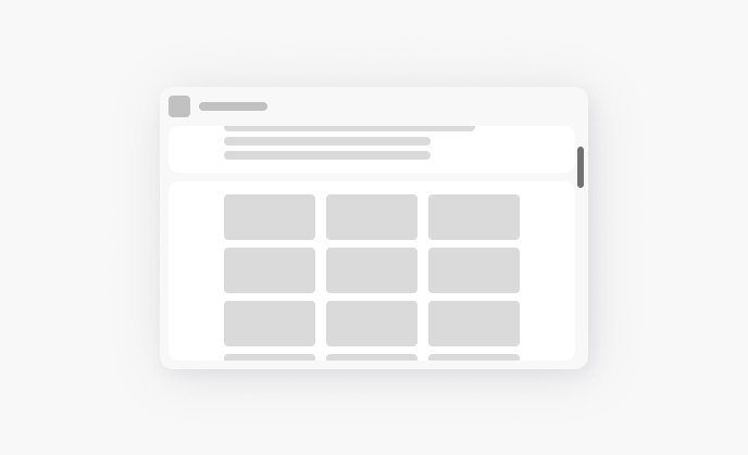
Don't enable scrolling on multiple areas
When using horizontal sections, the page should scroll as a single unit. Consider other ways to minimize the top section if needed, such as through an additional control to show and hide content.
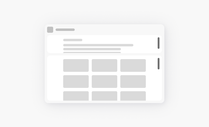
Put scrollable content in the bottom section of a horizontal layout
The top section of a horizontal layout should be reserved for high-attention marketing messages or quick actions, and it should not be scrollable. Put infinite scrolling and longer content in the bottom section.
Vertical sections
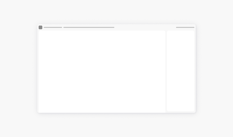
This layout is suitable to separate content that’s not semantically related, and if one of the content areas can be minimized. For example, this might apply for onboarding tutorials, or to include an AI assistant.
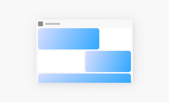
Multiple sections in a grid layout
This layout is suitable to separate multiple groups of content that aren’t semantically related. For example, this could show several widgets and distinct marketing messages. This layout can also be useful if a user is able to customize the page.
Make sure to consider smaller breakpoints and decide how content areas should reflow, hide, or combine. In general, show the most important information at the top, and if possible, then progressively disclose the not-as-important information.
App frame usage of gradients
Backgrounds that use gradients are always placed within the app frame intentionally and with a strategic meaning. They should contribute to the visual hierarchy, not distract from it. And, their colors are directly tied to product brand color palettes.
In the S2 app frame, gradients are only used as backgrounds in content areas — they are not used in the header and navigational areas. This allows for greater flexibility between pages where gradients may be calling attention to different kinds of content.
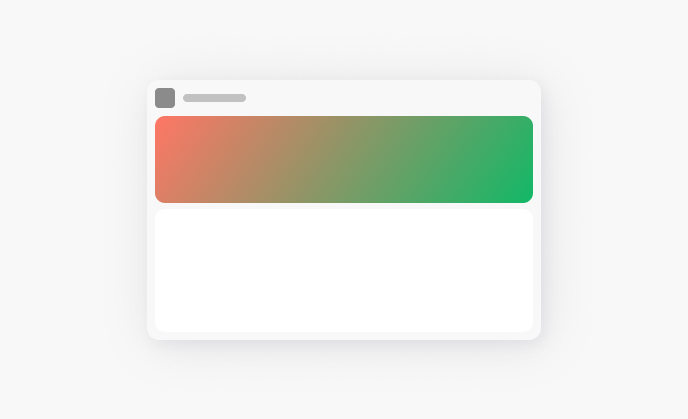
Creating attention hierarchy with gradients in the app frame
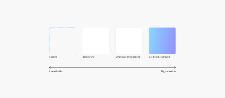
Containers in Spectrum share styles that draw different levels of attention, and the kind of container should be chosen based on the content within. Gradient backgrounds draw the most attention on a page; when used correctly, they help users better navigate the interface by drawing their attention to the most relevant, high-signal, and meaningful items at the given point in their workflow.
For example, on a Home screen, gradient backgrounds might call attention to new AI features in the product. On a Learn screen, gradient backgrounds might call attention to tutorials from new creators. On a Files screen, gradient backgrounds might not be used at all in order to focus attention on asset previews. In any context, consider where you want to draw attention and what you want to highlight for the user, what the user’s intentions might be, and how gradient backgrounds may add or detract from the goals of the page.
In general, less is more. The more gradients on a page, the more attention is diluted and no longer effective at communicating hierarchy of information. View more about attention hierarchy in Spectrum.
While there isn’t an objective scale for each style, it can be helpful to think about backgrounds in terms of how much attention they draw, on a scale of low-to-high.
Don’t use gradients as the background in navigational areas
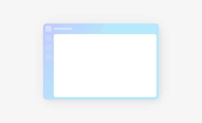
While you may have seen past Spectrum 2 explorations showing gradients as the background in header and navigational areas, they should not be used in that context. This is because gradients that appear in the navigation of every page distract from more important information on the page, clash with other imagery, and might not work for some product segments.
By using gradients in the content areas as backgrounds instead, there’s more flexibility to direct attention to different content and messages, depending on what’s important in the context of that page or workflow.
Use gradient backgrounds to draw attention to one area
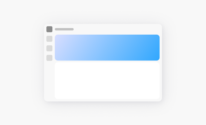
Gradients are used to draw attention to important content and features. They can be used in the background of content areas. Using gradients in more than one content area results in multiple areas competing for attention. This is distracting from the task-at-hand workflows on the page.
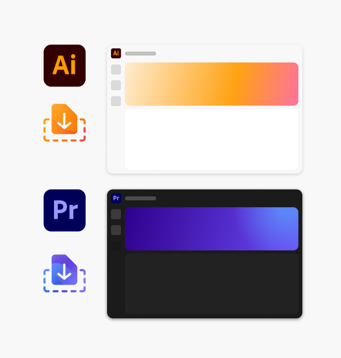
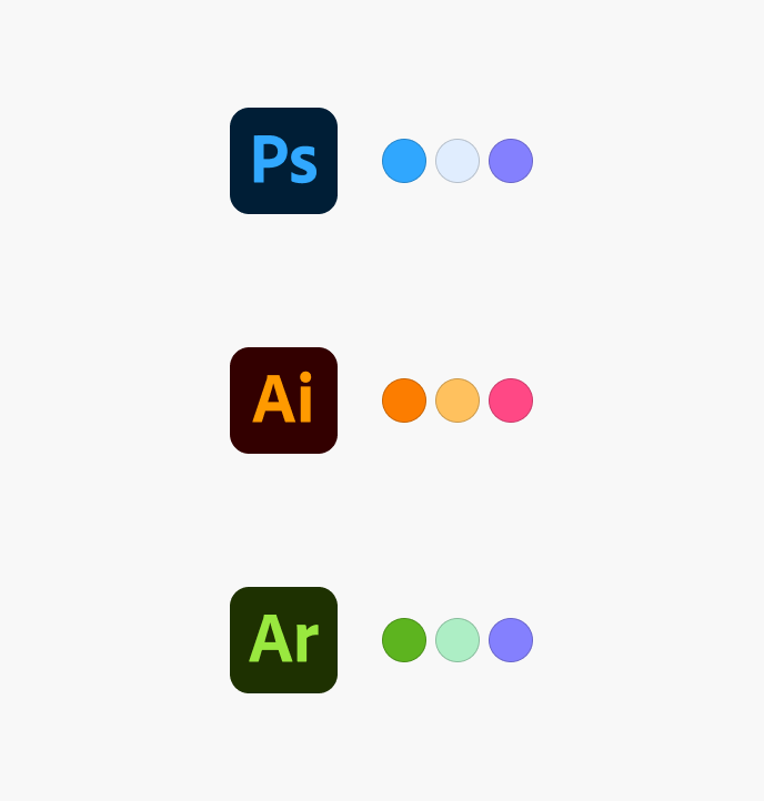
Use gradient backgrounds that reflect the colors of the product brand or feature
Gradient colors are directly tied to product brand color palettes.
Don't create your own gradients or customize them
Gradients should always be delivered directly from the Spectrum Brand team and used as-is. Do not modify them.