Illustration
The illustrations and graphics in Spectrum 2 have been completely reworked to reflect the significant update of our design system.
Fundamentals
Spectrum 2 (S2) evolved around the need to bridge the gap between purely professional tools and more consumer-orientated applications, creating updates that prioritize more approachability, a clearer sense of attention hierarchy, and a stronger connection to product branding. Illustrations are a major part of how Spectrum 2 creates such experiences.
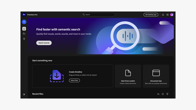
The S2 illustration styles reflect these ideas by introducing both clear, friendly UI illustrations and expressive brand illustrations with colors that are closely connected to Adobe’s product categories. Updated shapes and forms make clearer connections to Spectrum 2 iconography. The styles work as a dynamic, flexible, and robust system that supports foundational attention hierarchy principles through a range of options. They work across UI illustrations, empty states, cards, banners, and more. These illustrations were also developed with product implementation as top-of-mind, and have been intentionally created to support export as SVG native files — making the assets lean and easy to implement across many frameworks.
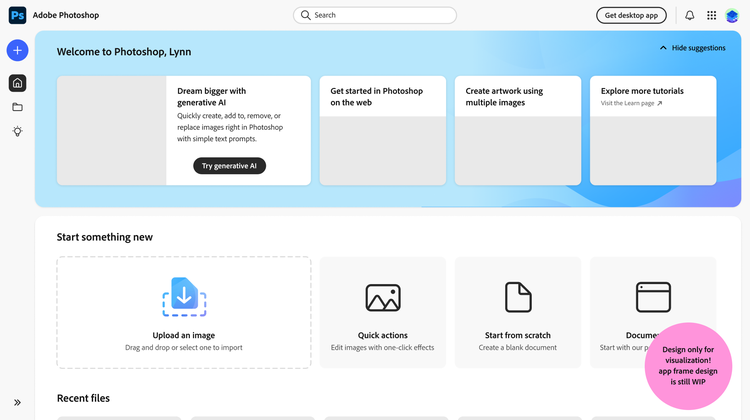
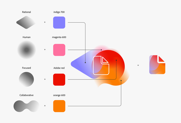
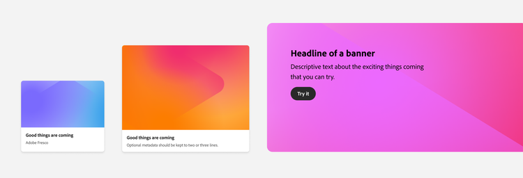
With S2, we’re also introducing a new style of illustrations: gradient illustrations. The gradient swatches are a combination of the product-specific brand colors within the S2 color system and a set of shapes that connect to the Spectrum 2 principles: rational, human, focused, and collaborative. Together, this brings a dynamic sense of a product’s brand presence directly into the user experience. Gradient illustrations are engaging and positive, and add moments of delight. They can draw attention to specific areas (such as a drop zone or an empty state), and can encourage users to take a specific, intended action, like beginning a project or uploading files. They can also be applied to cards, banners, and backgrounds.
Please note that parts of this illustration system are still in exploration, and will be added to these guidelines once they’re more defined. Animation is also currently being explored.
Comparing Spectrum 1 and Spectrum 2
Here’s a summary of the main updates that you’ll notice with Spectrum 2 illustrations, compared to the style of Spectrum 1:
- Similar to icons and text, all linear illustrations now use Spectrum gray 800 instead of gray 500. This meets accessibility standards by ensuring visibility regardless of the background color.
- These illustrations have a much closer connection to the icon metaphors and forms, for a consistent and cohesive visual language.
- Linear illustrations feature rounder and friendlier forms, making them feel more approachable. The compositions are also less cluttered and more clear, to promote focus and scaleability.
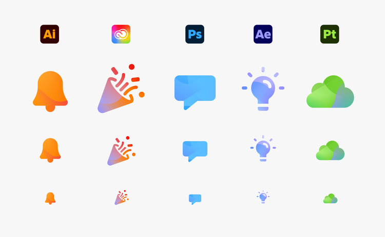
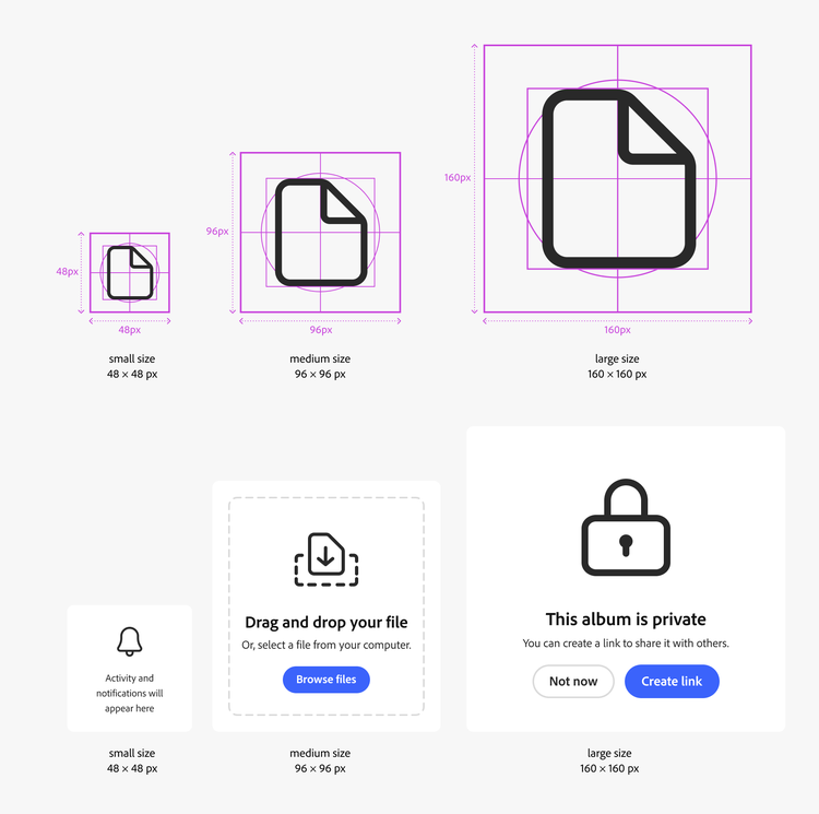
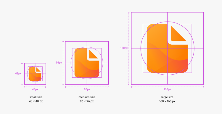
- The S2 illustrations come in three sizes: S (48×48 px), M (96×96 px), and L (160×160 px). These sizes are in line with the spacing tokens, and provide more flexibility for layouts.
- With the introduction of gradient illustrations, there's now an option for illustrations with more color. Color creates more expressiveness and brand integration, as well as supports multiple levels of attention hierarchy.
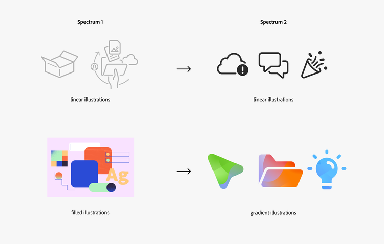
Illustration styles
Spectrum 2 illustrations have two styles: linear (monochromatic) and gradient (color). Both have specific use cases.
Do not create your own illustrations, or use 3rd-party assets. Illustrations are very visible parts of our design system that drive the consistent look and feel to our products, so they need to be used strategically and thoughtfully.
Linear illustrations
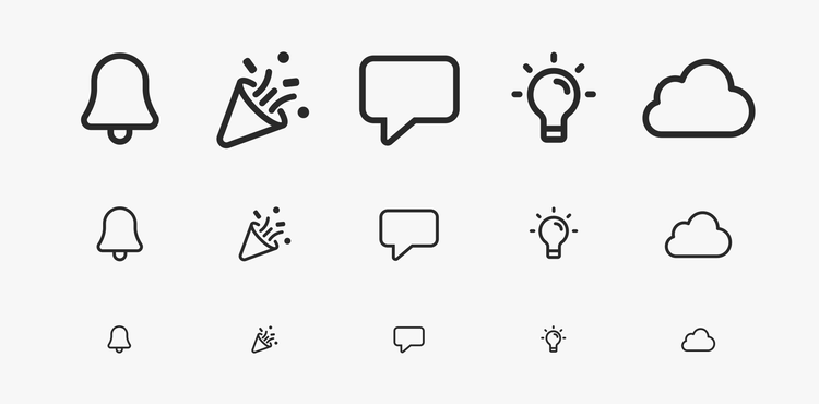
The Spectrum 2 linear illustrations are an evolution of the Spectrum 1 outline style. The Spectrum 2 icons serve as the blueprint; they follow the same metaphors and are drawn in a similar way.
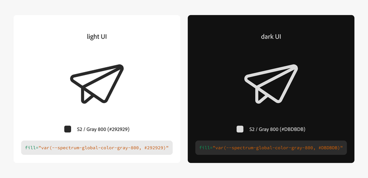
Linear illustrations are monochromatic. They use the same color token as the icons (S2 / gray 800), and switch colors according to dark and light UI.
Sizes
Linear illustrations come in three sizes: small (48×48 px), medium (96×96 px), and large (160×160 px). Small and medium are the most commonly used sizes; large is not used as often. For most use cases, the medium size works well across mobile, tablet, and desktop.
Color
The linear illustrations use Spectrum gray 800, and switch between light and dark UI. For production, the SVGs in the A4U libraries use embedded tokens, similar to the structure of the icons. This ensures that they can programmatically switch depending on UI brightness or color theme.
Naming convention
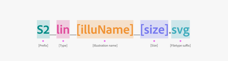
Linear illustrations use the following naming convention:
- Prefix identifies it as part of a larger group of assets: in this case, S2 (Spectrum 2).
- Type is the type of the asset: lin for linear illustration.
- Illustration name is in camel case, and there are no empty spaces or individual characters allowed.
- Illustration size is stated in pixels at @1x.
- Filetype suffix indicates the asset format, like SVG or PNG.
Use cases
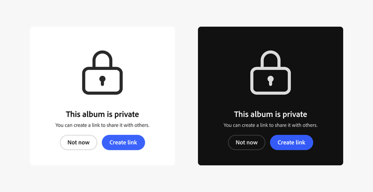
Linear illustrations are straightforward and clear UI illustrations for a variety of use cases, such as empty states or error messages. They support calls to action — like a drop zone illustration, or an empty state illustration — that explain the next steps for how to use the interface in order to get started or move forward. A good example of a use case for a linear illustration is with the illustrated message component.
Gradient illustrations
Gradient illustrations are new to our design system with the update to Spectrum 2. Compared to linear illustrations, they’re much bolder. They can help users understand a message more quickly, or motivate them to perform a specific action.
Gradient illustrations also introduce color, which makes them more expressive, reinforces product branding, and supports attention hierarchy. They use distinct pairings of colors and shapes that are tied to the product brand categories and the Spectrum 2 principles.
This style replaces the Spectrum 1 filled illustration style.
Sizes
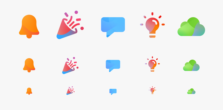
Gradient illustrations come in the same sizes as the linear illustrations: small (48×48 px), medium (96×96 px), and large (160×160 px). For most use cases, the medium size works well across mobile, tablet, and desktop.
Colors
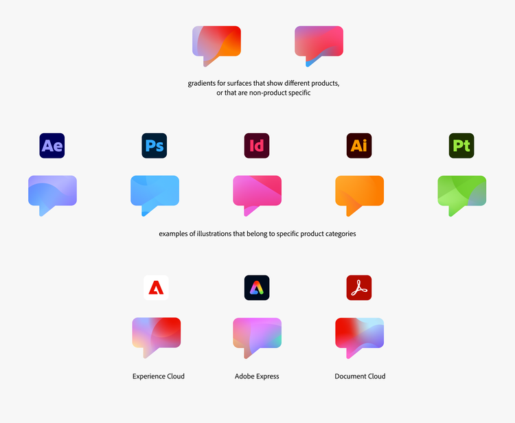
The colors of the gradient illustrations use Spectrum’s 6.0.0 color system. They're tied to the different Adobe product categories and individual products.
There are two gradients that can be used for surfaces that show different products, or that are not product-specific. The other gradients are tied to specific products or clouds. For example, blue is tied to the photography and digital imaging category (such as Photoshop, Lightroom, and Fresco), while green represents the 3D category (such as Substance 3D Stager and Substance 3D Designer). It’s essential to use the appropriate illustration colors according to the product categories. If the application is for multiple products, use one of the gradient swatches that incorporate the Adobe brand red.
Do not use the category gradient sets as semantic colors to communicate meanings like errors (red), warnings (yellow), or successes (green).
Naming convention
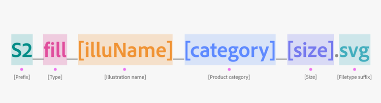
Gradient illustrations use the following naming convention:
- Prefix identifies it as part of a larger group of assets: in this case S2 (Spectrum 2).
- Type is the type of the asset: fill for gradient illustration.
- Illustration name is in camel case, and there are no empty spaces or individual characters allowed.
- Category differentiates the different gradient fill colors. The categories include: allproduct1, allproduct2, 3D, DC, drawing, DVA, express, EC, photo, and print.
- Illustration size is stated in pixels at @1x.
- Filetype suffix indicates the asset format, like SVG or PNG.
Usage guidelines
Illustrations and attention hierarchy
The different styles of illustrations are connected to the Spectrum 2 concept of attention hierarchy.
Linear illustrations are elements that communicate lower attention, as they blend in well with the rest of the UI. They can be used multiple times in a layout without drawing too much attention.
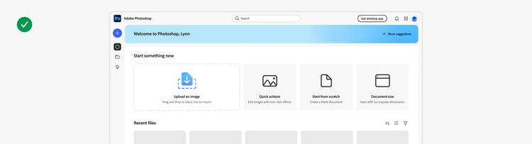
Gradient illustrations are high attention elements that should be used sparingly and selectively. Only one illustration, element, or group of elements should have high attention on a page. Learn more about this with the Spectrum 2 attention hierarchy guidelines.
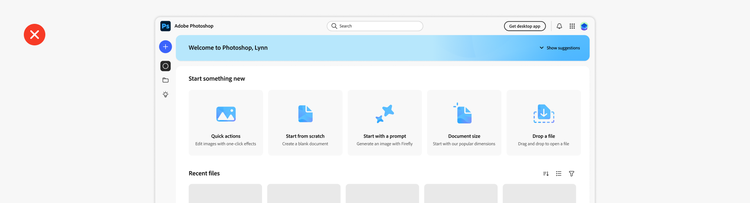
Use linear illustrations for errors or critical messages
Errors or critical messages should only use linear illustrations.
Gradient illustrations use colors that can be misunderstood as semantic colors (e.g., green for positive, red for negative). They also have an upbeat and inspirational tone, which isn’t appropriate in situations where a user may be frustrated by something that’s an inconvenience or is disruptive to them in accomplishing their work.

Use linear style when showing several illustrations together
The linear illustration style works well for layouts that feature a number of illustrations together (such as a collection of cards). Linear illustrations draw a lower level of attention and blend in well with the UI, so it’s appropriate to use them in a collection of elements. Gradient illustrations draw a lot of attention in multiples, so they need to be used sparingly and sparsely.
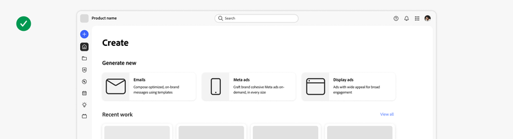
Don’t resize illustrations
Don’t scale or resize linear illustrations. The stroke weight and the corner radii are already set to work best in the given canvas sizes.
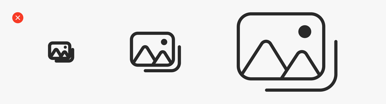
Don’t create your own linear illustrations
It’s essential to have consistency in tone and metaphors across all Adobe products. Don’t create your own linear illustrations or alter existing ones.

Don’t recolor illustrations
Always use gray 800 for the illustration color. Using semantic colors (red, orange, green, blue) can help reinforce meaning, but should be considered on a case-by-case basis.
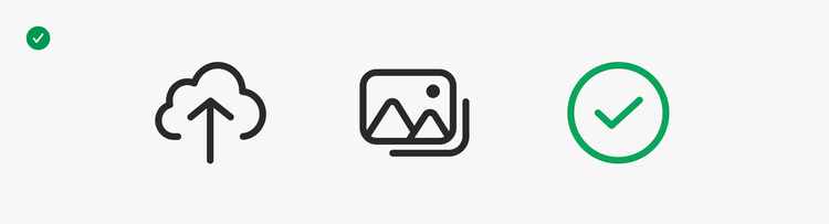
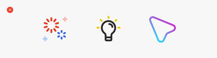
Use gradient illustrations thoughtfully
Gradient illustrations are high attention elements in the layout. Use them strategically and thoughtfully to draw the user’s attention and to provoke a delightful moment.
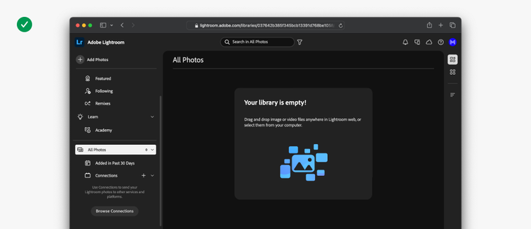
Don’t show more than one gradient illustration at a time
Gradient illustrations draw more attention because they’re very colorful. Using more then one in a given view will make the UI too busy and too loud. Use gradient illustrations sparingly to guide a user’s attention to engaging, high-value actions such as uploads, starting projects, or commenting.
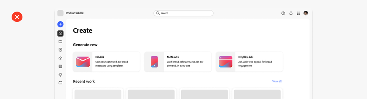
Don’t use gradient illustrations for error or critical messages
Gradient illustrations incorporate product category colors, and also include colors that have semantic meanings in Spectrum: red, orange, or green. It creates inconsistency and confusion to have an error message or a critical alert in green (a color has a positive semantic meaning).
Use gradient illustrations when you want to emphasize positive actions. Gradient illustrations have an upbeat and inspirational tone, which isn’t appropriate in situations where a user may be frustrated by something that’s an inconvenience or is disruptive to them in accomplishing their work.

Don’t create your own gradient illustrations
It’s essential to have consistency in tone and metaphors across all Adobe products. Don’t create your own gradient illustrations or alter existing ones.

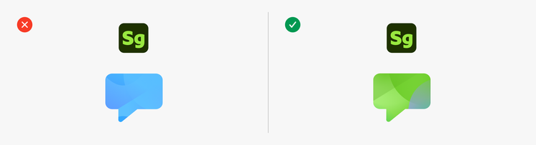
Use the correct colors for your product
The colors in gradient illustrations are connected to the product categories. For example, an illustration for a Substance 3D product should use the Substance 3D green colors.
Do not use different colors than those of your product category. Reach out to the Spectrum Brand team for guidance about the appropriate colors for your use case.
Test if gradient illustrations work well in your layout
It’s highly recommended to test gradient illustrations as you’re designing your layout. They’re very expressive and colorful, so it’s important to determine how they complement (or don’t) different communication points (e.g., user-generated content, onboarding, feature banners, upsells, and more).
If gradient illustrations are making the layout too noisy, use linear illustrations instead.
Thematic banners
Thematic banners are descriptive and represent a specific topic or feature. Similar to the gradient illustrations, they’re either connected to the product brand categories by color, or they use the generic gradient swatches.
These banners use the same shapes, metaphors, and elements as the linear illustrations, but they have a distinct style that is combined with the gradients and colors of the gradient illustrations. With their size, usage of color, and high editorial quality, thematic banners are high on the attention hierarchy scale. In layout, they work best when used to promote positive and high-impact moments, such as announcing new features. Because of this, they should be used sparingly.
Thematic banners are created on a case-by-case basis by the Spectrum Brand team. There is no asset library for thematic banners because they have unique needs for each product use case.